

When your product grows, so do the challenges with your frontend architecture. Early-stage designs, like monoliths, prioritize speed but often lead to bottlenecks. Merge conflicts, slow builds, and fragile codebases become common. To maintain efficiency, transitioning to modular designs and scalable structures is key. Here’s what works:
- Modular Design: Break monoliths into smaller, independent modules using strategies like the strangler pattern.
- Component-Based Frameworks: Leverage tools like React or Vue.js for reusable, testable components.
- Feature-Sliced Design (FSD): Organize code by business domains and layers (e.g., App, Pages, Features) for clarity and scalability.
- Micro-Frontends: Split the UI into independent, deployable pieces managed by different teams.
- Monorepos: Centralize code for better collaboration and dependency management with tools like Nx or Turborepo.
- Performance Optimization: Use SSR, code splitting, and asset optimization to ensure faster load times and better user experience.
These strategies reduce development delays, improve team collaboration, and support long-term growth. A scalable frontend isn’t just about better code – it’s about enabling teams to work independently while delivering a fast, reliable experience for users.
[Frontend System Design] Scaling Web Applications | Part 1
Moving from Monolithic to Modular Designs
Switching from a monolithic design to a modular approach involves breaking your frontend into smaller, independent modules that can be developed and managed separately by different teams. This change tackles common monolithic problems like tight coupling, deployment risks, and collaboration slowdowns.
One effective strategy for this shift is the "strangler pattern", which allows you to gradually replace monolithic features with standalone modules while keeping existing workflows intact [2][5]. Take Kong as an example: in January 2024, they transitioned their Konnect platform from a monolithic Vue.js application to a modular architecture. The results? Their lint, build, and test cycle dropped from 45 minutes to just 6, and weekly pull requests jumped from 112 to 220 [7]. This modular approach not only improves efficiency but also sets the stage for scalable development using component-based frameworks.
Component-Based Frameworks for Scaling
Frameworks like React and Vue.js are built for modular development, treating components as the main building blocks. Each component combines its structure, styling, and behavior into a single, self-contained unit. This makes components easy to test, reuse, and maintain [3][4]. Such an approach organizes code effectively and enables multiple teams to work on and release features simultaneously.
By focusing on composition over inheritance, you can create small, testable components that combine seamlessly into more complex interfaces [1][6]. For instance, Kong adopted a pnpm-based monorepo of micro-frontends, which significantly reduced their GitHub Actions usage from 264,000 to 1,800 minutes per month and cut deployment times from 90 minutes to just 7 [7]. A key part of this transformation was implementing a shared AppShell component to handle global tasks like authentication and permissions. This freed up feature teams to concentrate on their specific business logic.
Core Principles of Modular Design
To ensure a maintainable design, follow these three principles:
- Single Responsibility: Each component should focus on one task. If a component grows too large, break it into smaller pieces [1][6].
- Low Coupling: Changes in one module shouldn’t affect others, keeping the codebase stable and predictable.
- High Cohesion: Related functionality should stay grouped together, making the code easier to understand and modify.
Organize your directory structure around business domains (e.g., /checkout or /search) so that related files are co-located, simplifying updates when features evolve [5].
"Micro frontends are all about slicing up big and scary things into smaller, more manageable pieces, and then being explicit about the dependencies between them." – Cam Jackson, Thoughtworks [2]
Avoid rushing into abstractions. It’s easier to deal with duplicate code than to fix a poorly thought-out abstraction that’s used in hundreds of places [5]. Use tools like "slots" or children props to give developers control over what renders inside a component. This approach minimizes the need for complicated conditional logic, keeping components flexible and preventing them from becoming overly complex mini-monoliths [1].
Feature-Sliced Design for Better Maintenance
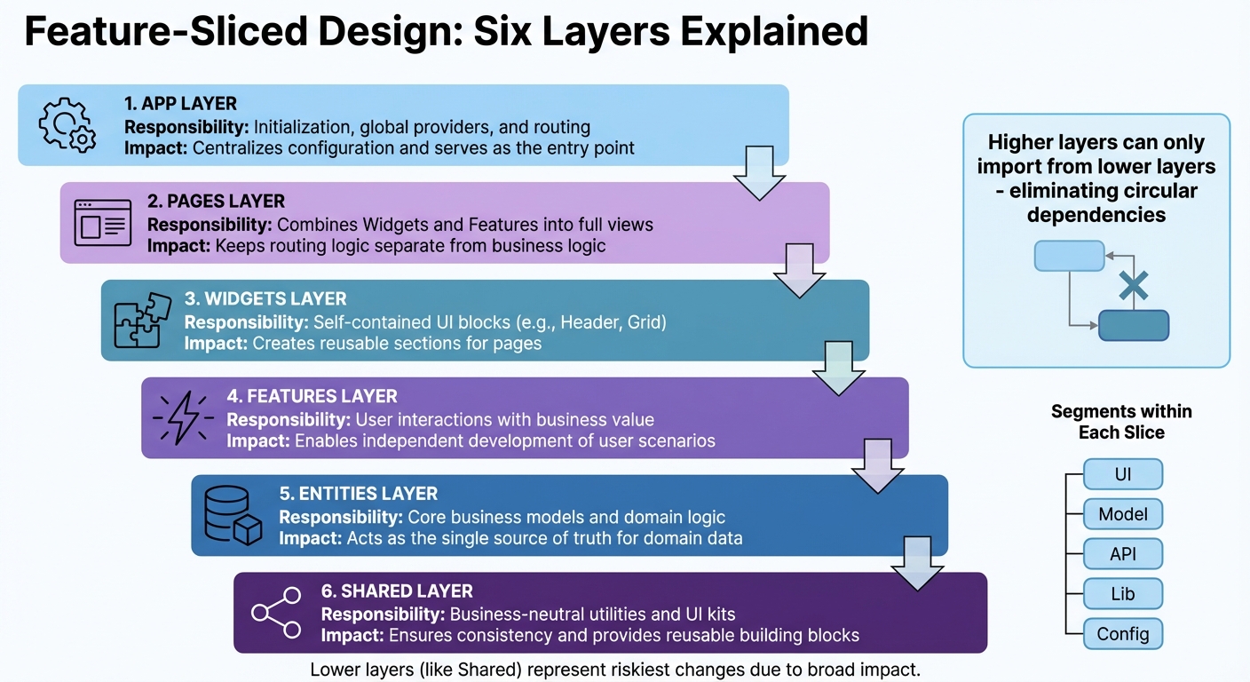
Feature-Sliced Design Architecture Layers and Responsibilities
As your product grows, sticking to a structure based on technical types – like components, hooks, or services – can lead to unintended consequences. Changes in one part of your app might unexpectedly ripple into others. Feature-Sliced Design (FSD) offers a smarter approach by organizing your codebase around business domains, making scaling more predictable and manageable. In FSD, your application is divided into layers (such as App, Pages, Widgets, Features, Entities, and Shared), slices aligned with business domains, and segments that address technical concerns (like UI, API, or logic).
One standout feature of FSD is its unidirectional dependency rule. Higher layers can only import from lower layers, which eliminates circular dependencies and keeps your codebase clean and predictable. Each slice exposes its functionality through a single entry point (typically index.ts), allowing internal changes without disrupting the entire application.
"The main purpose of this methodology is to make the project more understandable and stable in the face of ever-changing business requirements." – Feature-Sliced Design Documentation
FSD doesn’t lock you into specific tools or frameworks – it works seamlessly with React, Vue, Angular, Svelte, or others. You can adopt it gradually, starting with the App and Shared layers, then moving UI components into Widgets and Pages before breaking out Entities and Features. For smaller teams, focusing on just the App, Pages, Entities, and Shared layers can simplify the transition. This step-by-step approach complements modular design strategies, helping your app scale efficiently. Tools like linters (such as Steiger) can enforce the architecture, ensuring consistency as your team expands.
The Layers of FSD Explained
Here’s how FSD structures your code into six active layers:
- App: Manages initialization tasks, including global providers, routing, and entry points.
- Pages: Combines Widgets and Features to create full application views, keeping routing logic separate from business logic.
- Widgets: Contains large, reusable UI blocks (like headers or product grids) that integrate elements from multiple layers.
- Features: Focuses on user interactions tied to business goals, such as an "Add to Cart" button, allowing for independent development of user-specific scenarios.
- Entities: Houses core business models and domain logic (e.g., User, Product, or Order), serving as the single source of truth for your data.
- Shared: Includes reusable, business-neutral assets like UI kits, helper functions, API clients, and configuration files, ensuring consistency across the app.
Within each slice, code is further broken down into segments based on its purpose. For example, ui handles components, model focuses on state and logic, api manages requests, lib contains utilities, and config handles feature flags. This structure ensures that related logic stays together, while unrelated modules remain independent.
"The lower a layer is positioned in the hierarchy, the riskier it is to make changes to it since it is likely to be used in more places in the code." – Yan Levin, Frontend Developer
To keep refactoring safe and straightforward, avoid deep imports. Always rely on the index.ts entry point for accessing functionality. This boundary ensures higher-level logic changes don’t disrupt foundational components like shared UI elements.
FSD Layers Comparison
| Layer | Responsibility | Contribution to Scalability & Clarity |
|---|---|---|
| App | Initialization, global providers, and routing | Centralizes configuration and serves as the entry point. |
| Pages | Combines Widgets and Features into full views | Keeps routing logic separate from business logic. |
| Widgets | Self-contained UI blocks (e.g., Header, Grid) | Creates reusable sections for pages. |
| Features | User interactions with business value | Enables independent development of user scenarios. |
| Entities | Core business models and domain logic | Acts as the single source of truth for domain data. |
| Shared | Business-neutral utilities and UI kits | Ensures consistency and provides reusable building blocks. |
sbb-itb-51b9a02
Micro-Frontends and Monorepos
As your product grows, ensuring multiple teams can work in parallel without stepping on each other’s toes becomes critical. Two popular approaches – micro-frontends and monorepos – offer solutions to this challenge. Knowing when to use one, the other, or both together can make the difference between a smooth development process and a tangled mess.
Micro-frontends bring the microservice mindset to front-end development by splitting a single, monolithic user interface into smaller, domain-specific pieces. Each piece is managed by a cross-functional team that takes ownership of an entire feature, from database and APIs to the front-end interface. For example, a checkout team would handle everything related to the checkout process, while a search team would manage product search independently. This setup eliminates the need to divide responsibilities between separate UI and API teams, enabling faster and more focused development.
On the other hand, monorepos focus on centralizing code for multiple projects into a single repository. This approach simplifies code sharing and tool management across projects. Tools like Nx and Turborepo make it easier to handle the complexities of a monorepo, such as managing dependencies, running builds, and testing efficiently. While micro-frontends dictate how an application is structured and deployed, monorepos define how the code itself is organized and maintained.
"An architectural style where independently deliverable frontend applications are composed into a greater whole."
- Cam Jackson, Full-stack Developer and Consultant, Thoughtworks
These two approaches aren’t mutually exclusive. In fact, they often work well together. Many organizations use monorepos to manage their micro-frontend architectures, addressing challenges like dependency management, consistent tooling, and sharing UI components across teams. A great example is Vercel, which, in October 2024, transitioned its main website from a single Next.js monolith into three distinct micro-frontends (marketing, documentation, and the logged-in dashboard). Using a monorepo managed by Turborepo and Next.js Multi-Zones, they achieved a 40% reduction in preview build times and allowed teams to work on event pages independently from the core dashboard team [8]. This demonstrates how combining these strategies can streamline workflows and improve collaboration.
Micro-Frontends: Independent Deployment
The biggest advantage of micro-frontends is team independence. Each team can build, test, and deploy its module on its own schedule, without being tied to a global release cycle. This autonomy also enhances fault isolation – if one micro-frontend fails, the rest of the application can often continue running.
Technologies like Webpack Module Federation make this approach even more effective by enabling runtime integration. For instance, a checkout module can update independently while sharing common libraries, such as React, with other modules, avoiding redundant dependencies.
To succeed with micro-frontends, it’s essential to define clear boundaries around business domains like "checkout", "product search", or "user profile." This minimizes cross-team dependencies. A shared application shell can handle global tasks like navigation and authentication.
"The main objective of microfrontends is to scale frontend development across many teams without collapsing under coordination overhead."
- SourceTrail
For inter-module communication, native browser events or URL-based mechanisms work well. A shared design system, built with framework-agnostic Web Components, can also ensure a consistent look and feel across independently managed modules.
Monorepo Strategies for Team Collaboration
Monorepos tackle the challenges of sharing code – such as design tokens, UI libraries, and utility functions – across multiple projects. Managing these resources in separate repositories can lead to versioning headaches, but a monorepo centralizes everything, allowing for atomic updates. For example, a single commit can update a shared component for all applications that use it.
However, scaling a monorepo isn’t without its challenges. Without proper tools, operations like building or testing can become slow. Tools like Nx and Turborepo address these issues by managing task orchestration, dependency graphs, and build pipelines. They also include features like "affected" detection, which runs builds and tests only for the parts of the codebase affected by recent changes.
"Monorepos trade architectural friction for speed and visibility. When they work, they really work. But they do not scale on good intentions alone."
- Billy Batista, Software Engineer, Depot
To keep a monorepo healthy, it’s important to follow best practices:
- Use a clear directory structure, such as placing applications in an
/appsfolder and shared utilities in/packages/shared. - Employ package managers with workspace support, like pnpm or Yarn Workspaces, to manage local packages efficiently.
- Establish visibility rules to prevent unintended dependencies between projects.
- Use tools like CODEOWNERS for assigning directory-specific responsibilities.
- Implement path aliases in TypeScript to avoid fragile relative imports.
- Enable local and distributed caching to ensure unchanged code isn’t rebuilt or retested unnecessarily.
Micro-Frontends vs. Monorepos
Here’s a quick comparison of the two approaches:
| Feature | Micro-Frontends | Monorepos |
|---|---|---|
| Primary Goal | Independent deployment and team autonomy | Centralized code sharing and tools management |
| Scope | Architectural pattern | Version control strategy |
| Composition | Runtime integration (e.g., Module Federation) | Build-time integration (shared libraries/packages) |
| Tech Stack | Can vary | Typically standardized |
| Deployment | Each module has its own CI/CD pipeline | Unified or independent pipelines |
| Complexity | High (requires orchestration and coordination) | Medium (requires optimized build tools) |
| Main Challenge | Managing dependencies and operational complexity | Build performance and Git operation speed |
Performance Optimization for Scaling Frontends
As your frontend architecture grows, keeping performance in check becomes essential to delivering a smooth user experience. Scaling up often means increased traffic, which can put significant pressure on your infrastructure. Without careful attention, this can lead to sluggish performance. Consider this: 53% of mobile users abandon sites that load too slowly, while improving page speed by just one second can boost conversions by up to 2% [10]. To stay ahead, you need to focus on reducing the initial payload, ensuring content loads quickly, and making interactions feel instant. A mix of smart architectural decisions, asset optimization, and real-time monitoring can help your frontend remain fast and responsive, even as user demands grow. Let’s dive into some key techniques to keep your frontend performing at its best.
Core Performance Optimization Techniques
Choosing the right rendering strategy is a foundational step. Server-Side Rendering (SSR) and Static Site Generation (SSG) are often faster than Client-Side Rendering (CSR), which requires users to wait for JavaScript to load and execute before seeing any content. Frameworks like Next.js make SSR straightforward, while SSG pre-renders pages during build time, offering near-instant delivery for mostly static content.
Code splitting is another game-changer. By breaking your application into smaller chunks, you ensure that only the necessary parts load when needed. For instance, you can use dynamic imports to load an admin dashboard only when a user navigates to it, significantly cutting down the initial JavaScript payload.
Optimizing assets is equally critical. Use modern image formats like WebP or AVIF with responsive specifications (srcset) to minimize bandwidth usage and avoid oversized downloads on mobile devices. For fonts, using the WOFF2 format with font-display: swap ensures text remains visible with system fonts while custom fonts load, preventing the dreaded "Flash of Invisible Text" [9].
Resource hints can guide browsers to prioritize key assets. For example, <link rel="preload"> and fetchpriority="high" can improve loading times for critical elements like hero images. Etsy, for instance, saw a 4% improvement in their Largest Contentful Paint (LCP) metric after applying fetchpriority="high" to their primary images [10]. Similarly, using rel=preconnect can reduce latency by establishing early connections to third-party domains.
When dealing with large datasets, list virtualization is a must. Instead of rendering thousands of DOM elements at once, virtualization libraries create and destroy elements dynamically as users scroll, keeping the DOM light and responsive.
Here’s a quick breakdown of techniques and their impact on performance:
| Technique | Primary Benefit | Impact on Core Web Vitals |
|---|---|---|
| Lazy Loading | Reduces initial payload | Improves LCP (Largest Contentful Paint) |
| Critical CSS | Speeds up initial rendering | Improves FCP (First Contentful Paint) |
| Image Dimensions | Prevents layout shifts | Improves CLS (Cumulative Layout Shift) |
| Code Splitting | Cuts main thread workload | Improves INP (Interaction to Next Paint) |
| SSR/SSG | Faster content delivery | Improves LCP and FCP |
Implementing these strategies is just the start. Continuous monitoring is crucial to ensure your frontend remains optimized as it scales.
Monitoring and Improving Core Web Vitals
Core Web Vitals are the gold standard for measuring user experience. The three key metrics to focus on are Largest Contentful Paint (LCP) for loading speed, Cumulative Layout Shift (CLS) for visual stability, and Interaction to Next Paint (INP) for responsiveness. Starting in 2024, INP replaced First Input Delay (FID), as it provides a more comprehensive measure of responsiveness throughout the user’s entire session [10][13].
Real-world examples highlight the impact of improving these metrics. In 2024, QuintoAndar, a Brazilian real estate platform, improved their INP by 80%, which led to a 36% increase in year-over-year conversions [11]. Similarly, Disney+ Hotstar reduced INP by 61% on their living room interface, doubling weekly card views [11]. These aren’t just technical wins – they’re directly tied to business growth.
"Core Web Vitals is not just a metric, but a metric that will distinguish between a successful product and a URL entering the Bermuda triangle."
- Kevin, MERN Stack Developer [12]
To monitor performance, combine lab data from tools like Lighthouse with field data from real users using PageSpeed Insights and the Chrome User Experience Report (CrUX). Lab data helps identify specific issues during development, while field data reveals how users experience your site across various devices, networks, and locations. Google uses field data to influence SEO rankings, so aim for at least 75% of page views to meet the "Good" threshold for each Core Web Vital metric [13].
Here are some actionable tips for each Core Web Vital:
- LCP: Preload hero images and prioritize above-the-fold content to ensure it loads first.
- CLS: Always define
widthandheightattributes for images and videos to prevent layout shifts. - INP: Break up "long tasks" in JavaScript – any execution over 50ms – to keep the main thread responsive [13].
Establishing a performance budget is another key step. This involves setting strict limits on bundle sizes, load times, and other metrics. Tools like Lighthouse CI can automate performance checks in your CI/CD pipeline, catching regressions before they reach production. As Karolina Szczur, a Performance Researcher, pointed out, "Expecting a single number to be able to provide a rating to aspire to is a flawed assumption" [13]. Performance isn’t a one-time effort – it’s an ongoing process of monitoring and refinement.
Conclusion
Building a scalable frontend architecture demands careful planning from the very beginning. As your product evolves, the choices you make early on will either lay a solid foundation for efficient growth or create roadblocks that can slow your team’s progress.
The strategies outlined here provide a clear path forward: breaking the UI into reusable components with modular design, structuring code around business domains using Feature-Sliced Design, leveraging micro-frontends for independent team deployments, and focusing on performance to protect user experience – especially since users are quick to leave if a site takes more than 3 seconds to load [3].
A scalable frontend doesn’t just benefit the codebase – it also strengthens the collaboration between people, processes, and platforms. As one developer pointed out, well-thought-out architecture naturally drives smarter decisions and supports long-term growth.
To set yourself up for success, start by adopting a design system for consistent UI, use tools like Nx or Turborepo to handle project boundaries and streamline builds, and make Core Web Vitals a priority to maintain performance. Even if you’re working with a monolithic setup, keeping it modular allows for gradual improvements without major disruptions. The architecture you design today will determine how easily your system can scale in the future, helping you avoid expensive overhauls down the road.
FAQs
What are the main advantages of using a modular design in frontend development?
A modular design breaks down a large frontend codebase into smaller, self-contained components. This structure makes the codebase easier to manage, test, and update. Each module operates independently, handling its own logic and user interface. This means developers can focus on specific sections without worrying about disrupting the entire application. As a result, debugging becomes simpler, bugs are less frequent, and new features can be developed more quickly.
This approach also enhances teamwork. With modules functioning independently, multiple developers can work on different parts of the system at the same time. This not only speeds up release cycles but also allows for greater flexibility. Plus, because modules can be upgraded or scaled individually, there’s no need for a complete system overhaul when changes are needed. This makes it much easier to scale, maintain, and adjust your product as it evolves.
How do micro-frontends enhance team collaboration and streamline deployments?
Micro-frontends break a large user interface into smaller, independent pieces, each with its own codebase, build process, and release schedule. This setup lets teams update their part of the application without needing to rebuild or redeploy the entire system. By cutting down on coordination efforts, it speeds up releases, reduces risks, and makes maintenance easier.
This approach also supports autonomous, cross-functional teams, where each team is responsible for a specific feature or section of the product. Teams can pick the tools and frameworks that work best for their needs, which encourages ownership, quicker decision-making, and a more satisfying developer experience. Clear boundaries make onboarding smoother, while focused testing and code reviews result in better-quality work.
In real-world applications, a central "shell" handles routing and shared services, while each micro-frontend is deployed independently, often using parallel CI/CD pipelines. This separation allows teams to work on different parts of the UI simultaneously without stepping on each other’s toes. It also makes scaling the product easier as new features or updates are added.
What are the best ways to improve frontend performance as your product grows?
To keep your frontend performance in check as your product scales, start by breaking a monolithic UI into smaller, independent units. Enter micro-frontends – a strategy that lets teams work on, test, and deploy individual modules separately. Not only does this reduce the bundle size, but it also makes upgrades smoother and keeps maintenance manageable as your codebase expands.
Frameworks like React or Vue are great for supporting this modular approach. To take it further, use techniques like code-splitting and lazy-loading to ensure only the necessary components load for the current view. Efficient state management, smart caching, and thoughtful data-fetching methods – such as pagination or background syncing – can help cut down on unnecessary processing and network strain. Don’t forget to optimize your assets: compress images, switch to modern formats like WebP, and use a CDN to deliver content faster.
And here’s a crucial step – keep a close eye on performance metrics. Monitor key indicators like Time-to-First-Byte and Largest Contentful Paint to catch and address slowdowns early. When paired with modular strategies, these practices create a fast, seamless experience that scales effortlessly with your growing audience.


Leave a Reply