
Your SaaS Loses Users in the First 90 Seconds. Your Analytics Won’t Tell You Why
Huzefa Motiwala March 28, 2026
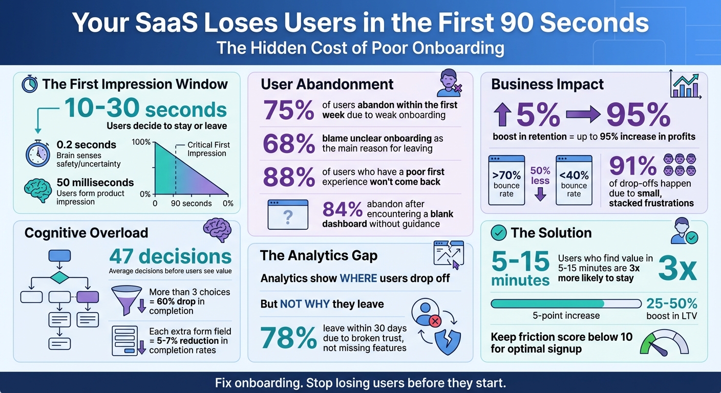
Most SaaS products lose users in the first 90 seconds. Why? Poor onboarding, unclear guidance, and frustrating design drive users away before they even experience the product’s value.
Here’s what you need to know:
- 75% of users abandon within the first week due to weak onboarding.
- 68% blame unclear onboarding as the main reason for leaving.
- Analytics tools only show where users drop off, not why.
To fix this, focus on understanding user behavior beyond the numbers. Identify friction points, guide users to value within minutes, and eliminate unnecessary steps. Even a 5% boost in retention can increase profits by up to 95%.
Time to rethink your onboarding process – and stop losing users before they even get started.
SaaS Onboarding Statistics: Why Users Abandon Products in 90 Seconds
The Ultimate SaaS Onboarding Playbook with Justin Hammond
sbb-itb-51b9a02
Why Standard Analytics Miss Early Drop-Offs
When it comes to understanding why onboarding fails, it’s essential to recognize the blind spots in standard analytics. Metrics like bounce rates, short sessions, or exit spikes might highlight that something is wrong, but they rarely explain why. Let’s explore the gaps in what traditional analytics reveal – and what they miss.
What Numbers Can’t Tell You
While analytics tools excel at tracking user actions – like page visits, session durations, and clicks – they fall short of explaining user intent. For instance, 78% of users who leave within the first 30 days do so because the experience breaks their trust, not because a feature is missing [4]. Metrics alone can’t capture moments when users encounter unclear language, unexpected permission requests, or overwhelming choices.
Event-based tracking only monitors what you’ve set up to track. If a user struggles with an unmonitored element, your analytics might show a drop-off but won’t explain the cause [2]. These hidden frustrations – like rage-clicking on unresponsive buttons, retracing steps out of confusion, or hesitating over unclear options – are invisible to your data [2][4]. Yet, these moments are often the tipping point for early churn.
Even "positive" metrics can be deceiving. A long session duration might seem like a win, but it could just as easily signal confusion. A user spending extra time on your dashboard might be stuck trying to locate a basic feature rather than engaging productively [3]. Your analytics might look fine, right up until the user gives up and churns.
The Limits of Bounce and Exit Rates
Aggregated metrics like bounce and exit rates add another layer of ambiguity. While they show where users are leaving, they don’t uncover the specific reasons behind those exits. For example, a page with a bounce rate over 70% converts 50% less than one with a bounce rate below 40% [5]. But this metric alone doesn’t tell you if users left due to a technical glitch, a confusing form, or a poorly placed call-to-action.
Take this example: 84% of users abandon a product after encountering a blank dashboard without contextual guidance during their first session [4]. While a high exit rate might flag that dashboard as an issue, it won’t explain that users expected personalized setup instructions or felt unsure about their next steps. The small, compounding moments of confusion that lead to abandonment remain hidden in standard reports [3].
| Metric Type | What It Tells You | What It Misses |
|---|---|---|
| Bounce/Exit Rate | Where users leave the site | The exact frustration point or "rage click" that triggered the exit |
| Session Duration | How long users stayed | Whether the time was spent productively or struggling with the interface |
| Feature Usage | Which buttons were clicked | Whether users understood the feature or used it as a workaround out of frustration |
These gaps between what metrics show and what users experience directly impact retention. To tackle early drop-offs, you need to go beyond the surface numbers and dig into the reasons why users feel confused, frustrated, or disengaged – often within the critical first 90 seconds of their journey.
What Happens in a User’s Mind During the First 90 Seconds
In the first 10 to 30 seconds, your brain makes a quick decision – stay or leave. Emotions take the lead, processing information five times faster than conscious reasoning. This means users can sense whether a product feels safe or uncertain in as little as 0.2 seconds [6][9]. This snap judgment is shaped by the primacy effect: one moment of doubt can make the entire app seem confusing or risky. And here’s the catch – 88% of users who have a poor first experience won’t come back [6][9].
"The brain’s emotional circuits act first. Reasoning is always late to the party." – Joseph LeDoux [6][9]
Mental fatigue kicks in almost immediately. After just two decisions, cognitive strain starts to build. If onboarding demands too many choices – averaging 47 decisions before showing any value – it can overwhelm users, leading them to disengage [6][9][8]. Adding to the problem is "stacked friction", where small interruptions pile up. Research shows 91% of drop-offs happen because of these seemingly minor frustrations. Users have an unconscious "frustration budget", and once it’s exceeded, they’re gone [7][4].
Too Many Choices, Too Much Information
The problem gets worse when users face an overload of options. Presenting more than three choices during onboarding can slash completion rates by up to 60% [1]. Ambiguity doesn’t just confuse – it feels unsafe. If users can’t quickly figure out what a product does or what they should do next, they’re likely to give up [6][9]. Overly text-heavy interfaces only make things harder, forcing users to scan and guess their way through. Each extra form field can reduce completion rates by 5 to 7%, draining the mental energy users need to reach their first "aha" moment [1].
Notion tackled this in 2025 by ditching its traditional setup wizard. Instead, it introduced a pre-built workspace with sample content. This simple change cut down cognitive load and boosted activation rates by 40% [8]. By showing users a ready-to-use workspace rather than making them set everything up, Notion delivered immediate value.
"Don’t make users work for value. Remove every unnecessary step." – Hiten Shah [1]
Another common issue is the "empty state." When users are greeted by a blank dashboard without guidance, 84% abandon the product during their first session [4][1]. Empty graphs and tables create a psychological barrier – an "activation energy" that feels too high to overcome.
Design Problems That Drive Users Away
Poor design only makes things worse. Users form an impression of your product in just 50 milliseconds – faster than they can consciously think [10]. If navigation or layout doesn’t match their expectations or hides important features, they’ll leave before you even get a chance to show value. Poor information architecture has a big cost: users typically access only 20 to 30% of a product’s features because the rest are too hard to find [4].
| Friction Type | What Causes It | How Users React |
|---|---|---|
| Cognitive | Too many options, excessive text | Brain feels overloaded; "Maybe later" mindset |
| Emotional | Unexpected permission requests, lack of trust | Users feel vulnerable or overwhelmed |
| Behavioral | Breaking familiar patterns | Resistance; flow feels unnatural |
| Interaction | Tiny buttons, low contrast | Physical discomfort; triggers exits |
Slack nailed this by focusing on a frictionless experience. They set a goal of delivering value within five minutes, using a simple three-step onboarding flow that leads directly to sending the first message. The result? A 93% daily active usage rate among adopted teams [1].
"Users do not leave products. Users leave friction." – Tushar Deshmukh, Founder, UXExpert [7]
Timing matters too. When users can’t tell how much effort a process will take, they’re 27% more likely to abandon it [6][9]. Asking for credit card details or permissions before demonstrating value only makes things worse. This taps into loss aversion, where users feel a lack of control or clarity. In fact, 78% of users who leave within the first 30 days do so because of broken trust – not because the product lacks features [4].
How to Find the Real Reasons Users Leave Early
Numbers alone can’t uncover the frustrations that drive users to abandon your product. To truly understand what’s going wrong, you need to dig into user behavior. This involves three key steps: auditing your user journey, observing how users interact with your product, and speaking directly to those who left.
Audit Your User Journey
Start by mapping out every step of your onboarding process – from signup to the moment users find value. Assign a friction score using this formula: (Required Fields × 1.5) + (Required Decisions × 2) + (External Dependencies × 3) [1]. If the score exceeds 15, there’s a strong chance more than half of users will drop off [1].
Next, assess psychological friction – the mental hurdles users encounter that might not show up in UI testing. These include:
- Uncertainty: "Am I on the right track?"
- Risk calculation: "What if I make a mistake?"
- Effort estimation: "This looks like it’ll take forever" [7].
"Continuous discovery should extend to onboarding. Talk to users who drop off – their feedback is more valuable than completion analytics alone." – Teresa Torres, Product Discovery Coach [1]
Pay close attention to "zero-state" experiences. If new users land on empty dashboards without any guidance, 84% are likely to abandon the platform during their first session [1]. Also, limit the number of concepts introduced at each step. Stick to 1-2 new ideas per step until users reach their "aha moment" [1].
Once you’ve identified friction points, validate them by watching how users interact with your product.
Use Session Replay Tools
Session replay tools let you see exactly what users experience – their clicks, hesitations, and moments of frustration. Focus on replaying sessions from funnel steps with high drop-off rates. Look for frustration signals like rage clicks, dead clicks, or backtracking. These behaviors often point to UX issues or technical glitches that event tracking might miss [2].
"Funnels tell you where the leak is; session evidence tells you why the leak exists." – Roman Mohren, CEO, FullSession [2]
Follow the "Rule of Three": if the same failure pattern shows up three times in a row for a specific user segment and step, it’s time to stop watching and start fixing [2]. Categorize the issues you find into groups such as UX confusion, missing guidance, permission errors, slow performance, or bugs. This approach helps you focus on actionable fixes [2].
Talk to Users Who Left
Metrics can’t capture the emotional buildup that leads to abandonment – that’s where direct conversations with users come in. Timing is crucial: reach out within 24-72 hours of a cancellation or failed activation event while their experience is still fresh [11].
Instead of asking, "Why did you leave?", encourage users to walk you through their onboarding experience from start to finish. This storytelling approach often reveals where your product fell short of their expectations [11][3]. Exit surveys might point to reasons like "too expensive" or "missing features", but these are often surface-level excuses. The real issues usually stem from onboarding confusion, hidden features, or slow value delivery [11].
You don’t need to interview hundreds of users. Most teams uncover clear patterns after speaking with just 5-8 users per segment [3]. Segment your findings by factors like acquisition channel, user role, or device type. This can help you determine whether the problem lies with a specific cohort – such as a mismatch between marketing promises and the actual product experience [12].
"What customers say in a form is rarely the real reason they leave. The real reason is usually a buildup – confusion during onboarding, a feature they couldn’t find, a moment where the product didn’t deliver fast enough." – Junu Yang, Founder, Usercall [11]
5 Steps to Fix Your First-Session Retention
If you’re losing users in their first 90 seconds, it’s time to act. The goal? Get them to experience your product’s core value in that brief window. Achieving this takes a structured approach that balances speed with smart tracking. Here’s a five-step plan to turn those first moments into lasting engagement.
Step 1: Identify Your ‘Aha Moment’
The first step is finding your "aha moment" – that instant when users truly see the value of your product. For Slack, it’s when teams exchange about 2,000 messages, signaling they’ve embraced the platform. For Loom, it’s when users realize a quick video saves them from scheduling yet another meeting [13].
"The ‘aha’ moment is the moment that the utility of the product really clicks for the users; when the users really get the core value – what the product is for, why they need it, and what benefit they derive from using it." – Sean Ellis, Author of Hacking Growth [13]
Dive into your retention data and use tools like session replays to spot where users shift from confusion to engagement. Talk to power users about what made the product click for them, and ask churned users why it didn’t. Break down your findings by user type, role, or location – different groups may have different "aha moments." Once you’ve nailed it down, design your onboarding to hit that moment fast – ideally within 5 to 15 minutes. Studies show users who experience core value quickly are three times more likely to stick around than those who wait 30 minutes or more [1].
Step 2: Get Users to Value Faster
Cut out anything that delays users from reaching the "aha moment." For example, if you’re building a file-sharing app, encourage users to upload a file and access it on another device right away. Skip lengthy feature tours – they can wait [13].
"A well-designed city has clear signposts, helpful landmarks, and easy-to-navigate streets that guide people to their destination while giving them freedom to explore. Similarly, your product should gently nudge users toward key actions." – Julia Sholtz, Former Group Product Marketing Manager, Amplitude [13]
Each step should introduce just one or two new concepts to keep things moving. Top SaaS companies aim for a friction score below 10 during the initial signup process [1]. Pay attention to user intent – if someone gravitates toward a secondary feature, guide them to value there instead of forcing a rigid path. Tools like progress bars and checklists can tap into the Zeigarnik Effect, boosting completion rates by 20–30% [1].
Once you’ve streamlined the path to value, focus on fixing the biggest obstacles.
Step 3: Fix High-Impact Problems First
Not every issue needs immediate attention. Start with the friction points that matter most – those that are significant, consistent, and closely tied to your activation goals [12].
"Start with the most decisionable drop-off: big enough to matter, stable enough to trust, and close enough to the KPI that moving it is likely to move activation." – Roman Mohren, CEO, FullSession [12]
Use the Impact × Confidence × Effort (ICE) framework to prioritize fixes and ensure your tracking captures actual user behavior [12]. Segment data by browser, device, or channel to identify the biggest drop-offs. If technical issues like slow load times or errors are causing leaks, tackle those before refining the UX copy [12]. Back up your findings with qualitative evidence, such as rage clicks or inactive interface elements. Avoid wasting time optimizing minor steps or chasing data anomalies [12].
Step 4: Improve Your Interface Gradually
Take a page from AlterSquare’s playbook: make small, targeted UI/UX tweaks instead of overhauling everything at once. Test each change’s impact before moving on. Define clear criteria for rolling back changes, and keep an eye on secondary metrics like error rates and support tickets [12]. A fix that boosts activation but doubles support volume isn’t a win – it just shifts the problem down the line. Watch out for these "downstream shifts", where drop-offs move to a later stage without improving overall activation [12].
Step 5: Measure Results with Cohort Analysis
To gauge the success of your changes, compare Day 1 activation and 7-day retention across different user cohorts. Look at sign-ups by cohort vintage – compare this week’s new users to last month’s – to see how specific updates impact engagement [12]. Regular onboarding experiments can boost activation by 5–10% per quarter, and even a modest 5-point lift in completion rates can increase lifetime value (LTV) by 25–50% over the next year or two [1].
Create cohorts of your most engaged users and analyze their early behaviors to understand what actions to emphasize for new users [14]. Segment users by channel, persona, plan type (Free vs. Paid), and device to uncover specific friction points [12]. Finally, ensure your event tracking is accurate – eliminate duplicate events and verify that identity stitching links anonymous actions to logged-in users properly [12].
Better Metrics for Measuring Onboarding Success
To truly measure onboarding success, it’s time to move beyond basic volume metrics and focus on metrics that capture real value. While traditional metrics often track effort, outcome metrics are what reveal whether users are experiencing the core value of your product.
"Onboarding completion is an input metric. It measures effort. Activation is an outcome metric. It measures value delivery." – Jake McMahon, Product Growth & Analytics [17]
The key is shifting from monitoring what users do to understanding what they achieve. For example, while 86% of SaaS companies define an activation event, only 41% track how long it takes users to reach it [16]. This gap often hides retention issues. The metrics below can help close that gap.
Track Day 1 and Day 7 Retention
Day 1 retention shows whether your product makes a strong enough impression to bring users back, while Day 7 retention reveals if they’ve started forming a habit around your product’s core value. Together, these metrics help determine if your onboarding tweaks are driving genuine engagement or just short-lived interest [15][18].
Compare retention rates for users who hit your activation milestone versus those who didn’t. If retention curves for these groups reconverge over time, it means the activation event is more about engagement than actual value [18]. Missing activation in the first week is a red flag – users who fail to activate in that timeframe are 60% more likely to churn within the first month [16].
To dig deeper, segment retention data by factors like acquisition channel, device type, or user persona. For example, high Day 1 retention paired with a steep Day 7 drop-off suggests your product sparks interest but fails to deliver ongoing value. This could point to a disconnect between your marketing promise and the actual user experience [18].
From here, you can refine your onboarding flow using a focused 90-second funnel.
Build a 90-Second Completion Funnel
A 90-second funnel helps map out the critical steps users must take to experience their first moment of value. Aim for 4–8 key steps – too few won’t provide enough insight, while too many create unnecessary complexity [12]. Define what "first value" means for your product, whether that’s uploading a file, sending a message, or generating a report, and chart the path to get there.
Before making changes, ensure your tracking is accurate [12]. Measure the median time between each step to identify where users get stuck. Delays between steps often signal confusion or technical issues [12].
Segment this data by browser, device, or acquisition channel. For example, if one browser shows a significant drop-off, you may have an environment-specific bug. Similarly, if users from a particular channel abandon the funnel early, it might mean your landing page promise doesn’t align with the product experience [12].
"Funnels tell you where the leak is; session evidence tells you why the leak exists." – Roman Mohren, CEO, FullSession [2]
Once the funnel is optimized, compare the results to validate your progress.
Compare Before and After Your Changes
To confirm the impact of your fixes, track activation rates and Day 7 retention both before and after implementing changes. This comparison will show whether your adjustments are improving value delivery. Segment users by signup date to isolate the effect of the changes [12]. Even a 5-point increase in completion rates can boost lifetime value (LTV) by 25–50% over the next year or two [1].
For example, in June 2025, Dropbox discovered that users who uploaded at least one file were far more likely to convert. By focusing onboarding on this action, they reduced Time to Activation (TTA) by 30% and saw a 10% rise in conversion rates [16]. Similarly, DocuSign streamlined their onboarding process from seven steps to three, cutting their TTA by 60% that same month [16].
Finally, monitor guardrail metrics like the 75th percentile (P75) for Time-to-First-Value. A large gap between the median and P75 often highlights friction points for specific user segments [15][16]. Keeping an eye on these metrics ensures that improvements in one area don’t create problems elsewhere.
Conclusion
Standard analytics can tell you where users drop off in the first 90 seconds, but they don’t explain why. That’s the tricky part most SaaS teams wrestle with. Closing this gap calls for a mix of hard data and real user insights.
The secret lies in combining both methods in a structured way. Start by pinpointing the biggest drop-off points in your funnel. Then, dive deeper with session replays to see what’s tripping users up. Group users by key attributes to spot patterns [12]. If you see the same issue crop up three times within the same group, stop analyzing and take action to fix it right away [2].
Even small adjustments can lead to big results. 75% of users abandon products within the first week due to poor onboarding [1]. On the flip side, users who find the product’s core value within 5–15 minutes are 3x more likely to stick around compared to those who don’t [1]. And here’s the kicker: just a 5% boost in retention can increase profit by up to 95% [1]. The teams that thrive aren’t just watching numbers – they’re digging into the “why” behind user behavior and fixing what truly matters. By combining these strategies, you can turn early drop-offs into long-term loyalty.
FAQs
What should I track if analytics can’t explain early churn?
If your analytics tools aren’t shedding light on early churn, shift your attention to User Resistance Detectors. These include metrics like hesitation signals, repeated actions, or sudden exits within the first 90 seconds. Pair this with behavior analytics by blending quantitative data (such as clicks and navigation paths) with qualitative insights (like session replays and user feedback). Together, these approaches can reveal friction points, expose hidden problems, and provide direction for making targeted changes to improve onboarding and retention.
How do I find my product’s “aha moment” fast?
To pinpoint when users first recognize the value of your product, start by analyzing their early interactions. Look at behaviors like clicks, navigation paths, and time spent on specific features. Tools like session replays can give you a window into real user experiences, helping you spot moments of delight or areas where they might get stuck.
Pair this data with direct user feedback to get a clearer picture. Combining numbers with personal insights allows you to identify and refine this pivotal moment, ensuring your product delivers its value effectively.
What’s the quickest way to spot onboarding friction?
The quickest way to spot onboarding hiccups is by diving into how users behave during their first interactions. Tools like session replays let you watch exactly where users hit snags or get stuck. Pair these observations with user feedback and behavior analytics to pinpoint where people drop off. By focusing on actual user sessions, you can catch issues that traditional analytics might overlook.
Related Blog Posts
- How Microinteractions Can Improve User Retention in SaaS Products
- Why Founders Underestimate the True Cost of Poor Onboarding – and How to Fix It
- Onboarding in 30 Minutes or Less: Designing Frictionless First-Time Experiences for BIM SaaS
- User Resistance Detectors: Metrics That Signal Your Adoption Problem Early


Leave a Reply