

Creating interfaces that work for both beginners and experts is challenging but essential. Beginners prioritize ease of use and clarity, while experienced users value speed and efficiency. Missteps – like overwhelming new users or frustrating experts – can lead to poor retention and wasted time.
Here’s how to strike the balance:
- Progressive Disclosure: Show basic features upfront and keep advanced tools accessible but hidden initially.
- Onboarding and Personalization: Tailor the experience by letting users choose their goals and skill level early on.
- Dual-Mode Design: Offer beginner and expert modes, so users can switch based on their needs.
Key stats to consider:
- 90% of apps are abandoned within a month if onboarding fails.
- Power users waste 45% of their time navigating poorly designed interfaces.
Understanding Power Users and First-Time Users
To create an interface that works for both power users and first-time users, it’s crucial to understand how these groups differ – not just in experience but in their goals and behaviors. Let’s break down what sets them apart.
Who Are Power Users?
Power users are the seasoned pros of your system. Their frequent and repetitive use has made basic interactions second nature[6]. Picture an experienced driver – someone who shifts gears without a second thought, compared to a learner who carefully narrates every step.
For power users, efficiency and speed are everything[3][2]. They value tools like keyboard shortcuts, gestures, and macros that help them bypass standard workflows and get straight to the point[2]. They also prefer dense information layouts and advanced controls that let them accomplish tasks with minimal effort[3]. Customization is key for this group – they want the ability to tweak interfaces and shortcuts to match their specific, high-frequency workflows[2].
Now, let’s look at the other side of the spectrum: first-time users.
Who Are First-Time Users?
First-time users are encountering your interface for the very first time. Their main focus? Learnability – how easily they can understand and use your design right out of the gate[5]. They’ll quickly decide whether your platform is worth their time[3].
These users need clear, step-by-step guidance. Features like wizards, simple navigation, and consistent patterns help them get started without frustration[5][1]. They benefit from interfaces that reduce cognitive load and avoid overwhelming them with advanced features right away[2].
The difference between these groups is striking. First-time users thrive on clarity and guidance, while power users demand speed and flexibility. This contrast highlights why adaptive design is so important – it’s the best way to meet the needs of both groups effectively.
sbb-itb-51b9a02
Design Strategies for Both User Types
Here are three strategies that strike the right balance between ease of use for beginners and efficiency for experts.
Progressive Disclosure
Progressive disclosure is a smart way to manage complexity while keeping things user-friendly. The idea is simple: show the most essential features upfront and tuck the more advanced options into secondary menus[7][8]. This keeps first-time users focused on what matters most while giving experienced users easy access to powerful tools without unnecessary clutter.
For instance, "training wheels" interfaces have shown impressive results: a 26% speed boost for beginners, a 52% increase in advanced task performance, and a 69% improvement in learning for novices[9].
"Progressive disclosure defers advanced or rarely used features to a secondary screen, making applications easier to learn and less error-prone."
- Jakob Nielsen, Principal, NN/g[7]
When designing with progressive disclosure, it’s crucial to limit the depth to just two levels. Going beyond that can confuse users and hurt usability[7]. To make navigation intuitive, use clear indicators like "More Options", ellipses (…), or arrows to signal where additional features are located[8]. And for onboarding tutorials that highlight hidden features, always provide a skip option so experienced users can bypass the basics[8].
| Feature | Progressive Disclosure | Staged Disclosure |
|---|---|---|
| Initial Display | Core features | Features accessed first in a sequence |
| Subsequent Display | Secondary/Advanced features | Features accessed later in the task |
| Navigation | Hierarchical (Primary to Secondary) | Linear (Step-by-step) |
| Main Benefit | Learnability: Novices focus on core tasks | Simplicity: Each step is clear and uncluttered |
The next step is to enhance the user experience with tailored onboarding and personalization.
Onboarding and Personalization
Good onboarding starts with knowing your audience. Let users identify their role or purpose upfront – whether they’re working on personal projects, collaborating with a team, or learning something new[11]. This small step lets you customize their experience right from the beginning.
A well-thought-out onboarding process can boost retention by as much as 50%[11]. Define clear goals for each type of user and guide them toward achieving those goals right away.
To avoid overwhelming users, trigger tooltips or guides only when they perform specific actions[11]. Keep them engaged with small rewards like progress bars or success messages during setup. For power users, make sure they can skip walkthroughs entirely – no one wants to feel trapped in a never-ending tutorial[11].
For even more control, consider offering dual-mode interfaces that cater to both beginners and experts.
Dual-Mode Design
Dual-mode design gives users the option to switch between beginner and expert modes, ensuring everyone gets what they need[4]. Studies show that users prefer manual controls over automatically adaptive interfaces, which can feel unpredictable and frustrating[4].
A simple "Expert Mode" toggle can make a big difference. For example, Safari’s "Develop" menu is hidden by default but can be enabled by developers when needed[8].
Start users in a beginner-friendly default layer and let them access advanced features through a single, clearly marked toggle[4][9]. To keep things straightforward, ensure there’s only one clear path to advanced options, avoiding multiple or confusing routes[9].
Power Users vs First-Time Users: A Comparison
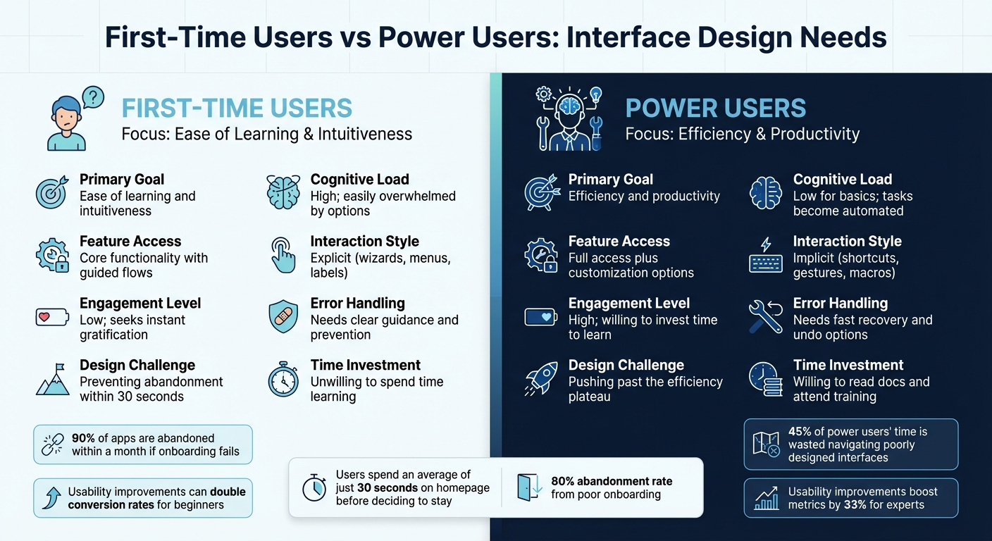
First-Time Users vs Power Users: Key Differences in Interface Design Needs
Grasping the differences between first-time users and power users is crucial for making smart design choices. First-time users typically seek simplicity and instant results. They need to complete tasks with no prior training, which means designs should focus on clean interfaces and guided workflows[3][5]. In fact, users deciding whether to stay on a new site spend an average of just 30 seconds on the homepage[10]. Power users, however, value speed and efficiency above all else. They’re willing to invest time in learning advanced features if it helps them complete routine tasks faster[3][10].
The way these groups handle complexity couldn’t be more different. Beginners often feel overwhelmed by feature-heavy interfaces, making it essential to prioritize straightforward designs with fewer options upfront[10]. By contrast, experienced users not only tolerate complexity but often appreciate it when it leads to higher productivity[10][6]. This difference also influences their interaction styles: while novices need step-by-step guidance with clear labels and intuitive elements[5], experts prefer "accelerators" like keyboard shortcuts, gestures, and macros that streamline repetitive tasks[2].
Engagement metrics further highlight these contrasts. New users tend to have low engagement, spending less than two minutes on a site before leaving if they can’t quickly find what they need. Experts, on the other hand, engage at a deeper level, often taking the time to read documentation or attend training to master advanced tools[10][6]. Interestingly, usability improvements can double conversion rates for beginners, but for experts, the gains are smaller – about 33% on average[6].
Comparison Table: Needs and Challenges
| Dimension | First-Time Users | Power Users |
|---|---|---|
| Primary Goal | Ease of learning and intuitiveness | Efficiency and productivity |
| Cognitive Load | High; easily overwhelmed by options | Low for basics; tasks become automated |
| Feature Access | Core functionality with guided flows | Full access plus customization options |
| Interaction Style | Explicit (wizards, menus, labels) | Implicit (shortcuts, gestures, macros) |
| Engagement Level | Low; seeks instant gratification | High; willing to invest time to learn |
| Error Handling | Needs clear guidance and prevention | Needs fast recovery and undo options |
| Design Challenge | Preventing abandonment within 30 seconds | Pushing past the efficiency plateau |
| Time Investment | Unwilling to spend time learning | Willing to read docs and attend training |
Here’s a telling statistic: around 45% of experienced users’ time is wasted due to confusing interface elements[4]. A study on telephone company directory assistance revealed that optimizing command keys for experts could save approximately $10 million annually[3]. These numbers underscore how critical it is to balance the needs of both groups, ensuring satisfaction for users and better outcomes for businesses.
These insights lay the groundwork for designing and testing interfaces that cater to both first-time and experienced users effectively.
Prototyping and Testing Dual-Purpose Interfaces
After diving into adaptive design strategies, it’s clear that prototyping and testing play a crucial role in making sure dual-purpose interfaces work for both beginners and experts. The right tools and methods can help you confirm whether your design truly serves both audiences – or if it unintentionally favors one group over the other.
Prototyping Tools for Adaptive UI Design
When it comes to prototyping, Axure RP stands out with its adaptive views, conditional logic, and variable support. These features make it possible to simulate different user skill levels effectively. Pricing starts at $25 per user per month for the Pro edition and $42 for the Team edition, making it a practical option for startups that need to prototype complex interfaces without diving into full-scale production code[13].
Figma, on the other hand, offers a collaborative edge. Its components and design systems ensure consistency across interface layers, making it a favorite for teams. With a free tier for individuals and a Professional plan priced at $12 per editor per month, it’s accessible even for early-stage teams. Tools like AlterSquare integrate with Figma, enabling rapid prototyping to test progressive disclosure patterns and multi-layer designs before committing to development.
For teams juggling both beginner and expert needs, ProtoPie is a versatile choice. It supports low-fidelity wireframes for testing basic concepts with first-timers and high-fidelity prototypes with complex interactions for expert validation[14]. Meanwhile, Balsamiq offers an affordable entry point for wireframing, starting at $9 per month for two projects. Its sketch-style approach helps first-time users focus on core functionality without getting distracted by polished visuals[13].
The trick is to align your tools with your testing phase. Early-stage concepts benefit from simple wireframes that help beginners understand basic flows. As the design evolves, tools that simulate advanced features like conditional logic or keyboard shortcuts can prepare prototypes for expert testing. These tools lay the foundation for meaningful user feedback.
User Testing with Mixed Audiences
Once your prototypes are ready, testing with real users becomes essential to refine the design for both novices and experts. This isn’t as simple as it sounds – recruiting representative users from both groups can be tricky. For new products without established experts, you might need to simulate expertise by training users quickly or testing with internal staff. Keep in mind, though, that internal users may have mental models that differ from those of your target audience[6].
The tasks you assign during testing are just as important as who you recruit. Beginners should tackle basic, guided tasks, while experts need to work through advanced, realistic scenarios[6][5]. Facilitating these sessions also requires tailored approaches. Beginners often articulate their thoughts easily during think-aloud protocols. Experts, however, may rely on "automated behavior" that they can’t always explain[6]. In such cases, recording sessions and analyzing them later – sometimes even in slow motion – can uncover their reasoning. If experts drift into critiquing the design instead of completing tasks, gently steer them back toward task behavior to gather actionable insights[6][12].
Striking the right balance when analyzing feedback is key. Research indicates that usability improvements can double business metrics for novice users but only boost them by about 33% for experts[6]. Pay attention to "workarounds" or adaptations from power users – these often hint at opportunities for innovation[12]. However, avoid basing decisions solely on expert feedback, as this can lead to designs that alienate new users. To dig deeper into feedback, consider the "5 Whys" technique. It helps distinguish between widespread issues, underlying problems, and niche requests that could compromise overall usability[12].
Common Mistakes and How to Avoid Them
Even with the best intentions, designers can fall into traps when trying to cater to both beginners and experts. These mistakes can derail a well-thought-out design, leaving one group frustrated and the other struggling to find their footing.
Over-Focus on One User Group
Focusing too much on power users can alienate newcomers. For example, a poor onboarding experience can lead to abandonment rates as high as 80%[11]. On the other hand, prioritizing first-time users can create an "efficiency plateau", where experienced users hit a ceiling and can’t speed up their workflows, no matter how skilled they become[5][12]. Imagine being forced to go through the same step-by-step wizards every time – it’s a recipe for frustration for seasoned users.
The key is multi-layer design. Start with a simple interface (Layer 1) for beginners, featuring only the essentials to avoid overwhelming them. As users grow more confident, they can unlock additional layers with advanced tools and features[4]. For experts, include UI accelerators like keyboard shortcuts or gestures. These should remain "available yet easy to ignore" for beginners[2]. A lesson from the past: Microsoft’s Windows 95 adaptive menus, which hid rarely used items, ended up confusing users with their unpredictability. This backlash forced Microsoft to rethink its approach[4].
And that’s not the only pitfall. Let’s talk about the risks of trying to make one design fit everyone.
Forcing One-Size-Fits-All Solutions
Designing a single interface for all users often leads to bloated software that satisfies no one[4]. Wizards, while beginner-friendly, can trap experts in repetitive workflows. On the flip side, feature-heavy interfaces can overwhelm new users.
A smarter approach is to create thoughtful defaults that cater to most users while offering intuitive paths to advanced features. Take iGoogle as an example. It promised users they could set up a personalized homepage "in under 30 seconds", providing a quick and simple entry point while encouraging experimentation[15]. The result? By 2008, customized homepages made up 20% of all visits to Google’s home page[15].
Another common misstep is resolving design debates by adding endless preference settings. While customization sounds appealing, most users stick with the defaults. If those defaults are poorly designed, everyone suffers[15]. Instead, introduce advanced features with "just-in-time" education – contextual hints that appear only when users interact with specific tools. This avoids overwhelming them with dense instructions during setup[11].
Conclusion
Creating interfaces that work seamlessly for both first-time users and seasoned experts involves crafting layers of functionality that evolve alongside user proficiency. While users may start as novices, they quickly gain expertise, and your design needs to reflect this progression. The goal? Deliver a welcoming first impression that avoids frustration and abandonment, while also paving the way for experienced users to work efficiently – without being bogged down by overly simplistic workflows.
By applying these principles, you can make real, measurable improvements to your design. Striking the right balance between ease of use for beginners and efficiency for experts often requires thorough testing with both groups. For instance, testing with novice users has been shown to double conversion rates – a result that underscores the importance of addressing both ends of the user spectrum[6].
At AlterSquare, we specialize in helping startups and growing businesses tackle these challenges head-on. Whether you’re rolling out an MVP that needs to onboard users quickly or refining an established product to meet the needs of power users, we design solutions that grow with your audience.
Through thoughtful defaults, well-placed contextual hints, and comprehensive user testing, we create products that not only welcome first-time users but also empower experts to achieve peak efficiency.
FAQs
What’s the best way to use progressive disclosure in interface design?
Progressive disclosure is a smart design approach that simplifies interfaces for beginners while still catering to experienced users who need advanced features. The key to making this work is starting with the basics: identify the essential tasks and design a minimal interface that allows users to complete them easily. Advanced features should be grouped separately and made accessible through clear, intuitive triggers like a “More options” button or an expandable section.
To ensure a seamless experience, keep the additional options within the same workflow so users don’t feel lost or disconnected. For those just starting out, you can include short explanations or tooltips the first time they encounter these advanced features. And don’t forget to adjust the design based on user feedback – this helps keep the interface intuitive while meeting the needs of both beginners and experts.
How can I design interfaces that work for both beginners and experienced users?
To design interfaces that work well for both beginners and experienced users, the key is progressive disclosure. This means showing only the most essential features to new users while keeping advanced options easily accessible as they become more familiar. It simplifies the experience for newcomers, avoiding overwhelm, while still giving advanced users quick access to the tools they rely on.
For seasoned users, incorporate accelerators like keyboard shortcuts, customizable toolbars, or context menus to make frequent actions faster and more efficient. Adding a well-placed mode switch or an advanced settings toggle can allow experts to explore deeper functionality without cluttering the interface for those just starting out. At the same time, maintain visual and interaction consistency throughout, so users can transition smoothly from beginner to expert without needing to relearn the basics.
Lastly, use usage data to fine-tune how and when features are introduced. This ensures the interface grows with the user, striking a balance between simplicity for beginners and efficiency for experienced users.
How can I design an onboarding process that works for both first-time and experienced users?
To design an onboarding experience that works for both newcomers and seasoned users, focus on blending simplicity with functionality. For first-time users, offer clear, step-by-step instructions that introduce key features as they become relevant. Meanwhile, give experienced users the option to skip tutorials with a ‘skip onboarding’ feature and provide access to shortcuts or advanced tools that don’t disrupt their workflow.
Incorporate progressive disclosure to maintain a clean interface, revealing advanced features gradually as users become more comfortable. Adaptive design patterns can also enhance the experience – track user behavior to highlight shortcuts, quick-access panels, or advanced tools for those who need them. Always ensure onboarding is optional, and include a persistent help section for users to access support whenever they need it.
Lastly, test your onboarding process with both user groups. Evaluate how easily new users can complete tasks and how smoothly experienced users navigate the system. Use the insights gained to fine-tune the experience, making it intuitive for beginners and seamless for experts.


Leave a Reply