

When your app grows from hundreds to thousands of users, UI patterns that worked initially often break down. Infinite scrolling slows performance, heavy animations bloat load times, and fixed layouts frustrate mobile users. Yet teams keep using these patterns because they’re quick to implement, familiar, and seem effective early on. But the cost of fixing these issues later is steep – up to 100x more than addressing them during design.
Key takeaways:
- Infinite scrolling: Causes lag and usability issues; better alternatives are pagination or "Load More" buttons.
- Heavy hero images: Slow load times; replace with optimized images and lazy loading.
- Fixed layouts: Fail on varied devices; use responsive grids instead.
- Overused modals: Create accessibility problems; limit their use and manage focus properly.
To avoid these pitfalls, focus on scalable design systems, mobile-first approaches, and performance metrics like fast load times and smooth interactions. AlterSquare’s structured I.D.E.A.L. Framework offers a step-by-step method for building scalable UIs, helping businesses save costs and improve user satisfaction.
The Unique Challenges of Design Systems at Scale
UI Patterns That Break at Scale
The design patterns that make your MVP stand out can quickly become a headache when your user base grows. What works seamlessly for 1,000 users might crumble under the pressure of 100,000. Below, we explore how some common UI patterns falter under heavy traffic and why scalable alternatives are essential.
Infinite Scrolling and Performance Issues
Infinite scrolling can feel sleek and intuitive when dealing with a small dataset. But as the number of items grows, the browser’s memory usage balloons, causing sluggish performance. Every new item loaded into the DOM (Document Object Model) stays in memory, leading to lag and slower rendering speeds [10].
For instance, layout calculations for around 1,600 elements can take more than 28 milliseconds per frame. That’s nearly double the 16ms budget needed for smooth 60fps animations [9]. This inefficiency, known as layout thrashing, forces the browser to repeatedly recalculate element positions, making the interface feel clunky [9].
"Layout is almost always scoped to the entire document. If you have a lot of elements, it’s going to take a long time to figure out the locations and dimensions of them all." – Jeremy Wagner, Technical Writer, Google [9]
The usability challenges are just as problematic. Studies show that over 90% of e-commerce sites using infinite scroll fail to preserve the user’s scroll position when they hit the back button [11]. Imagine clicking on a product, only to return and find yourself back at the top of the list – frustrating, right? On mobile, infinite scroll can also make footer links, like customer support or shipping policies, nearly impossible to access as new content continuously pushes the footer down [11].
Etsy experienced this firsthand between 2012 and 2013. Their A/B test on infinite scrolling for search results revealed a noticeable drop in user engagement and search experience. As a result, they reverted to pagination [11]. For goal-oriented users who need to backtrack or compare options, infinite scroll can become a barrier.
"Infinite scrolling is probably not for you if site visitors want to achieve goal-oriented activities, such as when they need to backtrack or find specific information quickly." – Hoa Loranger, Vice President, Nielsen Norman Group [8]
Heavy Hero Images and Animations
A bold hero image paired with smooth animations may wow users at first glance, but this approach often backfires as traffic scales. Large visuals and complex animations can significantly increase load times and demand more from the browser, especially on mobile devices or older hardware.
While these elements may be prioritized for marketing-focused MVPs, they can quickly become a liability. Beyond performance concerns, animation-heavy designs can create accessibility challenges for screen readers and discomfort for users with motion sensitivity.
Non-Responsive Fixed Layouts
Fixed-width layouts are a tempting shortcut when creating quick wireframes or designing for desktop screens. They’re predictable and easy to implement. But when your product is accessed on a variety of devices, these layouts fall apart [1].
On mobile devices, fixed layouts often force users into horizontal scrolling – a frustrating experience as they pan left and right to view content or navigate. On tablets, these layouts either waste screen space or feel cramped. With mobile users accounting for an ever-growing share of web traffic, sticking to fixed layouts can alienate a significant portion of your audience. Starting with a mobile-first design and scaling up for larger screens is generally more effective than trying to shrink a desktop-first layout down [1].
Overuse of Modals
Modals can be a convenient solution during prototyping, but as your application grows, they can cause significant usability and accessibility issues [10][12].
One common problem is z-index conflicts, which occur when multiple modals overlap or interfere with other UI elements. This can confuse users and make navigation feel chaotic. For users relying on screen readers, modals can be particularly challenging. Without proper focus management, keyboard-only users might accidentally interact with elements behind the modal, leading to disorientation [12].
While modals may seem like a quick fix in the early stages, relying on them too heavily can result in technical debt. As your application scales, these issues become harder to untangle and can hinder user experience.
Why Teams Keep Using These Patterns
Ease of Implementation for MVPs
When startups are racing against the clock, speed often takes priority over perfection. Prebuilt UI libraries allow teams to launch functional products in a matter of weeks, not months – a critical advantage when resources are tight and time is limited [13][14]. Building a custom design system from scratch requires extensive planning and effort, something many early-stage companies simply can’t afford [13].
The data supports this approach. 86% of funded MVPs included revenue-generating features in their first version, and 73% of successful MVPs had payment systems ready before launch [15]. For these teams, proving that users are willing to pay takes precedence over crafting flawless technical architecture. Take Lovable.dev, for example: between late 2024 and early 2025, the platform achieved an impressive $18M ARR within just three months of launch by leveraging AI-generated code to build their MVP, sidestepping traditional development hurdles [15].
However, there’s a tradeoff. While prebuilt libraries and AI tools like Cursor and Claude can handle up to 70% of standard operations, they often produce code that’s quick to deploy but harder to maintain long-term. In fact, 78% of rapidly scaling startups later cite architectural limitations as a significant challenge [14]. The convenience of rapid development can lead to hidden costs down the road.
Familiarity and Developer Comfort
When deadlines loom, developers tend to stick with what they know. Familiar libraries like Material UI or Chakra UI provide ready-to-use components that work right out of the box, making them a go-to choice for many teams [16]. These tools help developers move fast, even though they may limit customization and struggle to scale in more complex environments.
A classic example is the "Sort-By-Column" pattern. It’s so widely used that teams often implement it without considering the performance issues it can cause with large datasets [3]. Familiarity with these libraries gives teams confidence, but it can also lead them to underestimate the challenges of scaling and maintaining cross-platform consistency [16].
"Education and adoption is a chain of events, but everything starts with education." – Cintia Romero, Design Systems Lead, Pinterest [16]
History offers cautionary tales about ignoring user familiarity. GAP’s rebranding misstep and the backlash against Microsoft’s navigation changes in Windows 8 serve as reminders of the risks involved in deviating too far from what users are accustomed to [17]. While familiarity speeds up deployment, it can also lock teams into patterns that don’t hold up under pressure.
Initial Success and Momentum
Early wins can make it hard to change course. When a UI pattern performs well during testing or with smaller datasets, it can create a false sense of security [18]. Teams see positive results and resist making changes until a critical failure forces their hand.
"Market pressure to add features forces design changes before inherent limitations emerge." – Luke Wroblewski, Product Director, Google [5]
One example of proactive problem-solving comes from the FinTech startup TransactNow. In 2024, they avoided a costly $1.5 million system rewrite by making incremental architecture improvements. While handling 50,000 transactions daily, they noticed API response times had doubled over a single quarter. By shifting away from a monolithic structure before the system reached a breaking point, they maintained growth without the downtime typically associated with large-scale overhauls [14].
The hidden cost of early success becomes evident when technical debt piles up. Teams working with high technical debt deliver 25% to 50% fewer features, and developers in these environments spend only 30% to 40% of their time working on new innovations [18]. Applications burdened with technical debt are also 2 to 3 times more likely to experience production incidents and outages [18]. Early momentum might feel like progress, but it often comes at the expense of long-term stability.
sbb-itb-51b9a02
Scalable Alternatives to Replace Failing Patterns
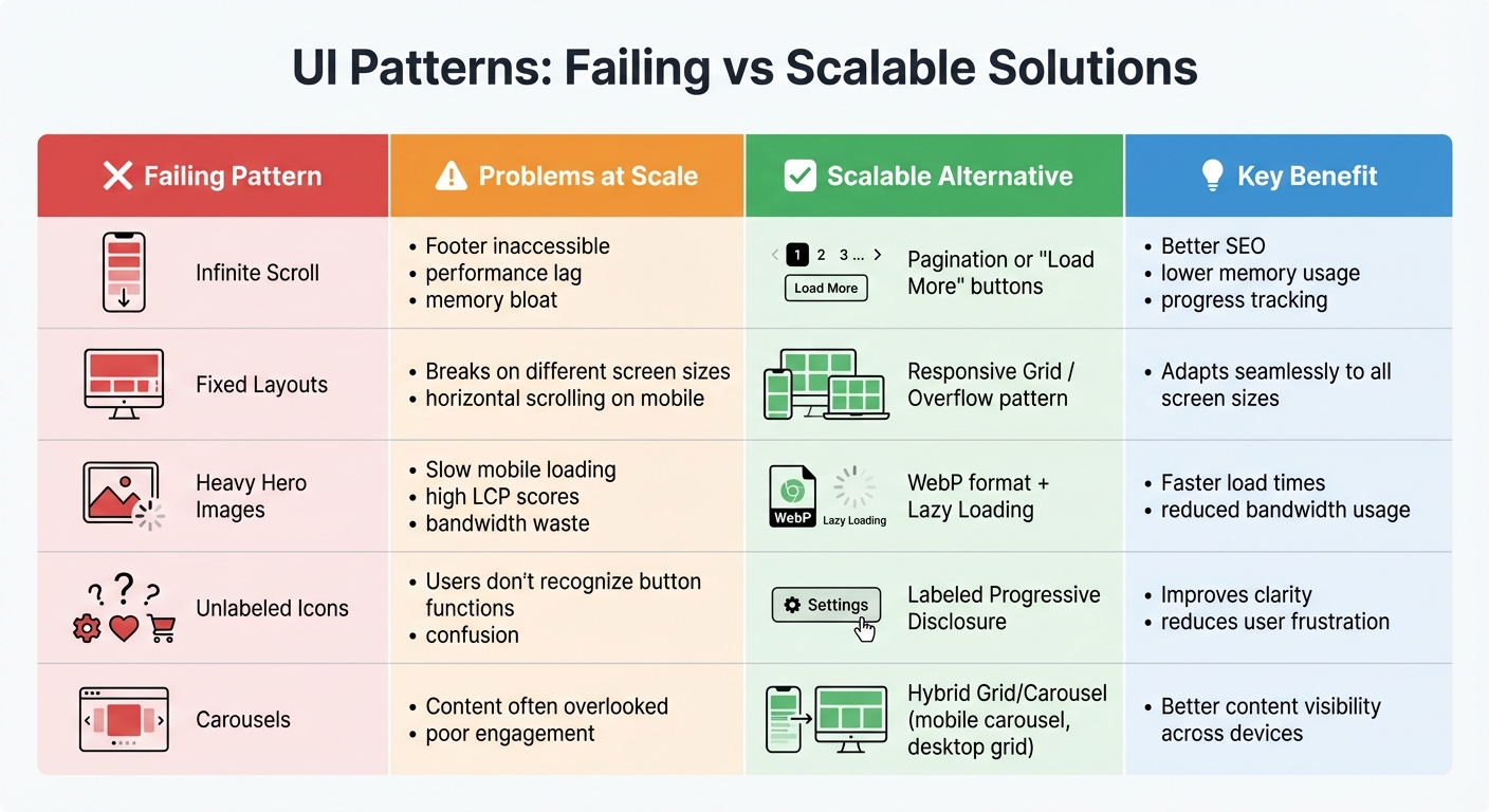
Failing UI Patterns vs Scalable Alternatives Comparison Chart
Comparison of Failing Patterns vs Alternatives
As platforms grow, early-stage design patterns often fall apart under the pressure of scaling. For instance, pagination proves to be a more efficient solution compared to infinite scroll. It improves SEO, reduces memory demands, and provides a clear and structured way for users to navigate content [19][20]. When users need to search or compare items, pagination offers the control and predictability that infinite scroll lacks.
For users who prefer a more discovery-oriented browsing experience, "Load More" buttons strike a balance. This approach blends the engagement of infinite scroll with better user control, while also ensuring elements like the footer remain accessible on mobile devices [7][20]. This hybrid solution is especially effective for mobile interfaces, where accidental loading can frustrate users.
"What you definitely need to avoid is that people are waiting for infinite scroll to load because if your user needs to wait for more than like one second, that’s a disaster." – Vitaly Friedman, Senior UX Consultant [20]
Switching to responsive grids built with CSS Grid or Flexbox is another smart move. Unlike fixed layouts, these grids adapt seamlessly to different screen sizes instead of simply stretching or shrinking content [1]. For navigation on smaller screens, the overflow pattern – using horizontal swiping instead of hiding menus – keeps items visible and accessible [1].
To improve loading times, implement skeleton screens and lazy loading. Load the most important content first, and use WebP image formats alongside the loading="lazy" attribute for images outside the initial viewport. These changes can significantly speed up load times, which is critical since pages should load in under 2 seconds to keep users engaged [21]. For dynamic content, aim for wait times of less than 300 milliseconds [20].
| Pattern | Drawbacks at Scale | Scalable Alternative | Key Benefit |
|---|---|---|---|
| Infinite Scroll | Footer inaccessible, performance lag | Pagination or "Load More" | Better SEO, lower memory usage, progress tracking |
| Fixed Layouts | Breaks on different screen sizes | Responsive Grid / Overflow | Adapts to all screen sizes |
| Heavy Hero Images | Slow mobile loading, high LCP | WebP + Lazy Loading | Faster load times and reduced bandwidth usage |
| Unlabeled Icons | Users may not recognize button functions | Labeled Progressive Disclosure | Improves clarity and reduces frustration |
| Carousels | Content often overlooked | Hybrid Grid/Carousel | Combines carousel for mobile with grid for desktop |
These alternatives not only resolve scaling challenges but also align with modern UI design principles.
Best Practices for Future-Proofing UI Design
To ensure your UI remains effective over time, start with mobile-first design. Designing for smaller screens first makes it easier to expand to larger screens, while also forcing you to focus on the most essential elements [1]. This approach helps you avoid unnecessary complexity from the outset.
Use progressive disclosure to manage complexity. Show only the most relevant information at any given time, and make sure secondary actions are clearly labeled to avoid confusion. Since the average mobile session lasts just 72 seconds [2], every screen element must serve a clear purpose.
When it comes to scalability, adopt a modular, stateless architecture. Breaking your application into independent services allows for easier scaling and ensures resilience [4]. Monitor performance with the Four Golden Signals – latency, traffic, errors, and saturation – to identify and address bottlenecks before they escalate [4].
For consistency across platforms, implement design tokens for shared elements like colors, typography, and spacing. This approach maintains a unified design system, reducing user frustration and reinforcing brand identity [22]. Accessibility should also be a priority: wrap pagination in a <nav> element and use aria-current="page" to help screen readers identify the active page [22]. On mobile, ensure touch targets are at least 44×44 pixels for easy interaction [22][23].
Finally, prioritize performance. Aim for a Time to Interactive of under 1,500 milliseconds and a Cumulative Layout Shift below 0.1 [22]. These metrics directly impact user satisfaction and retention, making them essential benchmarks for any scalable UI.
How AlterSquare Helps You Build Scalable UI
The I.D.E.A.L. Framework for Scalable UI
AlterSquare’s I.D.E.A.L. Framework is a structured, five-phase approach designed to tackle the challenges of scaling user interfaces. It starts with the Discovery Phase, where the team identifies scale requirements upfront – what they call "Principle 0" – to ensure the solution won’t fail under increased demand [24][26]. This phase includes stakeholder interviews and competitor analysis to align priorities before any coding begins.
Next is the Design Phase, which emphasizes creating reusable components and "screen frameworks." These act as templates for future updates, ensuring the UI can grow without needing a full redesign [25][5]. During Agile Development, components are only refactored after being used at least three times. This avoids premature optimization and prevents components from becoming unnecessarily complex [25].
Before the Launch, AlterSquare conducts rigorous testing to ensure optimal performance metrics like LCP (Largest Contentful Paint), FID (First Input Delay), and accessibility across all devices [26]. This is critical, as studies show that 88% of users won’t return after a poor experience [26]. Finally, the Post-Launch Optimization phase includes ongoing UX health checks using tools like heatmaps and funnel analysis to uncover pain points that basic analytics might miss [26].
This method treats UI updates as strategic business decisions rather than just aesthetic tweaks. Metrics like revenue per visitor and customer lifetime value are tracked, and UX improvements often lead to significant cost savings. For example, startups can reduce customer support expenses by 30–50% because users can navigate the interface more easily [26].
By following this structured process, AlterSquare ensures scalable design that delivers measurable outcomes.
How AlterSquare Has Helped Startups Overcome UI Scaling Challenges
Using the I.D.E.A.L. Framework as a foundation, AlterSquare has helped startups achieve noticeable improvements. Many startups struggle with fragmented user experiences across Android, iOS, and web platforms due to inconsistent navigation [27]. Without a centralized design system, these inconsistencies worsen as the product grows. AlterSquare resolves this by creating a unified "source of truth" for components, reducing design debt and ensuring a cohesive UI [28].
Navigation issues are another common pain point. AlterSquare addresses this with modular routing and context-aware navigation, which adapt to user behavior rather than imposing a rigid structure [27][5]. For products handling large datasets, they implement server-side filtering to prevent slow loading times [24].
The results are impressive. Clients report increased revenue, better profit margins, and higher customer satisfaction after AlterSquare revamps their projects. Essential features are delivered within months, and the starting cost of $4,000 makes scalable design accessible even to early-stage startups [21]. With their expertise, AlterSquare helps companies avoid expensive redesigns while setting the stage for long-term growth.
Conclusion
When scaling a product, the user interface (UI) patterns that worked flawlessly during the early stages can quickly become obstacles. Infinite scrolling, heavy hero animations, and horizontal tabs might shine at launch but often turn into performance bottlenecks as your user base grows from hundreds to millions. Scaling isn’t just about adding more servers; it’s about designing UI patterns that can handle growth without breaking down. Investing in scalable UX not only enhances performance but also prevents user frustration and abandonment.
These patterns remain popular because they’re easy to implement and familiar to developers. However, this short-term convenience often leads to long-term challenges. Transitioning to solutions like keyset pagination, vertical lists, and unified design systems can save your product from costly redesigns while keeping it competitive in the long run.
"Scalable UI/UX is not an optional enhancement – it is a fundamental driver of business growth." – Prince Kumar Thakur, Technical Content Writer, GeekyAnts [6]
To avoid these pitfalls, a strategic approach is crucial. AlterSquare’s I.D.E.A.L. Framework offers a proactive way to address scaling needs early, creating reusable components that grow alongside your product. Starting at $4,000, their services deliver essential features within months, helping businesses avoid costly missteps [21]. Whether you’re working on a new MVP or updating a legacy system, the UI choices you make today will determine whether your product thrives or struggles in the future.
Plan for scale from the start, test with actual users, and prioritize performance-driven design to ensure your product’s long-term success.
FAQs
Why do infinite scrolling and fixed layouts struggle as products scale?
Infinite scrolling might seem like a great idea for early-stage products. After all, it removes the need for extra clicks and keeps users engaged for longer periods. But as your audience grows, this design choice can introduce a host of problems. For one, constantly loading more content as users scroll increases memory usage, which can slow down devices and, in some cases, even lead to crashes – especially on older or less powerful hardware. Beyond performance issues, infinite scrolling can make it harder for users to locate specific items, frustrating those with clear goals and ultimately lowering overall satisfaction.
Fixed-width layouts come with their own set of challenges as products scale. A layout tailored for just one screen size often struggles on devices like tablets, large monitors, or high-resolution displays. This can lead to clipped content, awkward scrolling, and an overall broken experience for users. Together, these examples emphasize the need to create UI designs that not only scale with your product’s growth but also maintain usability and performance across a variety of devices and user scenarios.
What are better alternatives to using large hero images and animations that don’t scale well?
Large hero images and full-screen animations might catch the eye at first glance, but they often come with a trade-off: slower load times and more upkeep as your audience grows. A better alternative? Use lightweight visual assets like SVG illustrations, icon sets, or CSS gradients. These not only load faster but also scale effortlessly across devices and blend seamlessly with your design system.
Another smart option is a content-first hero section. Pair clear, concise text with a small but impactful image and bold typography to draw attention. This approach keeps your design flexible and avoids the awkwardness that often comes with hero sections on smaller screens.
If you still want a strong visual element, consider using lazy-loading techniques or progressive image placeholders. These methods ensure high-quality visuals load only when necessary, preserving your site’s speed while maintaining a polished look – even as your traffic grows.
How can teams design UI patterns that scale effectively as their product grows?
To build UI patterns that can scale effectively, the key is starting with a well-structured design system. Begin by setting clear objectives – such as minimizing inconsistencies, enhancing accessibility, and improving collaboration between designers and developers. Conduct an audit of your existing components to spot reusable elements, eliminate redundancies, and organize them systematically. A framework like Atomic Design can help you create a hierarchy of components that adapts as your product evolves.
Leverage tools that offer version-controlled libraries, real-time collaboration, and built-in documentation to keep everyone on the same page. Consistency is crucial, so establish standardized naming conventions and detailed usage guidelines to prevent unplanned changes that could disrupt workflows. Design layouts with adaptability in mind by outlining key areas – like headers, navigation, and footers – so new modules can integrate smoothly.
Make it a habit to review and refine your design system regularly. Test the performance of high-traffic features, and involve cross-functional teams to ensure your UI decisions align with practical, real-world needs. By integrating these strategies, your UI patterns can stay efficient, accessible, and ready to grow alongside your product and audience.


Leave a Reply