
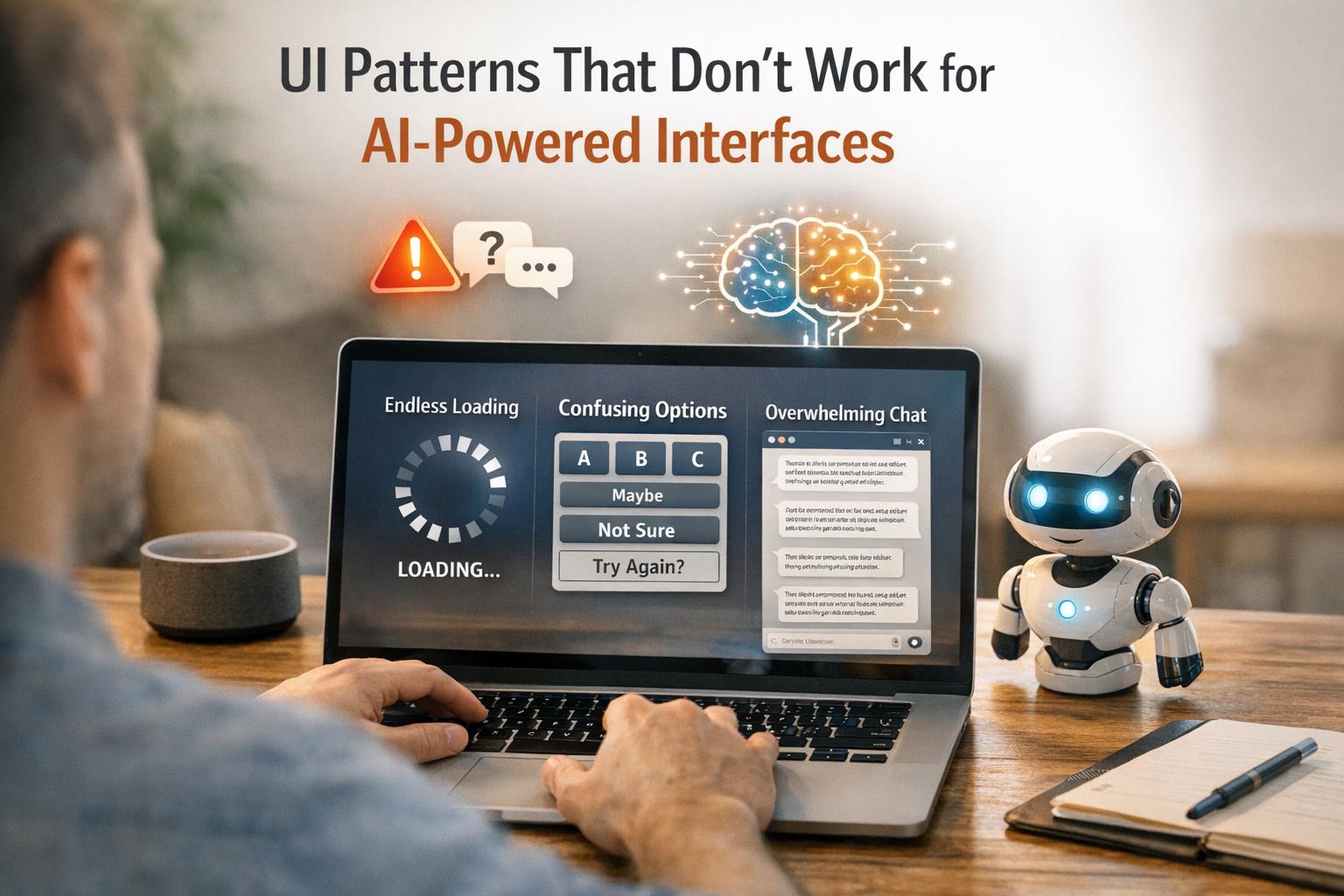
Balancing Complexity and Usability: UX Design Guidelines for Cloud AEC Software
Huzefa Motiwala June 7, 2025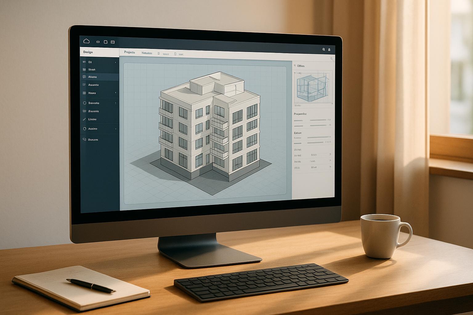
Designing cloud-based software for Architecture, Engineering, and Construction (AEC) is all about finding the right balance: how do you deliver advanced features professionals need without overwhelming them with complexity? Here’s the core takeaway:
- Progressive Disclosure: Show only essential tools upfront and reveal advanced features as needed.
- Role-Based Interfaces: Tailor tools and data to specific roles like architects, contractors, and project managers.
- Interactive Visualizations: Use 3D models, BIM (Building Information Modeling), and digital twins to simplify complex data.
- Quick Onboarding: Make it easy for new users to start while providing customization for experienced professionals.
- US Localization: Adapt formats like dates (MM/DD/YYYY), measurements (feet/inches), and currency ($) for American users.
The key is designing software that’s intuitive for beginners but powerful enough for experts. The result? Better adoption, fewer errors, and more efficient workflows. Keep reading to learn how these strategies work in practice.
Panel Discussion: Product Design & Architecture | Integrated Projects
Progressive Disclosure for Managing Feature Complexity
Progressive disclosure addresses a core challenge in cloud AEC software: how to deliver advanced functionality without overwhelming users. This design strategy introduces features and information gradually, showing only what’s essential upfront while keeping advanced options accessible but out of the way. By focusing on primary functions first and delaying the introduction of more complex features, it helps beginners avoid mistakes that could disrupt workflows. At the same time, experienced users enjoy a cleaner interface, free from rarely used options. This approach improves ease of learning, boosts efficiency, and reduces errors for all users [3] [4] [5].
"Progressive disclosure defers advanced or rarely used features to a secondary screen, making applications easier to learn and less error-prone."
– Jakob Nielsen, Co-founder, Nielsen Norman Group [5]
Methods for Implementing Progressive Disclosure
There are several effective ways to incorporate progressive disclosure into AEC software interfaces:
- Collapsible Panels and Accordions: These let users expand sections only when needed. For example, a structural analysis tool might display basic load calculations upfront, while advanced options like seismic analysis remain hidden behind expandable menus [6].
- Step-by-Step Wizards: These break down complex tasks into smaller, manageable steps. For instance, a wizard could start by collecting basic project details, then guide users through additional steps like setting up stakeholders, file-sharing preferences, or integration options.
- Contextual Tooltips and Hover Actions: These provide quick explanations or reveal extra options without cluttering the interface. For example, hovering over a technical term might display its definition, while pop-ups can offer detailed settings when needed [6].
- Clear Visual Hierarchies: Logical layouts help users focus on what’s most important. For example, Amazon’s product pages highlight key details – like product names, images, and prices – at the top, with further information available as users scroll [4].
These techniques, combined with thoughtful design, create user-friendly interfaces that balance simplicity with access to robust features.
Contextual Help Systems
Contextual help systems work hand-in-hand with progressive disclosure, offering guidance exactly when and where users need it. These systems provide support tailored to the specific area a user is interacting with, ensuring minimal disruption to their workflow [8].
Proactive help anticipates user needs, offering suggestions before they even realize they need assistance. This is particularly useful for introducing new features. On the other hand, reactive help steps in when users encounter issues, offering solutions through searchable documentation, inline tips, or hover-triggered tooltips.
Among these approaches, pull revelations – where users discover relevant tips during their interaction – tend to be more effective than push revelations, which can interrupt workflows with unrelated suggestions [7]. The goal is to keep help content simple, easy to access, and focused on areas where users genuinely need extra guidance. By doing so, AEC software becomes easier to navigate for both beginners and experts, while still retaining its advanced capabilities [9].
Role-Based Interface Customization
Role-based customization fine-tunes cloud software to match each professional’s specific responsibilities by displaying only the tools, data, and workflows they need. Instead of overwhelming users with a cluttered, one-size-fits-all interface, this approach simplifies workflows, minimizes mistakes, and boosts productivity for everyone involved in a project. It’s a practical way to ensure that each stakeholder gets exactly what they need to perform their role effectively.
For instance, architects rely on advanced design tools, contractors need access to material and scheduling details, project managers focus on oversight dashboards, and clients benefit from simplified progress updates.
At the core of this approach is Role-Based Access Control (RBAC), which assigns permissions based on specific job roles. This not only enhances security by limiting access to sensitive information but also reduces unnecessary interface clutter, making it easier for users to focus on their tasks.
"Every company is a software company. You have to think and act like a digital company."
– Satya Nadella, CEO of Microsoft [11]
Role-based customization also pairs well with progressive disclosure, a design method that reveals only the tools and features relevant to a user’s immediate needs. This reduces navigation time, simplifies training, and fosters better communication among team members by presenting only the essentials.
Adapting Interfaces for AEC Stakeholders
To make role-based customization effective, it’s crucial to understand the unique workflows and information needs of different professionals in architecture, engineering, and construction (AEC). Here’s how interfaces can be tailored for key stakeholders:
- Architects need tools designed for creativity and collaboration. Their interfaces should prioritize drawing tools, 3D modeling, material libraries, and visualization features, making it easy to access design collaboration spaces.
- Engineers require dashboards focused on technical analysis, calculations, and compliance. Interfaces should highlight structural data, load calculations, and regulatory tools, ensuring advanced technical features are front and center.
- Contractors benefit from views that emphasize execution and logistics. Their interfaces should focus on schedules, material lists, installation instructions, and progress tracking, with tools for cost estimation and resource allocation readily available.
- Project Managers need comprehensive oversight. Their dashboards should provide a clear view of progress metrics, budget status, milestones, and team communication, with quick access to reporting tools and stakeholder updates.
- Clients prefer simplified interfaces that focus on visual progress updates, decision points, and streamlined communication. Technical complexities should be hidden, offering a straightforward experience centered on review and approval.
Modern AEC software platforms make this possible with flexible workflows and adaptable functionalities that evolve alongside project demands [10]. The key is ensuring that customization reflects how professionals actually work, rather than relying on abstract role definitions.
Mapping User Roles to Interface Features
A systematic approach to mapping user roles to specific interface elements and access levels is essential for successful role-based customization. This ensures that each stakeholder only sees what’s relevant to their responsibilities while maintaining secure data boundaries.
| Role | Access Level | Primary Interface Features | Data Control |
|---|---|---|---|
| Project Managers and System Administrators | Full Access | Dashboards, reporting, team management | Complete data control |
| Design Team Leaders and Engineers | Modified Access | Technical analysis, design tools, compliance | Edit specific project data |
| Clients and Contractors | View Only | Progress visualization, approval workflows | Read-only access |
| External Vendors | No Access | Communication portal, document sharing | No direct data access |
This mapping ensures permissions align with actual job duties while maintaining security [11]. For example, a project manager can isolate specific building components and access detailed information – like contractor assignments, installation schedules, and completion statuses – to track progress effectively [12].
To keep permissions relevant, a quarterly review process is recommended. This ensures that access levels remain aligned with team members’ current roles and responsibilities [13]. Additionally, as roles evolve during a project, automated updates to permissions can help maintain both efficiency and security.
Given that AEC professionals often juggle multiple roles, interfaces must be designed with flexible permissions that adapt as responsibilities shift. This ensures the right tools are always at their fingertips, no matter how their tasks change.
Visualization Methods to Simplify Complex Data
Turning complex AEC (Architecture, Engineering, and Construction) data into clear, interactive visuals can make decision-making faster and reduce errors. Visualization techniques transform technical details into a visual format that’s easier to grasp.
At the heart of modern AEC visualization is Building Information Modeling (BIM). Here’s how it works:
- 3D BIM models offer detailed visuals that improve design evaluations and planning accuracy.
- 4D BIM adds a time element, helping teams visualize construction sequences and streamline schedules.
- 5D BIM goes further by integrating cost estimation, enabling precise financial planning and budget management [15].
BIM delivers measurable results, cutting project costs by up to 20%, increasing efficiency by 82%, reducing coordination problems by 79%, and shortening project timelines by up to 7%. Plus, it achieves cost estimates within 3% of traditional methods [14][18].
Digital twins complement BIM by focusing on how spaces are used, rather than just the construction process. This dual approach helps optimize both the building’s functionality and the user experience throughout its lifecycle [18].
Next, let’s dive into how interactive visualizations enhance stakeholder understanding and improve decision-making.
Interactive Visualizations for Clarity
Interactive 3D models allow stakeholders to explore projects from every angle. This hands-on approach helps uncover potential problems early, turning static drawings into dynamic experiences. Users can manipulate views, isolate specific components, and examine intricate details [16].
VR and AR take this further, offering immersive design reviews that bridge the gap between technical teams and non-technical clients [17].
Real-world examples highlight these benefits:
- During the construction of One World Trade Center in New York City, advanced 3D modeling allowed teams to identify potential conflicts early, smoothing the construction process [16].
- The Sydney Opera House renovation used digital models to evaluate design options and their impact on aesthetics and functionality [16].
- Wesbuilt Construction in New York used bi-weekly 3D scans to track progress, leading to a 61% drop in document errors, a 36% reduction in rework hours, 22% faster project completion, and 17% fewer claims and litigation cases [20].
"The game-changing quality of 3D technology isn’t limited to its technical capabilities. It enables transformation of team dynamics, communication, and project execution. More than just tools, BIM processes and 3D visualization represent a new way of thinking and working in construction."
– Todd Weyandt, Innovation Champion for Construction [20]
Another example comes from Bayer, which digitized its design processes using digital twin technology. By capturing facilities at various construction stages, they created dynamic, up-to-date digital replicas. This approach improved coordination and cut project planning costs by 75% [20].
To make visualizations effective, it’s important to filter data for actionable insights. Use a limited color palette (5–6 colors) to avoid clutter, and include clear, concise annotations [21].
Once interactive methods are in place, the next step is to standardize interactions across visualization modules.
Standardizing Interaction Across Modules
Consistency across visualization tools is key to reducing learning curves and maintaining productivity. Whether switching between design tools, scheduling platforms, or budget dashboards, standardized navigation and terminology ensure smoother transitions.
Standardized APIs, protocols, and data formats also play a crucial role in creating consistent interfaces while allowing flexibility [22].
"Following the standards are the key here. Instead of following a custom protocol or format, always adapt an open standard, which will help you in the long run. It also reduces the learning curve for the developers who build on top of the software."
– Vimal Joseph, Director – Revenue Operations (AI & Automation) @ Zyxware Technologies [22]
Collaboration and documentation are just as important. Teams should share feedback through structured documentation, regular meetings, and integrated communication tools. Agile methodologies, code reviews, and thorough testing frameworks help keep development efforts aligned [22].
Standardization also improves user experience design. Consistent navigation patterns, button placements, terminology, and visual hierarchies allow professionals to focus on their tasks without having to adapt to new interface layouts. For example, KUOP Design, an architectural firm, cut as-built drawing time by 50% and increased project capacity by 15% by adopting standardized 3D scanning and digital twin workflows [20].
The challenge lies in balancing uniform interaction patterns with the unique functionality needed for each visualization module. When done right, standardization enhances both usability and efficiency.
Designing for Both New and Experienced Users
When creating cloud AEC software, the challenge lies in making it intuitive for beginners while still offering the depth and functionality that seasoned professionals expect. Striking this balance means crafting interfaces that cater to a wide range of skill levels without sacrificing usability or power.
Quick Onboarding for New Users
For new users, the onboarding process should feel approachable and not overwhelming. Progressive onboarding works well here, introducing features gradually to reduce cognitive overload. By segmenting users from the start – based on roles or experience levels – you can ensure each group sees the tools most relevant to their needs.
Using tooltips and spotlight effects to highlight key features is an effective way to guide beginners. Simplified interfaces during early use can help new users focus on learning the basics and iterating quickly. At the same time, providing an option to skip onboarding respects experienced users who are already familiar with the software and don’t need step-by-step tutorials.
This balance ensures that while onboarding supports new users, it doesn’t hinder those who are ready to dive into advanced workflows.
Advanced Tools for Experienced Users
Experienced users often require tools that let them work faster and more efficiently. Features like customizable toolbars, keyboard shortcuts, and advanced settings allow power users to tailor the software to their specific workflows. Techniques such as hotspots or gradual reveals of hidden functions can help these users discover advanced capabilities as they grow more comfortable with the platform.
It’s essential to design guidance systems that adapt to user behavior. For example, experts should not be interrupted by basic onboarding instructions. Instead, advanced tools like batch processing, template systems, and automation can be integrated in ways that are intuitive for seasoned users but not overwhelming for beginners.
User Testing with AEC Professionals
To ensure the software meets the needs of both new and experienced users, thorough testing with AEC professionals is critical. Research shows nearly half of developer time is spent fixing preventable issues, highlighting the importance of usability testing [23].
Testing should involve a diverse group of AEC professionals, representing a mix of novices and experts. By designing test tasks that range in complexity, you can evaluate whether the interface supports users at all levels.
"People are more likely to adopt something new if they can see how it helps them to better achieve their day-to-day goals and objectives – making them more productive." – Deltek [1]
Gather both quantitative data (like task completion times and success rates) and qualitative insights (user comments and recorded interactions) to identify pain points and inefficiencies. For instance, a feature that confuses a beginner might be the exact shortcut an expert relies on to save time.
Continuous testing throughout the development process is essential to catch and address issues early, before they become costly to fix.
"Change really needs to start from the top-down meaning ownership and/or upper management need to accept, promote and support the changes that are being implemented." – Jason Peckovitch, BIM Manager for Garver’s Buildings Business Unit [1]
sbb-itb-51b9a02
Localization and Formatting for US-Based Users
Designing cloud AEC software that resonates with US users means tailoring every detail – text, layouts, and workflows – to align with American formatting norms and cultural habits. This attention to detail creates a smoother, more intuitive experience for users, helping them work more efficiently within the platform.
When AEC professionals encounter non-US formats, they often have to pause and mentally convert the information. This extra step disrupts their workflow and slows them down. By localizing the software for US standards – just like implementing role-based interfaces or progressive disclosure – you can significantly reduce this cognitive strain and keep users focused on their tasks.
Supporting US Formatting Standards
Dates and times should follow the familiar US formats: MM/DD/YYYY for dates and the 12-hour clock with AM/PM for time. Imagine trying to track construction schedules or project milestones using formats like DD/MM/YYYY – it’s an unnecessary hurdle.
Measurements should also reflect US industry norms. Dimensions should be displayed in feet and inches, areas in square feet, and volumes in cubic feet or cubic yards, with metric units offered as a secondary option for those who need it. This ensures clarity and consistency for professionals working in the field.
Financial figures should use the dollar sign ($), include commas for thousand separators, and use periods for decimal points. For example, project budgets or cost estimates should appear like this: $1,234,567.89. These familiar formats eliminate confusion and make financial data easier to interpret.
Additionally, the software should automatically detect and respect the user’s operating system locale settings. This ensures consistency across tools and minimizes the mental effort of switching between different interfaces – a small but impactful detail.
User Preferences in UX Design
US-based AEC professionals value clear communication, straightforward navigation, and concise help text. They prefer practical, no-nonsense solutions that match the results-driven culture of construction and engineering in the United States.
Contextual help systems are especially effective for this audience. Instead of sifting through lengthy manuals, most users prefer quick, actionable guidance that’s available precisely when and where they need it. Features like tooltips, inline help, and progressive disclosure of information can make a big difference.
The software should also consider the diversity of US AEC teams. With 89% of companies reporting challenges in finding qualified workers [19], teams often include professionals with varying levels of technical expertise. This makes accessibility a critical factor. High-contrast design, keyboard navigation, and screen reader compatibility aren’t just nice-to-haves – they’re essential for creating an inclusive experience that meets both legal requirements and user expectations.
Finally, the software must support the fast-paced nature of AEC environments, where rapid task switching and seamless collaboration are the norm. Research shows that 74% of businesses globally recognize user experience as key to driving sales [24]. For cloud AEC software targeting the US market, every design decision should feel intuitive and efficient. By reducing adoption barriers and enhancing usability, localized design choices not only meet user expectations but also strengthen overall satisfaction and long-term engagement with the platform.
Conclusion: Key Takeaways for UX in Cloud AEC Software
Creating effective cloud-based AEC software means finding the sweet spot between complexity and usability. It’s about understanding users deeply and designing interfaces that reduce mental effort while still delivering powerful functionality.
One critical takeaway: start with your users, not your features. Research by Jakob Nielsen shows that talking to just five users can uncover a majority of a product’s usability issues [2]. This is especially true in AEC software, where professionals follow highly specific workflows that generic designs often fail to address. Use methods like surveys, interviews, and user journey mapping to pinpoint what matters most to AEC professionals [26].
Leverage progressive disclosure wisely. This means revealing advanced features only when necessary. For example, placing complex tools in an "Advanced Options" menu keeps the interface approachable for new users while still catering to experienced professionals who need access to the software’s full capabilities [27].
Design with roles in mind. AEC projects involve a mix of stakeholders – designers, project managers, and others – each with unique needs and varying levels of technical expertise. Role-based interfaces can simplify the experience by tailoring the tools and information shown to each user, reducing clutter and helping everyone focus on what’s relevant to them.
Test early and often with real users. Usability testing isn’t a one-time task – it should be a continuous process. Start testing with AEC professionals early in development and keep it going throughout the lifecycle of the software [25]. Combine this with analytics and A/B testing to measure improvements and ensure the interface stays intuitive under real-world conditions.
Another key aspect: performance and feedback matter. In fast-paced AEC environments, software delays can disrupt productivity. Optimize for speed and reliability, and provide clear feedback – like progress bars or visual confirmations – to keep users informed and confident during critical tasks [25].
Use AI and automation to streamline workflows, but always keep users in control. For instance, supplying default values for repetitive tasks can save time, while still allowing users to customize when needed [25]. This approach balances efficiency for both beginners and seasoned professionals.
The construction industry is undergoing a digital transformation, and software that users genuinely enjoy working with can drive that change. As one UX expert aptly put it:
"The challenge is not to choose between creativity and usability but to weave them together in a way that every innovative idea enhances the user’s journey" [28].
Striking this balance leads to software that professionals adopt more readily, reduces training costs, and improves project outcomes. In the end, good UX in AEC software isn’t just about making things look nice – it’s about empowering professionals to design and build better, safer, and more efficient structures. Every thoughtful design decision contributes to these goals, ensuring that the software truly supports the people who use it.
FAQs
What is progressive disclosure, and how does it enhance user experience in cloud AEC software?
Progressive Disclosure in Design
Progressive disclosure is a design approach that keeps things simple by showing users only the most important information or tools at first. As users interact more and their needs grow, advanced features and options are gradually introduced. This method keeps screens uncluttered and helps prevent users from feeling overwhelmed.
In cloud-based AEC software, this strategy plays a key role in improving usability. It allows both beginners and seasoned professionals to navigate complex tools with ease. By presenting features based on the user’s expertise and immediate needs, progressive disclosure creates a streamlined and focused interface. At the same time, it ensures that advanced functionality is readily available when required. The result? A smoother experience that boosts productivity and makes the software more approachable for everyone involved.
How does customizing interfaces for different roles improve AEC project workflows?
Customizing Interfaces for Roles in AEC Projects
Tailoring software interfaces to fit the needs of specific roles – like architects, engineers, or contractors – makes these tools much easier to use. By stripping away unnecessary features and focusing only on what’s relevant, users can navigate the software with less confusion and concentrate on their responsibilities more effectively.
This role-based approach doesn’t just simplify workflows; it also strengthens collaboration. When stakeholders have access to tools and information specifically designed for their tasks, communication improves, and team workflows become more seamless. On top of that, it helps reduce mistakes, speeds up task completion, and keeps up with changing project demands by incorporating feedback from users along the way.
How do visualization tools like BIM and digital twins improve decision-making in AEC projects?
Visualization tools like Building Information Modeling (BIM) and digital twins have become essential in streamlining decision-making in the Architecture, Engineering, and Construction (AEC) industry. BIM offers detailed 3D models that serve as a centralized reference point. These models help stakeholders visualize designs, spot potential problems early on, and evaluate different scenarios – all before construction even starts.
Digital twins go beyond static models by creating dynamic, real-time simulations of physical assets. By pulling in data from IoT devices and other sources, digital twins provide actionable insights into how a project is performing. This allows for continuous monitoring and fine-tuning throughout the project lifecycle. When used together, BIM and digital twins enhance team collaboration, enable smarter, data-driven decisions, and contribute to more efficient projects with lower costs.
Related Blog Posts
- Why Construction Software Feels Stuck in the 90s: UI/UX Challenges in Industrial Applications
- Why Construction Tech UX Is Different: Designing for Jobsite Realities
- Microinteractions That Matter: Small UX Details With Big Impact in AEC Software
- Beyond Desktop Thinking: Reimagining AEC Software UX for the Cloud Era


Leave a Reply