
Breaking the Learning Curve: UX Design Principles for Intuitive Cloud-Based AEC Tools
Huzefa Motiwala June 10, 2025
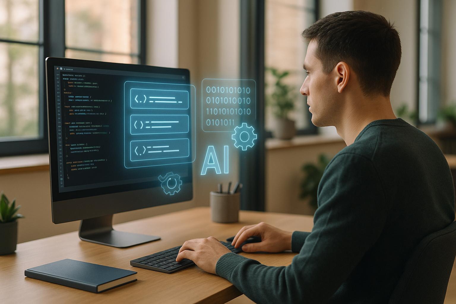
Learning AEC software is hard. Complex interfaces, fragmented tools, and outdated design make it challenging, especially as demand for BIM professionals grows by 40% while the industry faces a skills gap. But there’s a solution: better UX design.
Here’s how to fix it:
- User-Centered Design: Focus on workflows, pain points, and real-world tasks. Build tools that solve problems, not add complexity.
- Simplify Features: Use methods like progressive disclosure to reveal advanced features only when needed. Reduce cognitive load with clear layouts, tabs, and tooltips.
- Cloud-Based Collaboration: Enable real-time teamwork, faster file access, and mobile-friendly interfaces to boost productivity.
- Effective Onboarding: Use in-app tutorials, smart defaults, and step-by-step workflows to shorten learning curves.
- Measure and Improve: Track usability metrics like task completion rates and user satisfaction to refine and evolve tools.
The goal? Make advanced AEC tools feel effortless, helping professionals work smarter and faster.
What Product Design Research Brings to Software Development
Core UX Design Principles for Easy-to-Use AEC Tools
Creating intuitive AEC software means addressing complexity head-on with a design approach that puts users first. The best cloud-based AEC tools follow tried-and-true UX principles, balancing human needs with the advanced features professionals rely on.
User-Focused Design Methods
Good design starts with understanding how people actually work. For AEC software, this means diving into the daily routines of architects, engineers, and construction professionals. Observing workflows, identifying pain points, and considering the environments where these tools are used are all essential steps.
"People don’t want to buy a quarter-inch drill; they want a quarter-inch hole." – Theodore Levitt [1]
This quote sums it up perfectly: users care about solving problems, not navigating unnecessary features. By studying workflows and building user personas for everyone from project managers to structural engineers, designers can ensure the software meets diverse needs. Mapping user journeys is another way to pinpoint where friction occurs and where improvements can make a real difference.
Simplifying Complex Features
AEC tools often come with powerful, intricate features – but making them accessible without dumbing them down is the real trick. One effective approach is progressive disclosure: show the most-used features upfront while keeping advanced options easily accessible but out of the way.
"Testing one user early in the project is better than testing 50 near the end." – Jakob Nielsen [1]
Early usability testing is a game-changer. It catches confusing elements before they become ingrained in the design, saving time and money down the line. Another key is reducing cognitive load: users shouldn’t have to juggle information between screens. Grouping related functions with tabs, categories, or collapsible menus can make navigation smoother.
Contextual help, like tooltips or inline examples, is another way to make complex processes easier. For instance, in one insurance submission wizard, adding examples and tooltips for terms like dental codes made the process clearer and reduced user errors [3].
Clear Visual Design and Layout
Consistency in visual design is like a roadmap for users – it helps them navigate software without unnecessary guesswork. When buttons, menus, and navigation elements behave predictably, users can focus on their tasks instead of figuring out the interface.
"The principle of visual hierarchy: Guiding the eye on the page so that it attends to different design elements in the order of their importance." – Kelley Gordon, NN/g [2]
A strong visual hierarchy not only makes software easier to use but can also drive results. Research shows that improving UX design can boost conversion rates by up to 400% [4]. In AEC software, this translates to faster task completion and less time spent on training.
Design systems and style guides play a big role here, ensuring consistent use of colors, typography, and spacing. Strategic white space helps reduce clutter, while thoughtful use of color and contrast improves readability and highlights important elements. Following Web Content Accessibility Guidelines (WCAG) ensures that the design works for users with varying visual abilities.
Grid systems add structure and clarity, creating a polished, professional feel – especially important in AEC tools where precision is key. A great example comes from MetricMonkey, where users struggled to find project location settings hidden in a Settings tab. By moving these settings to a more visible spot, the designers made the tool more user-friendly [1].
These design principles create a foundation for AEC software that’s both powerful and easy to use, setting the stage for even more streamlined cloud-based features.
Cloud Features That Improve AEC Tool User Experience
Cloud technology has revolutionized how AEC (architecture, engineering, and construction) professionals work, offering tools that streamline workflows, enhance collaboration, and improve productivity across devices. By leveraging cloud-based solutions, teams can work more efficiently, access information seamlessly, and maintain productivity no matter where they are.
Real-Time Team Collaboration and Feedback
Gone are the days of endless email threads and version confusion. Cloud platforms make teamwork effortless, allowing multiple users to collaborate on the same project in real time, regardless of their location. This eliminates delays and ensures everyone is always working with the latest version of a file. In fact, companies that prioritize collaboration are five times more likely to achieve high performance [5].
With real-time coediting, team members can make updates – like an architect revising a floor plan – and those changes immediately appear for everyone. Built-in commenting systems further enhance communication by keeping feedback organized and tied directly to specific elements of the project. This ensures decisions are documented as changes occur, creating a clear record of progress.
One striking example of cloud collaboration comes from Buro Happold in Detroit. Using BIM 360 Design, they connected five global offices. The results were impressive: model opening times dropped from 29 minutes (over VPN) to just 1 minute with cloud access, large project access times were slashed from hours to mere minutes, and their collaboration capabilities expanded from local to global [7].
Cloud tools also offer role-based access control, ensuring that only the right people see the right information. For example, project managers may need a full view of the project, while consultants only access the areas relevant to their expertise. This targeted access not only protects sensitive data but also keeps workflows running smoothly. Mismanagement of access can lead to costly breaches, with the average cost of such incidents reaching $4.45 million [6].
Additionally, cloud platforms enable interactive prototypes and 3D models, allowing clients to engage with designs in a hands-on way. This accelerates decision-making and helps bridge the gap between technical teams and stakeholders. And because these tools are designed to work across various devices, teams can collaborate just as effectively in the office as they can onsite.
Flexible Interfaces for Different Devices
AEC work isn’t confined to the office. Whether it’s a field inspection, a client meeting, or working remotely, professionals need access to project data across different devices. Cloud-based tools with adaptable interfaces ensure consistent functionality on desktops, tablets, and smartphones.
The result? A productivity boost for 82% of engineers who report improved efficiency thanks to cloud tools [7]. This flexibility allows users to access critical information anytime, anywhere, without skipping a beat.
For onsite work, touch-friendly designs are a game-changer. Interfaces optimized for tablets include large buttons, intuitive navigation, and layouts that display essential information clearly, even on smaller screens. Take RIOS, an international design firm, as an example. They transitioned to cloud-based file management with Egnyte, and Bob Frederick, their Director of Computational Design, shared the impact:
"With Egnyte, we get the file server experience we’ve had for the last decade, with all the modern features of a cloud platform… If you’re running a suite of CAD tools and managing lots of computational design files across multiple locations, and don’t want to spend all your energy managing infrastructure and learning new processes instead of advancing your projects, Egnyte is for you." [7]
Cross-platform compatibility is another major advantage. Whether team members are using Windows, Mac, or mobile devices, everyone can access and contribute to projects without compatibility issues. This eliminates technical headaches and ensures smooth collaboration.
Fast Performance in Cloud Environments
Speed is critical when working with large, complex files. Cloud platforms are built to deliver fast, reliable performance, enabling users to efficiently tackle even the most demanding projects.
For instance, Autodesk Construction Cloud helped Oktra achieve significant productivity gains. Alex Turner, Head of Digital Design and Construction at Oktra, highlighted the benefits:
"This has saved a designer on average half an hour a day…this is value that we can see straight away from using Autodesk Construction Cloud." [7]
The ability to handle large files quickly and reliably not only saves time but also ensures that teams can stay focused on their work rather than dealing with technical delays. Whether it’s rendering a 3D model or accessing a massive project file, cloud tools keep things running smoothly.
User Onboarding Methods to Reduce Learning Time
Effective onboarding can turn the challenge of learning complex software into an approachable process. This is especially crucial in AEC tools, where the steep learning curve often determines whether users stay or abandon the platform. Consider this: around 25% of mobile app users stop using an app after just one session [11]. That statistic underscores the importance of a smooth and supportive introduction.
Good onboarding isn’t just about showing users where features are; it’s about helping them understand how the software solves their problems and guiding them to achieve meaningful results quickly. When users experience value early on, they’re more likely to stick around, ask fewer support questions, and even convert into paying customers [8].
In-Context Learning and Step-by-Step Workflows
One of the best ways to help users navigate complex AEC workflows is by embedding learning directly into the software. Instead of overwhelming users with long tutorials upfront, in-context learning allows them to discover features as they complete real-world tasks.
For example, product tours with tooltips can walk users through multi-step processes, highlighting the immediate benefits of each step [8]. Progressive onboarding takes this further by introducing new information only when it’s relevant. If a user starts a new drawing, they might be shown layer management tools first, while collaboration features are introduced later, when they’re ready to share their work.
RecruitNow provides a great example of this approach in action. By using integrated in-app flows and video tutorials, they cut monthly training time from hundreds of hours to just 4 hours [8].
Tools like checklists and progress bars can also simplify complex workflows by breaking them into smaller, manageable steps, while providing users with a sense of accomplishment as they progress [8]. Hotspots can subtly draw attention to advanced features without being intrusive [8].
"A good onboarding experience doesn’t overwhelm the user by providing too much information upfront – ideally, users can be onboarded to different areas of the product as they become more comfortable overtime or the onboarding experiences can be re-triggered so that the user can return to learn more about their desired area when they’re ready." [9]
In addition to step-by-step guidance, smart defaults can further ease the onboarding process.
Smart Settings and Helpful Suggestions
Smart defaults and contextual cues play a key role in removing setup friction. Nothing frustrates new users more than being forced to configure countless settings before they can even begin. By making intelligent assumptions about what users need, smart defaults simplify the process while still allowing for customization.
This approach is especially useful in AEC software, where settings often depend on project type or industry standards. For instance, a structural engineering project might automatically load relevant building codes, material properties, and load combinations. Meanwhile, an architectural project could come preloaded with common drawing scales, layer naming conventions, and units of measurement.
Consumer apps often demonstrate how smart defaults can streamline workflows [11]. Persona-based onboarding is another effective strategy. By asking users about their roles – such as architect, engineer, or project manager – the software can adjust templates, interfaces, and key features to match their specific needs. Miro, for example, asks users about their team type and workflow challenges before presenting them with tailored templates [11].
Contextual suggestions and adaptive navigation further enhance the experience by offering relevant recommendations and reorganizing the interface based on user behavior [11]. Delayed registration is another clever tactic – it allows users to explore the software’s features or try out templates before requiring full sign-up. This reduces initial friction and lets users experience the software’s value right away [8].
By reducing cognitive load through these strategies, users can focus on their work rather than struggling with unfamiliar interfaces. As Cibin KS puts it:
"The onboarding process should help your users to understand a product’s promise and learn how they can realize it." [10]
With a well-thought-out onboarding process, learning new AEC software transforms from an intimidating task into a guided, confidence-building journey. Step by step, users gain both competence and trust in the tool.
sbb-itb-51b9a02
How to Measure and Improve AEC Software UX
Creating user-friendly AEC software isn’t a one-and-done task – it’s an ongoing process that requires constant evaluation and adjustment. Why? Because every $1 spent on UX can yield a $100 return, translating to an incredible ROI of 9,900% [16]. For AEC companies aiming to simplify their tools and processes, defining clear metrics and improvement strategies is crucial. Measuring UX performance accurately is the key to achieving these results.
Key Metrics for Measuring Ease of Use
To truly understand how your AEC software performs, focus on usability metrics like effectiveness, efficiency, and satisfaction. These metrics provide clear insights into where users excel and where they face challenges [13].
The most insightful metrics come from observing how users handle real tasks. For example, completion rate shows whether users can successfully finish essential workflows, such as creating designs or generating reports. Meanwhile, time on task highlights how long these workflows take – critical in an industry where time directly impacts project costs and deadlines.
Tracking errors is especially vital in AEC software, where mistakes can lead to costly consequences. Here’s a quick breakdown of key usability metrics:
| Usability Metric | What It Measures | Definition |
|---|---|---|
| Completion rate | Success | Tracks whether users complete or fail a task |
| Time on task | Duration | Measures how long users take to finish a task |
| Misclick rate | Errors | Percentage of incorrect clicks |
| Number of errors | Errors | Counts mistakes like misclicks or slips |
| Task level satisfaction | Satisfaction | User ratings on how easy specific tasks are |
Satisfaction metrics dig deeper into the user experience. The System Usability Scale (SUS) is a widely used tool for this purpose. Scores above 68 are considered above average, while anything over 80 is excellent [13][17]. Since AEC software often frustrates users, these scores are a great way to measure if your efforts to improve UX are paying off.
However, there’s a disconnect in many companies: 83% of respondents in a 2023 study believe testing should occur throughout the product lifecycle, yet 78% admit they don’t do enough research [12]. This gap leaves many AEC companies guessing about their software’s usability instead of relying on concrete data.
"The biggest benefit to conducting usability testing is that you get to build scalable products with a short learning curve, which then translates into satisfied users."
- Belén Ardiles, Product Designer at StockFink [12]
When deciding what to measure, align metrics with your goals. For instance, if reducing training time is your priority, focus on time-to-proficiency. If cutting down on support tickets is the goal, track error rates and task completion. The idea is to collect data that directly informs your improvement efforts, rather than gathering numbers for the sake of it.
Continuous UX Improvement Methods
Measuring UX is just the first step – acting on those insights is where the real work begins. A continuous improvement process means regularly tracking performance and refining the software based on user feedback and behavior [16]. This ensures your software evolves alongside your users’ needs instead of becoming outdated.
Gathering user feedback should be a constant effort. Use tools like NPS scores to gauge overall satisfaction and pinpoint areas needing improvement. In-app surveys are another great way to capture feedback while users are actively engaged [14]. For a deeper look into user behavior, tools like heatmaps and session recordings can reveal where users click, scroll, or hesitate – insights that traditional surveys might miss.
Live user interviews can also uncover valuable insights. Instead of guessing what users might need in the future, these interviews explore how they’ve navigated challenges in the past [14]. This approach often reveals the true strengths and weaknesses of your software.
A/B testing is another powerful method for refining UX. By testing specific changes in real time, you can see what works best without relying on guesswork. This is especially useful in AEC software, where even small tweaks to the interface can significantly impact productivity.
When deciding which features to improve, prioritize those that are essential to daily workflows. Features used frequently by a large number of users should take precedence over less critical ones.
Visual feedback tools also streamline the improvement process by allowing users to point, click, and comment directly on the interface [15]. This eliminates much of the guesswork often associated with written feedback, making it easier for development teams to understand and address user concerns.
"Choosing the right UX metrics and what to measure is a matter of paying attention to what’s working and what’s not – for the users and the business."
- Thais Souza, Design Director at PayFit [17]
The most successful AEC companies treat UX improvement as a continuous effort rather than a one-time project. By consistently monitoring metrics, gathering feedback, and adapting to user needs, they ensure their software remains intuitive and effective [16]. This approach not only keeps up with the evolving AEC industry but also helps lower the learning curve for users.
Conclusion: Building Better AEC Tools with Smart Design
The AEC industry is at a pivotal moment. With projections showing the AEC software market could hit $24.36 billion by 2032 [21], the challenge is clear: combine powerful capabilities with designs that are easy to use.
The key? Putting users first. By focusing on their pain points, preferences, and daily workflows, developers can create tools that truly resonate [19]. As Irene Au, former design leader at Google and Yahoo, famously said:
"Good design is like a refrigerator – when it works, no one notices, but when it doesn’t, it sure stinks." [18]
This idea should be the foundation of every decision in AEC software development. Take Apple’s redesign of the iPhone keyboard in 2007, for example. By simplifying the interface, they unlocked its potential, proving that less can indeed be more [19]. Similarly, simplifying interfaces and grouping related information reduces cognitive strain, making complex tools easier to navigate [18]. And this isn’t just theory – there’s measurable proof in productivity gains.
Research from McKinsey shows that integrating modern technologies like AI/ML, VR/AR, cloud computing, and digital twins can increase construction productivity by as much as 50–60% [21]. One example? Companies reducing purchase order times from 32 minutes to just 7 [7].
Features like progressive disclosure and UX nudges also play a big role. By providing contextual guidance and respecting users’ cognitive limits – typically retaining only 3–5 pieces of information at a time – these tools make learning curves less steep [18][20].
For businesses aiming to develop or upgrade their AEC software, success lies in balancing technical innovation with a deep understanding of user needs. AlterSquare, for instance, offers tailored solutions that combine cutting-edge technology with user-friendly design. Their services range from AI-driven development to UI/UX design and application modernization [22]. This approach ensures tools are both functional and intuitive, setting the stage for the next wave of AEC advancements.
Effective AEC tools don’t just stop at launch – they evolve. Through constant research, thorough testing, and transparent updates, they embody the principle that "People ignore design that ignores people" [18][23]. This commitment is what will drive the next generation of innovation in the industry.
The future of AEC software lies in making advanced functionality feel effortless. With the right development partners, even the most complex tools can become second nature for users.
FAQs
How can UX design make cloud-based tools easier for AEC professionals to use?
How UX Design Can Improve Cloud-Based Tools for AEC Professionals
UX design can play a huge role in making cloud-based tools easier to use for AEC professionals by focusing on user-centered principles tailored to their specific needs. When navigation and layouts are designed to be intuitive, users can find the tools they need and complete tasks without unnecessary hurdles. Plus, consistent interfaces across multiple devices ensure smooth transitions, saving valuable time and reducing frustration.
Adding small but effective features like tooltips, progress indicators, and contextual suggestions can take usability to the next level. These elements help by offering immediate feedback, minimizing errors, and guiding users through even the most complex workflows. Together, these thoughtful design strategies make cloud-based tools feel more approachable, boosting both productivity and overall user satisfaction.
How can UX design principles help make AEC software easier to learn and use?
Reducing the learning curve in AEC software hinges on easy onboarding and smart defaults. By using design patterns that feel familiar – like those found in popular consumer apps – users can get comfortable faster. Built-in features such as guided workflows and interactive tutorials let users learn while they work, making the process smoother and less intimidating.
Smart defaults are another game-changer. Pre-set configurations designed around common user needs take the hassle out of setup, letting users dive into their tasks right away. Plus, real-time, contextual suggestions based on user behavior offer on-the-spot guidance, making the software feel intuitive and supportive from the start.
How does cloud-based collaboration improve productivity and communication in AEC projects compared to traditional methods?
How Cloud-Based Collaboration Boosts AEC Projects
Cloud-based collaboration is reshaping how teams in Architecture, Engineering, and Construction (AEC) work together by offering a centralized hub for effortless information sharing and real-time communication. Gone are the days of hunting through scattered systems for critical data. With cloud platforms, everyone on the team can access the information they need quickly, cutting down on delays and reducing the risk of miscommunication.
One of the biggest advantages? Teams can collaborate from anywhere, on any device. Whether you’re in the office or on-site, mobile apps make it simple to update progress, review plans, or share insights instantly. This level of connectivity keeps everyone on the same page, helping to avoid errors, speed up decisions, and keep projects running on time and within budget.
Related Blog Posts
- Why Construction Software Feels Stuck in the 90s: UI/UX Challenges in Industrial Applications
- Why Construction Tech UX Is Different: Designing for Jobsite Realities
- Microinteractions That Matter: Small UX Details With Big Impact in AEC Software
- Beyond Desktop Thinking: Reimagining AEC Software UX for the Cloud Era


Leave a Reply