
Startups succeed by prioritizing usability over feature overload. The Figma vs. Adobe rivalry shows how focusing on ease of use, collaboration, and accessibility can disrupt even industry leaders. Here’s the key takeaway: users prefer tools that simplify their work, not ones packed with unnecessary features.
- Figma focused on usability: Real-time collaboration, browser-based access, and intuitive design made it the go-to tool for design teams.
- Adobe relied on features: While powerful, its steep learning curve and complex workflows frustrated users.
- Results: Figma’s market share surged from 8% to 57% in just three years, proving usability drives adoption.
For startups, the lesson is clear: build products that solve problems effortlessly. Skip the feature overload and focus on smooth workflows, accessibility, and user feedback. It’s the smarter path to success.
Figma vs Adobe XD: What’s the Difference?
Figma vs Adobe: Different Product Strategies
The competition between Figma and Adobe highlights two very different approaches to product development. Adobe has long been known for its expansive, feature-packed ecosystem, while Figma has carved out its space by focusing on simplicity and putting user experience at the forefront. These contrasting strategies shed light on how prioritizing usability can reshape market trends.
How Figma Put Usability First
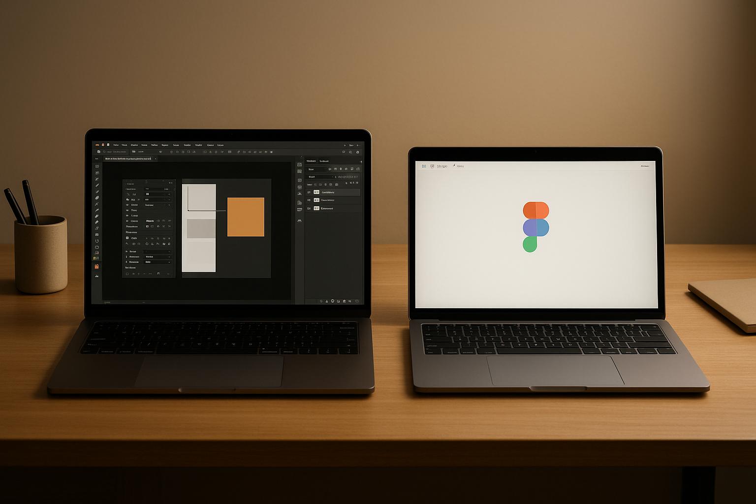
Figma’s strategy revolved around making design tools intuitive, collaborative, and accessible. By prioritizing real-time collaboration and a browser-based platform, Figma ensured that users could focus on their work without being bogged down by unnecessary complexities.
The browser-based model was a game-changer. Unlike Adobe’s tools, which require installation and frequent updates, Figma operates directly in a web browser. This means designers can dive into projects instantly, regardless of their device or operating system, making collaboration across teams seamless.
Real-time collaboration was another standout feature. Designers and stakeholders can work together simultaneously, with updates appearing live on the screen.
"When clients see their feedback reflected instantly on live prototypes, they feel genuinely involved – and more confident making decisions."
This approach extends beyond just designers. Stakeholders can leave comments directly on prototypes, making it easier to discuss and finalize decisions in days instead of dragging them out over weeks.
Figma also simplified the developer handoff process with its Dev Mode. Developers can access specs, code snippets, and assets directly within the platform, saving time and reducing misunderstandings.
"With Dev Mode, our developers spend less time deciphering designs and more time building features that match both UI vision and client requirements."
This relentless focus on usability has been a cornerstone of Figma’s growing influence in the design world.
Adobe’s Feature-Heavy Approach
Adobe, on the other hand, has built its reputation on offering a vast array of tools within its Creative Cloud suite. From advanced animations to professional-grade photo editing and typography controls, Adobe caters to power users who need a wide range of capabilities.
However, this depth of features comes with challenges. New users often face a steep learning curve, sometimes taking weeks to get comfortable with basic workflows. For instance, Adobe XD’s vertical toolbar can make asset selection feel clunky compared to Figma’s more flexible interface. While Adobe XD offers advanced prototyping options, the sheer number of features can overwhelm users who don’t need that level of complexity.
Adobe’s pricing model reflects its approach as well. Accessing the full suite of tools requires a subscription, which can be a barrier for beginners or smaller teams. In contrast, Figma offers a robust free tier that includes essential tools, making it more accessible to a wider audience. While Adobe’s integration across apps like Photoshop, Illustrator, and XD is a strength for existing users, it can feel like overkill for those who don’t need the entire ecosystem.
User Adoption Results Comparison
The impact of these strategies is clear when looking at user adoption and market trends. Figma’s user base has surged by over 200% since 2018[3]. Additionally, studies show that 88% of users are unlikely to return after a poor experience[1] – a problem Figma avoids by prioritizing usability.
Figma enables users to start designing almost immediately after opening their browser, while Adobe XD often requires significant time for setup and learning. This simplicity has made Figma a favorite among UX professionals[2].
Collaboration is another area where Figma shines. With features like real-time editing and live comments, it’s especially popular among remote teams. In fact, 73% of design professionals say integration capabilities directly impact their productivity[1].
| Strategy Element | Figma’s Approach | Adobe’s Approach |
|---|---|---|
| Core Focus | Usability and collaboration | Feature depth and professional tools |
| Learning Curve | Intuitive, minutes to start | Steep, weeks to master |
| Collaboration | Real-time editing, live comments | Co-editing with Creative Cloud |
| Accessibility | Browser-based, works on any device | Desktop apps, specific OS needs |
| Pricing | Free tier with essential tools | Subscription required for full access |
| Developer Handoff | Built-in Dev Mode | Separate tools and processes |
Studies show that 70% of organizations prioritizing user experience outperform their competitors[1]. Figma’s focus on simplicity and usability not only attracts individual users but also changes how teams collaborate, proving that less complexity can lead to greater success.
Building User-Friendly MVPs: Startup Lessons
The Figma vs. Adobe rivalry teaches a crucial lesson for startups: usability beats feature overload. When crafting your first MVP (Minimum Viable Product), you don’t need to replicate every feature your competitors offer. Instead, focus on making your core features work better than anyone else’s.
Tom Lowry, Figma’s Director of Advocacy, sums it up perfectly:
"Unlike a basic prototype that may be created to validate product decisions, an MVP is a focused product built with ruthless prioritization." [4]
This philosophy helped Figma avoid the common startup pitfall of trying to do too much too soon. Instead of spreading themselves thin, they prioritized creating a product that worked seamlessly. Usability became the foundation of their MVP strategy, starting with simple, intuitive workflows.
Making Workflows Simple and Smooth
Forget starting with a long feature list – begin with the user journey. Figma’s success came from understanding how designers work and cutting out unnecessary steps. They relied on wireframes and low-fidelity prototypes to test workflows before building anything complex.
A major reason startups fail is misjudging what the market actually needs [5]. You can sidestep this by focusing on user flows first. Map out how users will interact with your product and remove any points of friction.
Figma used a prioritization matrix to focus on features that were both urgent and impactful. This wasn’t about simply cutting features – it was about designing for the majority of users who value simplicity and speed over complexity.
Performance is another critical factor. Optimize your MVP by compressing images, cleaning up code, and implementing caching. Run performance tests early to catch and fix issues before they frustrate your users.
Core Features vs. Feature Overload
Some of the most successful companies – like Instagram, Uber, and Spotify – started with one standout function and scaled later. Their success came from identifying a unique value proposition and solving specific pain points better than anyone else.
To define your core features, research your market, understand your user personas, and pinpoint where competitors fall short. Then, zero in on solving those problems exceptionally well.
"When you have to deprioritize nice-to-have features, it breeds creativity." – Tom Lowry, Director of Advocacy at Figma [4]
Constraints like these force you to find smarter, simpler solutions rather than adding unnecessary complexity. Tools like the MoSCoW Matrix (Must have, Should have, Could have, Won’t have) can help you stay disciplined about what makes it into your MVP.
Premature scaling is one of the leading causes of startup failure – 70% of them fall into this trap [5]. Adding too many features too soon is a form of premature scaling. Focus on proving your MVP’s core concept works before expanding.
Building Collaborative and Accessible Platforms
Accessibility isn’t just a nice-to-have – it can be a game-changer. Figma’s browser-based approach ensured that anyone with an internet connection could use their tool, regardless of their device or operating system. This decision gave them access to a wider audience, including users who couldn’t or wouldn’t install Adobe’s desktop software.
From the start, prioritize accessibility. Add features like alt text, keyboard navigation, and proper color contrast. Seek feedback from a diverse group of users to ensure your product meets a variety of needs. Accessibility isn’t just the right thing to do – it’s also smart business.
Collaboration is another must-have for modern platforms. Include basic features like real-time editing, live comments, and easy sharing from the beginning. These tools solve real workflow problems and can make your MVP stand out.
Don’t forget to establish feedback mechanisms. Make it simple for users to report issues, suggest improvements, and share their experiences. This feedback fuels the iterative Build-Measure-Learn process that drives successful MVP development.
Finally, ensure your product looks and feels consistent. A unified style guide with consistent colors, typography, and icons helps users feel confident navigating your platform.
The goal isn’t to create the smallest product possible – it’s to create the most usable product within your constraints. Solve core user problems effectively, and let that guide every decision you make.
sbb-itb-51b9a02
Simple Workflows Drive User Adoption
When it comes to MVP development, keeping workflows simple is key to grabbing user attention and ensuring long-term growth. Users form opinions quickly – 77% stop using apps within three days, and 90% drop off within a month [6]. On the flip side, the most successful apps retain nearly 50% of users because they excel at onboarding.
The trick isn’t about cramming in more features. It’s about perfecting the essentials. Take Figma, for example. Its intuitive design lets users dive right in, no manuals needed.
Streamlined workflows also save resources while improving user satisfaction. Slack is a great example: simplifying its processes led to a 70% drop in support tickets [7].
Extra steps, on the other hand, can be a dealbreaker. They increase cognitive load, which frustrates users, especially when they’re short on patience. Jenny Reeves, Director of UX at Gordian, explains it best:
"As attention spans contract and peoples’ lives grow ever busier, users are raising their standards for intuitive usability. If an app even seems remotely difficult to use, many users won’t bother to install it. They’ve developed a set of expectations for speed, functionality, and design, and it’s up to designers to at least meet those expectations (if not exceed them)." [9]
Streamlined workflows don’t just make things easier – they boost productivity too. Superhuman, for instance, helps users send 72% more emails and respond a full day faster [11]. Its AI-powered features add another 34% productivity boost. As the Superhuman team puts it:
"The difference isn’t about working harder, but designing smarter pathways that cut out busy work and focus energy where it matters most." [11]
These smarter workflows not only improve usability but also provide a solid foundation for tracking and refining user experiences.
Tracking Usability for Better Products
To make products better, you need to measure usability. Key metrics like onboarding rates, time-to-first-value, and retention at 1, 7, and 30 days can reveal where improvements are needed. Tools such as heatmaps and session recordings help pinpoint problem areas – like users clicking on non-clickable elements, abandoning forms, or retracing steps in a workflow.
A/B testing is another powerful tool for optimizing workflows. Even small tweaks – adjusting button placements, rewording copy, or refining onboarding steps – can make a big difference. Adobe’s EMEA team showed just how impactful this approach can be. By digitizing its employee onboarding process with Adobe Acrobat Sign and Microsoft tools, they achieved:
- An 80% reduction in new hire processing time, saving talent coordinators over six hours per month.
- A 400% faster turnaround on onboarding documents.
- A 10% boost in onboarding satisfaction – all in just one month [8].
Reflecting on this transformation, Yasser Dehen, Talent Operations Manager at Adobe, said:
"Modern digital experiences should be fully digital and paperless, using automation to improve efficiency and personalization to connect with people." [8]
Beyond metrics, qualitative insights matter too. In-app surveys, user interviews, and support ticket analysis can uncover where users are struggling. Trends in support ticket volume or recurring complaints about specific features can act as a barometer for overall usability.
Automation also plays a big role. Around 34% of companies report that automation reduces time spent on admin tasks, while 35% say it improves customer service and support [10]. When workflows are simple and automated, both customers and internal teams benefit.
The takeaway is straightforward: users don’t want more features – they want their core tasks to feel effortless. By focusing on simplicity and streamlined workflows, you can drive adoption and lay the groundwork for lasting success.
The AlterSquare Method for Usable MVPs
AlterSquare has developed a framework that simplifies and accelerates MVP (Minimum Viable Product) development, focusing on usability and streamlined workflows. Their I.D.E.A.L Delivery Framework is designed to keep teams focused on what truly matters, avoiding the distractions that often derail projects.
One of the biggest hurdles in MVP development is staying on track. According to a 2024 Gartner survey, 76% of product launches fail to meet their original timelines, with feature creep being the primary culprit in 63% of cases [12]. AlterSquare addresses this by crafting scalable MVPs in just 90 days, using clear frameworks, well-defined priorities, and firm deadlines.
How AlterSquare Builds Usable MVPs
The I.D.E.A.L framework revolves around creating MVPs that deliver maximum user value with minimal complexity. It aligns closely with Eric Ries’s perspective on MVPs:
"An MVP is a new product iteration that enables the team to amass the most concrete consumer data with the least amount of work." [12]
At the heart of the process is user-focused design. AlterSquare puts the needs, challenges, and preferences of end-users first, starting with comprehensive user research. This research helps identify behaviors, motivations, and pain points, allowing teams to define the core features that provide the greatest value.
The framework incorporates Design Thinking principles, which emphasize empathy, rapid prototyping, and iterative development based on user feedback [15]. Rather than building features in isolation, teams test ideas with prototypes, ensuring they solve real problems before committing to full-scale development [12].
UI design is approached strategically, prioritizing clarity and ease of use. Teams create intuitive navigation systems and consistent design elements, ensuring accessibility is baked into every stage of development. Comprehensive design systems outline visual styles, interaction patterns, and UI components, creating a cohesive user experience [14].
The development process follows Agile principles, promoting collaboration, incremental progress, and continuous feedback from stakeholders [16]. AlterSquare provides a dedicated team of experts, including architects, designers, developers, and testers, all experienced in delivering innovative solutions [13].
Feedback is a cornerstone of the framework. Teams gather insights through surveys, interviews, and usage data, treating the MVP as a foundation to be refined and improved based on real-world user needs [15]. This iterative approach ensures the product evolves effectively.
Structured prioritization methods like the MoSCoW framework significantly increase the chances of achieving product-market fit – startups using these methods are 35% more likely to succeed in their first year [12]. For example, a U.S. construction firm that adopted similar practices reduced project delays by 25% and boosted client satisfaction by 15% through weekly demos and structured feedback [12].
Connecting Usability to Business Success
Usability isn’t just about creating a better experience for users – it directly impacts business performance. Research shows that every $1 invested in UX yields a $100 return, delivering an impressive ROI of 9,900% [19].
AlterSquare ties usability improvements to measurable outcomes by tracking metrics in four areas: completion/success rates, task duration, error rates, and user satisfaction [18]. Teams gather baseline data before launch and measure changes afterward, demonstrating the tangible impact of usability improvements [17].
As Dr. Peter Drucker famously said:
"What is measured gets improved." [17]
The framework encourages startups to focus on 3-5 core features that address users’ most pressing issues [12]. Tools like the Impact vs. Effort Matrix and MoSCoW method help prioritize resources effectively, ensuring alignment among stakeholders [12].
The benefits extend beyond user satisfaction. 87% of successful SaaS companies use third-party tools during the MVP phase, allowing them to focus on core functionality while saving resources for future growth or pivots [12]. This approach helps startups deliver polished user experiences without overextending their capabilities.
AlterSquare also emphasizes long-term success by safeguarding intellectual property and institutional knowledge. By building strong relationships with clients and laying a solid foundation for scaling, they ensure usability improvements continue to deliver value over time [13].
Research and testing are integral to the process. While 83% of respondents agree that testing should occur at every stage of the product lifecycle, 78% admit their companies don’t conduct enough research [18]. By embedding research and testing into development, AlterSquare helps startups avoid costly mistakes and unnecessary redesigns later on.
Conclusion: Main Lessons for Startups
The Figma versus Adobe story highlights a powerful truth: startups succeed by creating intuitive, user-centered products. Figma’s rise shows that users will consistently choose a tool that’s simple and easy to use over one that’s packed with features but feels overwhelming. When a product helps people achieve their goals faster and with less hassle, it wins.
The biggest takeaway for startups? Usability is the key to adoption. Consider this: more than 50% of apps are uninstalled within 30 days [21]. Why? Because users quickly abandon tools that don’t deliver immediate value through straightforward design. For startups, this means your product needs to provide value right away. When building an MVP, focus on creating smooth workflows that let users complete essential tasks without headaches or lengthy onboarding.
Another critical point is the value of collaboration. From the very beginning, bake collaborative features into your product. These capabilities not only enhance user experience but also create network effects, making it harder for users to switch to competitors.
The case study also emphasizes cross-platform accessibility. By ensuring your product works seamlessly across devices and platforms, you can attract a broader audience while minimizing barriers to adoption.
Figma’s success also teaches us to avoid overwhelming users with too many features. Instead, focus on the 20% of functionality that delivers 80% of the value. Claire Butler, Senior Director of Marketing at Figma, puts it perfectly:
"When you think about gating your product, consider how you can funnel customers toward your magic moment and get them to experience that as quickly as possible" [22].
This focus on usability doesn’t just drive adoption – it boosts ROI. Research shows that prioritizing UX design can increase user adoption rates by up to 200% and improve return on investment by 300% [23]. For resource-strapped startups, these numbers can be game-changing.
While simplicity is critical for adoption, security builds trust. But here’s the catch: security shouldn’t come at the expense of usability. As Lamarr Henry, Security Engineer at Figma, explains:
"Security is about helping the company succeed, and we can’t succeed if poorly designed controls get in the way of Figmates doing their best work" [20].
Startups should aim to integrate security into their workflows in a way that doesn’t disrupt the user experience. Automating security processes and offering self-service tools can help achieve this balance.
Figma’s journey proves that startups can win by prioritizing usability over feature overload. By focusing on intuitive design, collaborative tools, cross-platform accessibility, and streamlined workflows, even a small startup can deliver an effortless user experience. In today’s competitive market, the best product isn’t the one with the longest feature list – it’s the one that helps users achieve their goals with the least effort. Startups that embrace this principle are far more likely to succeed.
FAQs
Why is focusing on usability more effective than adding more features, as shown in the Figma vs Adobe example?
Focusing on usability makes a product simpler to learn and more enjoyable to use, which naturally draws in more users and boosts long-term adoption. When a design is straightforward and intuitive, users – no matter their skill level – can quickly accomplish what they need without unnecessary hassle.
Take Figma vs Adobe as an example. Figma put usability front and center by simplifying workflows and offering a collaborative, user-friendly platform. This strategy allowed them to stand out, even when competing with Adobe’s extensive feature set. On the flip side, packing a product with too many features can overwhelm users, making it harder to learn and less satisfying to use. Prioritizing usability ensures your product connects with users and keeps them engaged.
How can startups use Figma’s focus on usability to enhance their own product design?
Startups can take a page from Figma’s playbook by focusing on usability rather than cramming in too many features. The first step? Dive into user research. Understand what users truly need and design solutions that address those core problems without adding unnecessary complexity.
Leverage prototyping and iterative testing to fine-tune your product. Share prototypes with real users, collect their feedback, and tweak designs to ensure workflows are smooth and intuitive. By prioritizing clarity and creating user-friendly experiences, startups can craft products that not only stand out but also encourage strong user adoption.
How can you keep a product user-friendly while adding essential security features?
Balancing usability with security is crucial for building a product that users can both trust and enjoy. Start by providing clear, straightforward explanations for security features. This helps users understand why certain measures are in place without feeling confused or overwhelmed. Adding visual cues, like icons or color coding, can make secure actions more intuitive, guiding users seamlessly through the process.
Another effective strategy is implementing risk-based authentication. For example, you can require additional verification only when unusual activity is detected. This approach minimizes unnecessary disruptions while keeping security intact. Lastly, make it a priority to gather user feedback regularly. Listening to users helps identify areas where they might struggle, allowing you to fine-tune the experience so that security features feel like a natural part of the product rather than a hurdle.


Leave a Reply