

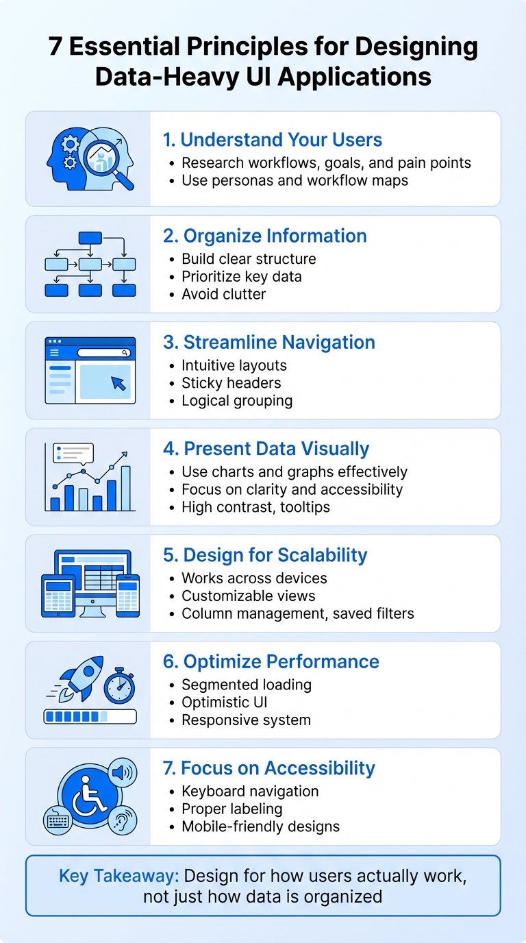
When creating user interfaces for applications that handle large datasets and complex workflows, the main goal is to simplify how users interact with the system without sacrificing functionality or performance. Here’s what matters most:
- Understand Your Users: Research how users work, their goals, and pain points. Tools like personas and workflow maps help identify needs.
- Organize Information: Build a clear structure that prioritizes key data and avoids clutter.
- Streamline Navigation: Use intuitive layouts, sticky headers, and logical grouping to make interfaces easier to use.
- Present Data Visually: Use charts and graphs effectively, focusing on clarity and accessibility (e.g., high contrast, tooltips).
- Design for Scalability: Ensure the UI works well across devices and allows users to customize views (e.g., column management, saved filters).
- Optimize Performance: Use techniques like segmented loading and optimistic UI to keep the system responsive.
- Focus on Accessibility: Include keyboard navigation, proper labeling, and mobile-friendly designs to make the application usable for everyone.
The key takeaway? Design for how users actually work, not just how data is organized. By balancing usability, performance, and accessibility, you can create interfaces that handle complexity without overwhelming users.
7 Essential Principles for Designing Data-Heavy UI Applications
Data-Heavy UI Design: From Chaos to Clarity
Understanding User Needs and Workflow Requirements
Before diving into wireframe design, it’s crucial to understand how users actually interact with your application. Data-heavy systems often come with five layers of complexity that can trip up users: Integrative (legacy systems and manual data entry), Information (overwhelming data volume), Intention (unstructured, nonlinear goals), Environmental (physical distractions or equipment limitations), and Institutional (organizational culture and resistance to change) [4]. Each of these layers introduces unique challenges, which only become apparent through focused research. Addressing these complexities requires thorough UX research to uncover user behaviors and pinpoint their pain points.
Conducting UX Research for Data-Heavy Applications
User interviews are essential for uncovering institutional challenges, such as cultural resistance or issues stemming from outdated systems. One UX design manager in the cloud-computing industry shared:
"The cleanliness and the consolidation of the data is probably the most challenging thing…because you can imagine if a record set began being captured 15 or 20 years ago, it’s in a very different place than a record set that we capture today." [4]
These conversations highlight the niche, domain-specific knowledge that outsiders might not fully grasp.
Usability testing is another key method, as it pinpoints specific interaction issues like minor errors or inefficiencies [11]. Testing can reveal where users encounter bottlenecks in productivity and whether features like undo buttons or cancel options effectively support high-stakes tasks. Research shows that testing with just five users often identifies the majority of usability problems [10].
Contextual inquiry and field studies are critical for understanding environmental challenges. Observing users in their actual workspaces – be it a noisy trading floor, a busy hospital ward, or a manufacturing plant where gloves interfere with touchscreens – provides insights you simply can’t get from a lab setting [4]. Remote observation can also uncover issues tied to information complexity, such as prolonged waiting times during data processing [4]. When users face delays, they often hit a 10-second threshold, where they decide whether to wait or shift focus to another task. Generic loading animations don’t help them make that decision [11].
These research methods serve as the foundation for creating detailed personas and mapping workflows that reflect real-world challenges.
Creating Personas and Workflow Maps
Using insights from your research, you can build personas that represent the diverse needs and workflows of your users. Personas should reflect distinct data consumption habits: executives need high-level summaries, managers require operational dashboards, and analysts demand tools for deep exploration [9]. Beyond identifying user types, map out their current workflows, including pain points and frustrations, to guide the design of more effective solutions [13].
Workflow maps for data-heavy systems must account for their nonlinear nature. Unlike consumer apps with predictable paths, these systems require flexibility – users need the ability to skip steps, loop back, or exit without losing progress [2]. During your research, continuously evaluate whether you’re asking the right questions or making incorrect assumptions about workflows [12]. As you transition to high-fidelity maps using tools like Figma, integrate auto-layout frames and overlays to embed user quotes, photos, or videos directly into the journey map [13]. This approach makes your research findings visible and compelling, helping stakeholders connect with the evidence instead of relying solely on verbal explanations.
Building an Information Architecture That Works
Creating a well-structured information architecture is essential for managing the complexity uncovered during user research. Once you’ve identified what your users need and how they work, the next step is organizing large volumes of data in a way that guides users effectively without overwhelming them. The trick is to avoid falling into the "Mission Control" trap – where everything is crammed onto one screen. Start by prioritizing the most important information and arranging secondary content in a clear, logical hierarchy[9].
As Erik Klimczak from Uber explains:
"When you start with distractions, your audience has a hard time seeing not just what each element is about, but the focus of the entire passage." [9]
This approach minimizes cognitive overload, allowing users to focus on their primary tasks without getting bogged down by unnecessary details. With this foundation in place, let’s move on to navigation and layout strategies that reinforce this structure.
Designing Clear Navigation and Layouts
Using insights from user workflows, create navigation systems that are both intuitive and contextually relevant. For example, place filters on the left side and ensure high-use elements like tabs and buttons are consistently positioned[6]. When designing tables, sticky headers and fixed first columns can help users maintain context as they scroll through data[14][15]. Nika Romanenko, Head of UI/UX Design at Outsoft, emphasizes:
"A great table isn’t just about cramming data into cells. It’s about making that data useful." [14]
Group data logically, such as by country and then by year, and display aggregated values to provide quick insights[7]. For mobile users, consider replacing traditional tables with card layouts or pivoted data views to minimize horizontal scrolling[3].
Whitespace plays an important role too. Aim for 30–40% whitespace to keep the interface clean and reduce cognitive strain[6]. Research shows that well-placed whitespace can boost user comprehension by nearly 20%[16].
Prioritizing Visual Hierarchy in UI Design
Visual hierarchy is key to guiding users’ attention to the most critical elements. Use font weight, color, and contrast to differentiate headers[15]. For example, apply large, bold fonts to primary buttons and key information, while smaller, lighter fonts can be reserved for secondary content[17][6]. Align text to the left for readability, and for numeric data, align based on its purpose – right-align for values like percentages or dollar amounts, and left-align for non-size numerical data like dates or ZIP codes[15]. Monospaced fonts can also make numbers easier to scan by keeping digits vertically aligned[15].
Take advantage of natural scanning behaviors by placing the most important information at the top and left of the page, following the F-shaped reading pattern many users adopt[16][6]. Use spatial separation techniques – like borders, drop shadows, or subtle background colors – to emphasize critical sections, while darker tones can signal less important elements like filters or collapsible panels[6]. Keep your top-level navigation simple, with no more than five primary actions, and limit the total number of visible components (like buttons or widgets) to ten per screen[6]. As Kate Kaplan from Nielsen Norman Group points out:
"The sheer amount of competing information and elements within complex applications can hinder these tasks. Help users find and act upon important information by making critical elements visually salient." [2]
Sometimes, making content stand out isn’t about adding flashy colors or graphics – it’s about removing unnecessary clutter. For instance, placing an email address directly under a user’s name instead of in a separate column can make the interface clearer and easier to navigate[2][11][15].
Optimizing Data Presentation Through Visualization
Once a solid information architecture is in place, the next step is to turn complex datasets into clear, visual narratives. Why? Because the human brain processes about 90% of information visually, making the choice of visualization critical for data-heavy applications [18].
As Transcenda explains:
"The role of a data visualization UI is to tell a story with data… the app will help users come to conclusions and make choices based on the information in the chart." [18]
To keep it simple and effective, focus each visualization on one main concept or, at most, two to three closely related ideas [19][20]. Overloading visuals with too much information can overwhelm users. Techniques like tooltips and drill-down features help maintain a clean interface while still providing deeper insights when needed [18][21].
Accessibility matters just as much as design. Use high-contrast colors and add redundant coding – like shapes or patterns – for users who are colorblind. This ensures everyone can interpret the data. Plus, with up to 75% of users judging a product’s credibility based on how it looks [18], a clean, accessible design isn’t just nice to have – it builds trust.
Next, let’s dive into choosing the right types of visualizations and how to prototype them effectively using tools like Figma.
Choosing the Right Visualization Types
Different datasets call for different visualization methods. Bar charts are great for category comparisons, while line graphs show trends over time. Heatmaps can highlight patterns in large datasets but aren’t ideal for pinpointing specific values [20][21]. The U.S. Web Design System puts it well:
"Your audience shouldn’t be required to interact with a visualization to understand its message." [19]
Here’s a quick guide to some common visualization types and their best use cases:
| Visualization Type | Advantages | Disadvantages | Best Use Case |
|---|---|---|---|
| Bar Chart | Easy to compare magnitudes; familiar to users | Can get cluttered with too many categories | Comparing distinct categories or ranking items |
| Line Graph | Great for showing trends over time | Not ideal for parts-to-whole comparisons | Tracking changes, like stock prices or health data |
| Heatmap | Quickly highlights patterns or density | Hard to extract precise values | Visualizing correlations or activity intensity |
| Scatter Plot | Shows relationships, clusters, and outliers | Can confuse non-technical audiences | Analyzing correlations (e.g., income vs. life expectancy) |
| Bullet Graph | Compact; compares actual vs. target performance | Requires familiarity to interpret | Monitoring KPIs and business goals on dashboards |
For better readability, always start bar and area charts at zero and use monospaced fonts for numerical data. Align numbers to the right for a cleaner look [15][18][20][21].
With the right visualization type in mind, let’s move on to prototyping these designs in Figma.
Prototyping Data Visualizations with Figma
Figma is a powerful tool for testing visualization ideas before coding. Start by building a reusable library of chart components, legends, and data labels. This not only ensures consistency but also speeds up iterations when designing complex dashboards [22].
A great example of this approach comes from Tejas Bhatt and his work with WebEngage in July 2017. Collaborating with 3 Sided Coin, Bhatt revamped WebEngage’s marketing automation dashboard by creating a modular component library in Sketch – a process easily adapted to Figma. This allowed the team to design new pages in minutes rather than hours. By shaping layouts around charts and tables instead of rigid grids, WebEngage’s scalable design system supported its expansion into the U.S. and European markets, serving over 38,000 customers. Arpit Rai from WebEngage shared:
"Tejas has created a comprehensive component library for us which basically means that any new page on the dashboard now gets designed in minutes." [23]
Figma’s prototyping features also let you display hover states and tooltips, keeping the main view clean while revealing specific data on demand [22]. Test how visualizations adapt to different screen sizes; for instance, expand charts to show more data points on screens wider than 1,280 pixels [22]. When conducting user tests, use real-world data instead of placeholders – this helps users focus on identifying usability issues rather than adjusting to unfamiliar content [24].
sbb-itb-51b9a02
Designing for Scalability and Customization
After establishing clear navigation and effective data handling, it’s crucial to focus on creating designs that work across devices and allow for user personalization. A dashboard that performs beautifully on a large desktop screen can become clunky and ineffective on a smaller tablet if scalability isn’t considered. The goal is to build interfaces that adapt seamlessly while giving users the ability to customize their experience without overwhelming them.
Implementing Responsive Design Principles
Traditional row-column data tables can become a nightmare on mobile devices. Instead of forcing horizontal scrolling, transform tables into cards or tabs that are easier to navigate on smaller screens [3]. For desktop users, maintain context during scrolling by using sticky headers for vertical scrolling and fixed columns for horizontal movement [15].
Break down screen sections with independent loading using a "Divide and Conquer" strategy [5]. For actions with high success rates, like deleting a record, apply Optimistic UI principles – show the result instantly while processing occurs in the background [5]. This creates a faster and smoother experience.
On mobile, avoid hover-based interactions entirely. Replace them with bottom sheets or standalone buttons for actions like editing or deleting rows. Hover states don’t translate well to touch screens and can lead to errors [3]. These responsive design practices lay the groundwork for a more user-friendly and customizable interface.
Adding Customization Features for Users
Customizable views empower users to tailor their experience. Start with column management: include a "Columns" button that lets users show, hide, reorder, and freeze columns to suit their needs [3][7][15]. For filtering, prioritize the most-used options upfront and move less common filters into a menu. Logical operators like "And/Or", "Less than", or "Starts with" help users sift through large datasets efficiently [7].
Support multi-level sorting – for example, sorting by department, then revenue, and then date – to help users uncover insights faster [14]. Allow users to save their filter settings and column preferences, so they don’t have to reconfigure each time they log in [15].
Offer display density options, such as condensed (40px), regular (48px), and relaxed (56px) row heights, to cater to different data volumes and visual preferences [15]. Align text data to the left and numeric data to the right for better readability [15][14]. Use monospaced fonts for numbers, ensuring digits line up vertically to make comparisons easier [15].
Using Progressive Disclosure to Reduce Complexity
Progressive disclosure keeps interfaces clean and manageable by revealing information only when it’s needed. As Thomas Lowry, Advocacy Director at Figma, explains:
"Designers sequence features and flows to reduce overwhelm." [17]
For data tables, use expandable rows to hide additional details, such as timelines or statistics, until the user chooses to view them [7]. On dashboards, present aggregated data initially and provide a "show more" or "details" option for deeper exploration [3]. Tooltips are a great way to display precise data on hover without cluttering the main view [2][16].
Kate Kaplan, Senior User Experience Specialist at NNGroup, notes:
"Staged disclosure, where options are shown to the user only when they are relevant to the task at hand or the item in focus, is one way to reduce clutter." [2]
For complex forms, break them into multiple steps. For example, start by collecting basic information like name and contact details before moving on to specifics like industry or role. Always include progress indicators so users know how far along they are and what’s left [17]. To reduce visual noise, combine related columns – for instance, display an email address as subtext beneath the user’s name – so you can maintain a clean yet information-rich layout [15].
Ensuring Consistency, Accessibility, and Performance
Once you’ve built scalable UIs, the next step is to focus on consistency, accessibility, and performance. Consistency ensures a cohesive look and feel, accessibility guarantees usability for everyone, and performance keeps the interface running smoothly – even with large datasets. Together, these elements create a reliable and user-friendly experience. They also build on the scalable strategies mentioned earlier, reinforcing a seamless and efficient user experience.
Building and Using Design Systems
A solid design system is key to maintaining consistency across your application. It provides a set of reusable components, interaction guidelines, and design tokens that keep your UI uniform across all screens [25]. Design tokens, for example, allow for global updates by standardizing elements like colors, typography, and spacing. Instead of hard-coding something like #3A7BD5, you can use a token such as primary-color, making updates quick and hassle-free [25].
Thomas Lowry, Advocacy Director at Figma, highlights the importance of consistency:
"Design systems create this familiarity through consistent patterns – when a button looks and works the same way throughout your product, users stop thinking about the interface and focus on their tasks." [17]
Teams that adopt design systems report completing design tasks 34% faster than teams without one [17]. For applications handling heavy data, it’s essential to include guidelines for data visualizations. For instance, charts should start at zero, and distinct colors or textures should differentiate variables [19]. Your design system should also include component libraries for elements like buttons, dropdowns, and input fields, as well as pattern libraries for workflows like filtering or sorting data [25].
Designing for Accessibility in Data-Heavy Workflows
Accessibility ensures that even users with impairments can navigate complex data sets effectively. This is especially important given that over one in four users globally experience vision impairments [17]. For data tables, use semantic HTML with proper <th> headers and ARIA labels for actions. For example, a sorting icon might include aria-label="[Column Name]: Activate to invert sorting" and aria-sort="ascending" [26]. Under WCAG 2.2 AA standards, all interactive elements, such as draggable controls and sorting icons, must be keyboard-accessible [26].
Other accessibility tips include ensuring mobile touch targets are at least 44×44 pixels [26]. Right-align numbers in tables and use monospaced fonts to make them easier to scan [26]. For inline editing, provide clear keyboard shortcuts like "Enter" to save and "Escape" to cancel, with visual cues such as highlighted borders [26]. If users face waits longer than 10 seconds, generic loading animations won’t cut it – detailed progress indicators showing elapsed time or remaining steps are much more effective [11]. These accessibility practices complement earlier discussions on user-first design.
Optimizing Performance for Data-Heavy Applications
Performance is just as critical as design consistency and accessibility. Start by avoiding the use of large, unstructured datasets. Instead, use segmentation or guided filters – such as limiting data by geographic region or department – to load only the most relevant information [5]. Break down screens into independently loading sections so that if one API call fails, the rest of the interface remains functional [5].
For actions with 97–99% success rates, apply Optimistic UI principles. This means showing the result immediately while the system processes the action in the background [5]. For shorter waits, use skeleton screens to preview the content layout. For longer operations, like generating reports, include a global background process indicator so users can continue working on other tasks [5].
How AlterSquare Helps Build Data-Heavy UIs
Creating user interfaces for data-heavy applications is no small feat – it requires a careful balance of usability, performance, and scalability. AlterSquare tackles this challenge head-on with its I.D.E.A.L. delivery framework. This approach combines rapid prototyping, robust design systems, and MVP development, making it particularly suited for startups dealing with complex workflows.
The process kicks off with prototypes that use predefined scenarios and local data to simulate key features and uncover potential issues early on [27]. This method not only helps teams identify problems but also allows for testing different levels of detail. For example, comparing admin dashboards to developer dashboards or experimenting with visualization tools like heatmaps to highlight vulnerabilities [1]. These prototypes then evolve into a cohesive design system, ensuring a smooth transition from concept to execution.
AlterSquare takes these prototypes and integrates wireframes, requirements, and static designs into a unified system [27]. By leveraging component-based architectures such as React and Ant Design, the framework ensures reusable UI elements that maintain consistency as the application scales and evolves [1].
Performance and accessibility are woven into every stage of development. AlterSquare employs a "divide and conquer" strategy to optimize screen loading, breaking down complex interfaces into smaller, independent widgets [5]. Accessibility is a top priority, with features like keyboard-friendly drag-and-drop functionality and user-friendly interaction patterns designed to minimize frustration [3]. For users navigating large datasets, persistent context panes and sticky headers keep everything organized and easy to follow [7][8][14].
The end result? A sleek, high-performing UI that feels intuitive and user-friendly. Whether you’re building your first MVP or revamping an older system, AlterSquare’s engineering-as-a-service model provides the expertise and structure needed to manage heavy data and intricate workflows – without sacrificing usability.
Conclusion
Creating user interfaces for data-heavy applications isn’t about cramming in more features – it’s about making complexity manageable. The process begins with truly understanding your users. By using personas and workflow maps, you can design an information architecture that mirrors how people actually work. Whether you’re designing for executives who need quick overviews or analysts who dive into granular details, prioritizing the right elements is key.
When it comes to presenting data visually, every detail counts. Power users don’t need less information – they need smarter layouts. Features like frozen table headers, right-aligned numeric data for faster scanning [15], and applying the "So What?" test to every chart or widget ensure that every element serves a purpose and supports decision-making [9].
Design systems also play a crucial role, keeping UI elements consistent and predictable as applications evolve. Meanwhile, responsive design principles and accessibility features – like keyboard navigation and high-contrast color schemes – ensure the interface works seamlessly across devices and for all users [19].
Performance is just as important as design. Interfaces handling massive data loads must stay responsive to maintain usability. Dividing screens into independently loading sections ensures that one slow data source won’t disrupt the entire experience, keeping everything running smoothly.
The secret to successful data-heavy applications lies in balancing functionality with simplicity. By grounding your design in user research, choosing visualizations that highlight patterns, using scalable design systems, prioritizing accessibility, and optimizing performance, you can create interfaces that handle complex workflows without overwhelming users. Every design decision should align with user needs and system capabilities, resulting in a UI that’s both intuitive and resilient.
FAQs
How can I design user-friendly interfaces for applications with complex data and workflows?
Designing user-friendly interfaces for data-heavy applications demands a careful balance between functionality and simplicity. Start by pinpointing the key tasks users need to accomplish – things like grouping, sorting, or performing batch actions. These should take center stage in your design. For less commonly used features, progressive disclosure is your friend. Options like collapsible menus or advanced settings can keep the interface uncluttered while still offering full functionality when needed.
To make the interface easier to use, focus on keeping it consistent, error-tolerant, and visually clear. Persistent sidebars or context panes are particularly useful for helping users stay oriented while navigating through large datasets. When designing tables, features like multi-level grouping, aggregated summaries, and clear pagination can make scanning and managing data much more intuitive.
When you’re ready to prototype, use realistic data in tools like Figma. This helps you spot usability problems early on, ensuring that the final design meets user needs and delivers a smooth experience, even for complex workflows.
What are the best practices for making data-heavy applications accessible to all users?
To make applications with large datasets more accessible, start by implementing semantic table structures. Use elements like <table>, <thead>, <tbody>, and <th> to help screen readers interpret the relationships between rows and columns. Add brief descriptions using attributes such as aria-label or summary to explain the table’s purpose. Ensure that all interactive features, like sorting or drag-and-drop, are keyboard-accessible and meet WCAG 2.2 AA standards. Include visible focus indicators, provide text alternatives for icons, and maintain adequate color contrast to improve usability for everyone.
For handling large datasets, consider progressive disclosure methods like filters, pagination, or virtual scrolling to prevent overwhelming users and assistive technologies. Offer clear feedback during loading states (e.g., "Loading 1,200 records…") so users are informed about delays and can cancel if necessary. Summarize key details upfront or provide a "view-all" option to make navigation simpler. Use ARIA live regions to announce dynamic updates, ensuring all users, including those relying on assistive tools, stay informed. These practices help create a user-friendly and inclusive experience for everyone.
What’s the best way to choose a data visualization method for different types of data?
Choosing the right data visualization depends on the type of data you’re working with and the message you want to convey. For categorical data (like product types or user roles), bar charts are a great way to compare values side by side. When dealing with temporal data (such as monthly sales or latency trends), line charts are ideal for highlighting patterns over time. If you’re working with proportional data (like market share), pie charts work well for a few categories, while stacked bar charts are better suited for larger datasets. To explore relationships or distributions (e.g., price vs. usage), scatter plots are the go-to option. For hierarchical or network data, consider using tree diagrams or network graphs. And for geographic data (like regional sales), maps or choropleths are your best bet.
Keep your visualizations clear and easy to understand. Stick to consistent color schemes, skip unnecessary embellishments, and label elements clearly using familiar US conventions. For example, use commas to separate thousands (e.g., 1,000), periods for decimals, and $ for monetary values. When designing dashboards, simplicity is key. Use sparklines to show trends and limit the number of visual elements to help users focus on the most important metrics. Consistent spelling, such as "visualization", and clear, concise labeling will make data-heavy interfaces much easier to navigate.
Related Blog Posts
- Elevate Your MVP’s UI/UX: Good Design vs. Bad Design Examples
- Why Construction Software Feels Stuck in the 90s: UI/UX Challenges in Industrial Applications
- Responsive Design for Construction Sites: Making Web Apps Work in the Field
- 2025 UI Trends That Actually Improve Conversion Rates (With Examples)


Leave a Reply