
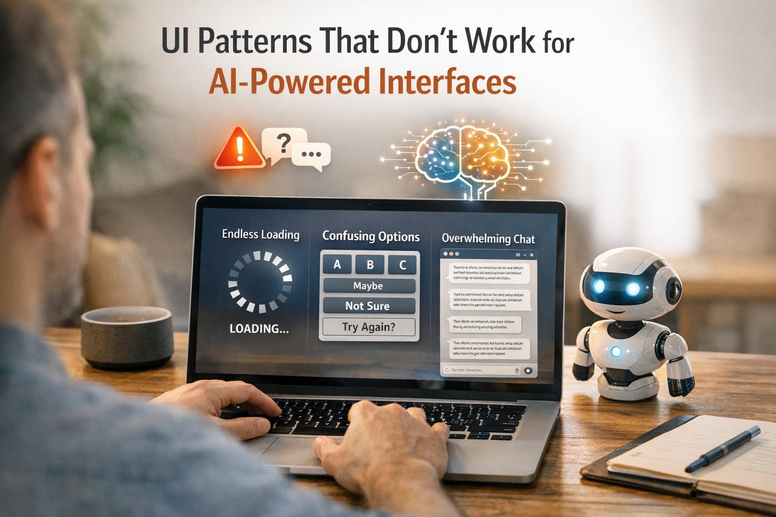
When designing for AI-powered systems, outdated UI patterns often fail because they don’t align with how AI works. Unlike deterministic software, where inputs lead to predictable outputs, AI is probabilistic and context-driven. This mismatch can cause user frustration and erode trust. Here’s what you need to know:
- Static Forms: Fixed input fields don’t leverage AI’s ability to auto-fill or adapt based on context. Solution: Use dynamic forms with AI-generated drafts, confidence indicators, and interactive tools for review.
- Linear Workflows: Step-by-step processes limit AI’s flexibility. Solution: Allow workflows with multiple entry points, autonomy sliders, and undo options.
- Rigid Navigation: Traditional menus can’t handle AI’s variable outputs. Solution: Use dynamic layouts, semantic search, and progressive disclosure to organize content effectively.
- Vague Prompts: Ambiguous user inputs lead to poor results. Solution: Guide users to provide structured, clear prompts with examples or visual controls.
- Empty Containers: Misaligned visual emphasis confuses users. Solution: Design layouts with real data and include confidence indicators to prioritize meaningful content.
AI-driven design requires flexible, context-aware interfaces that empower users to collaborate with AI effectively. By addressing these issues, you can create systems that are intuitive, trustworthy, and efficient.

Traditional UI Patterns vs AI-Optimized Interface Design
Static Forms Don’t Work with AI
Problem: Forms That Can’t Keep Up
Static forms rely on fixed inputs, which clashes with AI’s ability to adapt and respond based on patterns and context. This mismatch becomes clear when static forms are paired with AI functionality.
Take user data entry, for example. Static forms require users to manually input every detail, even when AI could easily auto-fill much of the information. This undermines one of AI’s greatest strengths: interpreting intent and handling tasks automatically[1]. Instead of letting AI create a draft that users can tweak, static forms force repetitive data entry, adding unnecessary effort.
Another issue? Static forms don’t communicate AI confidence. Users are left guessing whether the auto-filled data is accurate or needs verification. Without clear indicators – like confidence scores or "needs review" tags – users might either trust incorrect information or waste time double-checking every field[6].
This rigid approach highlights the need for a more flexible, adaptive design.
Solution: Smarter, Adaptive Forms
To tackle these problems, static fields should be replaced with dynamic, AI-aware components. Instead of starting with blank fields, let AI generate an initial draft using available context. For instance, AI could extract invoice details from a PDF, shifting the user’s role from manual data entry to reviewing and fine-tuning[6].
Interactive elements like inline chips or editable tokens can replace traditional text fields. These tools allow users to accept, reject, or modify AI suggestions without retyping, streamlining the process. Adding visual cues, such as color-coded confidence levels or labels like "Confident", "Unsure", or "Needs review", further enhances the experience. These indicators reduce the need for exhaustive checks while reflecting AI’s adaptive nature[6].
Another helpful feature is an "edit-before-apply" workflow. This lets users review and adjust AI-generated inputs before finalizing them, striking a balance between efficiency and control. Essentially, forms should embrace uncertainty and foster collaboration between users and AI.
Comparison Table: Static Forms vs. Adaptive Forms
| Feature | Static Forms | Adaptive Forms |
|---|---|---|
| System Logic | Fixed rules (deterministic) | Probabilistic, based on AI insights[6] |
| User Role | Manual data entry | Reviewer and editor |
| Content Flow | Linear and rigid | Context-aware and flexible |
| Feedback Loop | Limited to static error messages | Learns from user corrections[6] |
| Cognitive Load | High (manual input required) | Low (focus on review and recognition)[6] |
Linear Workflows Limit AI Capabilities
Problem: Workflows That Force a Single Path
Traditional workflows are well-suited for deterministic software – where the same input always leads to the same output. But AI doesn’t work like that. It operates in a probabilistic way, adapting its actions based on context. Forcing AI into a rigid, step-by-step sequence limits its ability to respond dynamically to real-world situations[9].
Take project management tools as an example. Many of these systems require users to follow a fixed sequence: define the scope, assign tasks, set deadlines, and track progress. While this structure works for predictable systems, it clashes with the flexibility AI offers. AI can adjust timelines based on team productivity, reassign tasks by analyzing workloads, or even identify potential risks before they become problems. Yet, linear workflows often block these capabilities. They assume a fixed progression, while AI thrives on adapting to unexpected changes.
At the heart of the issue is control. Traditional workflows are command-driven – you tell the system what to do at every step. AI, however, introduces intent-based interaction: you define the goal, and the system figures out how to achieve it[1].
"In our new era of adaptive, intelligent agents, workflows are a cage. As design tools, they are rigid, overcomplicated, and limiting." – Matt Fick, Senior UX Architect, and Max Peterschmidt, Principal User Researcher, Microsoft[9]
Another limitation is how linear workflows handle hidden steps. AI often performs intermediate tasks – like gathering data, cross-referencing sources, or drafting content – without needing user input. But traditional workflows assume every step requires explicit action, which slows down processes that AI could otherwise handle seamlessly[10]. To fully unlock AI’s potential, workflows need to move away from rigid paths and embrace flexibility, allowing for multiple points of intervention.
Solution: Workflows That Allow Multiple Paths
The answer lies in creating workflows that function as continuous loops – where the system can sense, decide, act, and reassess[9][11]. This structure lets users step in at any point to guide, adjust, or approve the process.
One practical approach involves autonomy sliders and steerability controls. These tools allow users to fine-tune how much independence the AI has, from following explicit commands to operating based on high-level goals[10]. For example, if an AI scheduling tool suggests meeting times, users can tweak preferences – like prioritizing mornings or avoiding Fridays – on the fly. The system recalculates instantly, without requiring a full restart of the workflow[10]. Similarly, some platforms let users adjust the AI’s creative input through slider controls, tailoring its output to specific needs[10].
Integrating human oversight into these workflows shifts the user’s role from operator to supervisor. Instead of manually executing every step, users can review AI-generated suggestions, handle exceptions, and provide feedback to improve the system over time[11][6]. This approach blends user control with AI adaptability, making workflows more efficient and user-friendly.
Lastly, ensure every AI-driven action is reversible. Features like “undo” buttons or preview modes give users the ability to review and edit actions before they’re applied. This not only preserves user control but also builds trust, especially when the AI takes on tasks that were traditionally done manually. Previewing the AI’s intended actions allows users to feel confident while maintaining workflow efficiency[10][6].
Complex Navigation Clashes with AI Outputs
Problem: Rigid Menus Can’t Handle AI Content
Traditional navigation systems, like static forms and linear workflows, struggle to keep up with the dynamic outputs generated by AI. These systems are built around fixed content, but AI delivers results that can range from concise answers to sprawling, multi-topic reports. The result? Clunky, cluttered layouts that frustrate users.
Hierarchical menus, designed for predictable content flow, often fail to accommodate the unpredictable nature of AI-generated information. This mismatch leads to what researchers call "Frankenstein layouts" – interfaces that feel disorganized and lack a clear structure[4]. Key details may get buried in long outputs, while irrelevant information might take center stage.
"AI-prototyping tools demonstrate a surface-level understanding of individual UI components… But when these elements are combined to create a page, the layouts often lack hierarchy." – Huei-Hsin Wang, NN/g[4]
Chat-based interfaces exacerbate these problems. Users are often faced with "massive walls of text", forcing them to scroll endlessly to find earlier information. This behavior, sometimes referred to as "apple picking", makes it harder to maintain focus and efficiency[2][7]. Without structured navigation, users must constantly reorient themselves, which undermines the consistency that well-organized layouts typically provide.
Another issue is the overuse of flashy visuals that lack substance. For example, AI-generated designs might display low-value information, like a single number, in oversized containers, wasting screen space and confusing users who rely on visual cues to assess importance[4]. In some cases, AI tools have even duplicated interface elements, such as progress bars, adding to the chaos[4].
These challenges highlight the need for navigation systems that can adapt fluidly to AI-generated content, paving the way for more dynamic solutions.
Solution: Navigation That Adjusts to Content
To address these issues, rigid menus must give way to dynamic navigation systems that adapt to the content being presented. Instead of forcing AI outputs into static categories, these systems can reorganize themselves to reflect the structure and relevance of the information.
Card-based layouts offer one effective approach. By breaking down content into individual cards – whether it’s a quick answer, a chart, or a detailed explanation – users can scan, rearrange, or dismiss information without feeling overwhelmed by cluttered visuals.
Another game-changer is semantic search, which replaces traditional menu browsing. Users can type exactly what they’re looking for, and the system instantly surfaces relevant AI-generated content. Some platforms even offer "style lenses", allowing users to filter results by attributes like tone or sentence length[3]. This minimizes the effort spent sifting through endless chat histories.
Progressive disclosure is another powerful tool. Instead of presenting everything upfront, interfaces can show summaries that expand only when more detail is needed. This prevents users from being bombarded with large blocks of text while still giving them access to deeper insights on demand[7]. Additionally, allowing users to select and refine specific parts of an AI response – rather than rewriting an entire prompt – can save time and reduce frustration[7][12].
Finally, visualizing the flow of generated content can help users stay oriented. For instance, a history of outputs or a visual map of nodes can provide a clear overview, reducing the confusion that often arises in linear chat threads[3][5].
Comparison Table: Traditional Navigation vs. AI-Dynamic Navigation
| Feature | Traditional Navigation | AI-Dynamic Navigation |
|---|---|---|
| Structure | Fixed hierarchy and rigid menus | Flexible layouts that adapt to content[2][10] |
| User Target | Designed for the "average" user | Personalized for individual needs[2] |
| Content Handling | Static screens with fixed information | Handles variable outputs of different lengths[5] |
| Consistency | High (predictable locations) | Lower (adapts to each session)[2] |
| Information Discovery | Browsing predefined paths | Semantic search and smart suggestions[10] |
| Interaction Cost | High (manual clicks and searches) | High (requires precise prompts)[3] |
Vague Prompts Create Unclear Results
Problem: Unclear Inputs Lead to Poor Outputs
When users input vague prompts like "design something modern" or "make it simple", AI systems often struggle to interpret the actual intent. This can result in "Frankenstein layouts" – interfaces that feel haphazardly assembled, lacking a clear visual hierarchy or logical structure[4]. Instead of producing sleek, user-friendly designs, these unclear inputs lead to messy outcomes: duplicate progress bars, redundant information blocks, or oversized containers displaying very little content. The result? A cluttered interface that increases cognitive load[4]. Worse yet, the flow of content might feel unnatural, presenting information out of order and disrupting the user’s experience[4].
Just as UI elements need to align with AI capabilities, a well-crafted prompt is essential for the AI to deliver useful results. Vague instructions often lead to inefficient back-and-forth exchanges[12][14]. This phenomenon, dubbed "accordion editing," happens when users repeatedly tweak the same content to meet their needs[7].
"Typically it doesn’t actually listen to me. It still is generally too long, so I keep saying, ‘Shorten that, shorten that,’ until it gets me down to 280 characters." – User participant in NN/g study[7]
Statistics highlight the impact of unclear prompts: 77% of AI interactions involve more than one exchange, with an average of 3.6 user-generated prompts per conversation[14][15]. Additionally, half of these interactions require at least one follow-up action[15]. This constant refinement wastes time and leaves users frustrated, especially when they expect quick, actionable results. The key to solving this? Clear, structured prompts that guide the AI effectively.
Solution: Structured Prompts for Better Results
The solution is simple: replace vague instructions with specific, detailed parameters. Instead of asking for a "modern" design, specify a style like "neobrutalism" or "flat design." If you want a "simple" layout, provide mock data in JSON format so the AI can understand the content structure[4].
A helpful approach is the CARE framework, which emphasizes four key elements: Context, Ask, Rules, and Examples[16]. For instance, instead of a generic request like "Create login error messages", try something more structured:
"Senior UX designer, e-commerce login screen. Generate 15 login error message options. Plain language, max 100 characters. Avoid: ‘Oopsie, we couldn’t log you in.’ Use: ‘Please check your email and try again.’"[16]
"The more direct the context you provide, the less interpretation the system needs to make – and the higher the accuracy of the output." – Huei-Hsin Wang, NN/g[4]
In addition to crafting better text prompts, UI-based controls can ease the process. Instead of requiring users to type everything, tools like clickable "pills" or sliders can visually adjust parameters[13][3]. For example, Amazon’s Rufus AI adapts its suggestions dynamically, such as prompting questions about "arch support" when a user browses Birkenstocks[13].
For more complex tasks, chain-of-thought prompting can break down requests into step-by-step instructions[16]. Attaching visual aids like moodboards or code snippets can also eliminate guesswork[4]. If a prompt remains too vague, the AI itself can step in with clarifying questions, like "Who is the audience for this report?" or "What tone do you prefer?"[12][14].
"Verbosity without precision hurts clarity – a concise, well-chosen keyword can often produce better results than a long but vague description." – Huei-Hsin Wang, NN/g[4]
sbb-itb-51b9a02
Empty Prominent Containers Mislead Users
Problem: Visual Emphasis Without Substance
AI-powered interfaces sometimes fall into the trap of giving a lot of screen space to elements that offer little value. Picture a dashboard where a large progress ring highlights an insignificant metric, while critical action items or task lists are crammed into less noticeable corners. This creates a mismatch between visual hierarchy and actual importance. As Huei-Hsin Wang, Senior User Experience Specialist at NN/g, points out:
"When hierarchy contradicts content priority, users may feel confused or distracted from completing the main tasks. This is a common flaw of AI-generated interfaces, which often place visual emphasis on the wrong element." [4]
This kind of design misstep results in layouts that feel disjointed. Users are drawn to flashy containers showcasing trivial data, while the information they truly need gets buried. It’s a clear sign that the design isn’t aligning visual prominence with meaningful content.
Solution: Layouts That Prioritize Real Content
The fix? Start designing with real data from the beginning. Instead of relying on empty placeholders during prototyping, use actual mock data to ensure that the most visually dominant elements showcase information that matters. Incorporate confidence indicators – like labels (High, Medium, Low) or numeric scores – to help users quickly assess the reliability of the data. These indicators are essential, especially since AI can sometimes generate misleading or incorrect outputs. For instance, one study revealed that ChatGPT falsely attributed 76% of 200 quotes from popular journalism sites [17], while AI-powered legal tools from LexisNexis and Thomson Reuters produced errors in about 1 out of 6 queries [17].
To further build trust, include tooltips and source links that let users verify the data. By doing this, you can transform empty visuals into something both informative and credible, ensuring that the design serves its purpose effectively.
Nordic.js 2025 • Vitaly Friedman – Design Patterns For AI Interfaces
AlterSquare‘s Approach to AI-Optimized UI Design
AlterSquare takes a forward-thinking approach to UI design by focusing on adaptive, user-first principles. At the heart of their strategy is the I.D.E.A.L. framework, which weaves AI into every aspect of user interaction. This framework doesn’t just tack AI onto existing designs – it builds interfaces that adapt dynamically to each user’s needs and goals. By setting clear objectives and constraints right from the start, AlterSquare moves away from static navigation and creates personalized paths for users. Instead of designing for the "average" user, the focus shifts to crafting experiences tailored to the individual.
A key part of this approach is transparency. AlterSquare leverages tools like SHAP (SHapley Additive exPlanations) and LIME (Local Interpretable Model-agnostic Explanations) to break down AI decision-making in a way users can understand. Features such as confidence meters, "needs review" tags, and color-coded risk indicators make it easier for users to gauge the reliability of AI outputs. This level of openness is a stark contrast to older, rigid UI designs and helps build trust by making AI decisions more accessible and clear.
Another cornerstone of AlterSquare’s design philosophy is keeping users in control. Their human-in-the-loop approach incorporates micro-feedback tools like thumbs up/down buttons or options to flag errors, such as "wrong department" corrections. These small but impactful inputs feed back into the system, turning user feedback into valuable data that improves the interface over time. This ensures that the system evolves with user needs while maintaining a sense of user agency.
For MVPs and generative AI initiatives, AlterSquare’s framework is designed to grow alongside your business. It creates interfaces that embrace AI’s probabilistic nature, empowering users to express intent, refine outputs, and reach meaningful results – all while keeping the process intuitive and user-driven.
Conclusion
Creating effective designs for AI-powered interfaces demands a departure from traditional UI approaches. Elements like static forms, rigid navigation, linear workflows, vague prompts, and misleading layouts often fall short because AI systems operate on probabilities rather than fixed outcomes. These challenges highlight the importance of prioritizing flexibility, clarity, and straightforwardness in design.
Poor design isn’t just a theoretical issue – it directly impacts businesses by wasting resources and eroding user trust. With 65% of global organizations expected to use generative AI by 2024 and worldwide AI spending projected to grow at a 29% annual rate from 2024 to 2028, the stakes are higher than ever [8]. Jakob Nielsen, Founder of NN/g, captures this shift perfectly:
"AI is introducing the third user-interface paradigm in computing history, shifting to a new interaction mechanism where users tell the computer what they want, not how to do it – thus reversing the locus of control" [1].
To address these challenges, startups and product teams must rethink their UI strategies. Focus on designs that reveal AI’s uncertainties, simplify decision-making, and empower users to stay in control. These principles are vital for building trust in AI-driven products.
As interfaces evolve from command-based to intent-based, users are no longer mere operators – they become collaborators working alongside AI [8]. Designing for this partnership means creating systems that adapt in real time, clearly explain their reasoning, and allow users to adjust or override AI outputs. By embedding these principles into your design, you can craft experiences that not only integrate AI but also make it genuinely effective.
Take a closer look at your interface. Look for signs of rigid workflows, hidden AI ambiguities, or unnecessary manual effort [3]. Addressing these issues is the first step toward building trust and delivering AI solutions that truly work.
FAQs
How do dynamic forms enhance user experience in AI-powered interfaces?
Dynamic forms take the traditional, static process and turn it into a tailored experience by adjusting in real-time based on AI’s interpretation of user input. They simplify interactions by displaying only the fields that matter, pre-filling known information, and even suggesting logical next steps. The result? Less hassle for users and a smoother, more intuitive flow.
These forms also incorporate progressive disclosure, where users initially encounter only the most straightforward questions. Additional fields appear only when necessary. Imagine a travel planning form: it might begin by asking for basic trip details but expand to include more options if the user’s plans involve a complicated itinerary. This method keeps things simple while remaining adaptable to individual needs.
Another standout feature of dynamic forms is their ability to provide instant feedback. For instance, they can display cost estimates in U.S. dollars ($) or offer deadlines formatted as January 20, 2026. By blending AI-driven insights with responsive design, these forms feel smarter and more personalized, which naturally boosts user engagement and satisfaction.
Why are flexible workflows important for AI-powered interfaces?
Flexible workflows enable AI systems to adjust to users’ needs in real time, making interactions smoother and more efficient. Instead of sticking to a strict sequence of steps, these systems can interpret what a user wants and dynamically adapt tasks. This not only cuts down on errors but also saves valuable time, creating a more tailored and hassle-free experience.
On top of that, flexible workflows empower users with more control. They can tweak settings, step in when needed, or redirect the AI without throwing off the entire process. This level of control builds trust and confidence while keeping the tools running efficiently. By focusing on results rather than rigid processes, these workflows also lighten the mental effort required from users, making it easier to adapt the interface to a variety of use cases. The result? Happier users and better engagement.
Why is adaptable navigation crucial for AI-powered interfaces?
In AI-driven interfaces, content adapts in real time based on user input, which means the information and options users interact with can shift as they engage. This dynamic nature can make traditional navigation tools, like fixed menus or static breadcrumbs, feel clunky and unhelpful. Users may struggle to keep up, leading to confusion, dead ends, or frustrating backtracking.
Flexible navigation solves this by evolving alongside the content. Features like re-prioritized options, collapsible sections, or contextual shortcuts help users stay oriented and reduce mental effort. These adjustments create a smoother, more intuitive experience, ensuring that even as the AI personalizes content, the interface remains user-friendly and easy to navigate. In AI-powered systems, this kind of responsive navigation is key to keeping the experience seamless.


Leave a Reply