
Construction tech platforms face unique challenges in UI/UX design. Why? Construction workers operate in tough environments, often with limited tech experience, yet need tools that match the simplicity of paper-based workflows. Poor design leads to abandoned tools, wasted time, and massive financial losses – $1.84 trillion annually due to poor data management.
Here’s what makes UI/UX in construction particularly tricky:
- Diverse Users: Platforms must work for tech-savvy professionals and older, tech-averse supervisors alike.
- Harsh Conditions: Bright sunlight, gloves, and unreliable connectivity demand designs with high contrast, large buttons, and offline functionality.
- Data Overload: Workers juggle complex data but need interfaces that simplify tasks without overwhelming them.
- Time Pressure: Clunky data entry wastes up to 35% of workers’ time. Streamlined forms, voice input, and auto-syncing are key.
- Building Trust: Clear error messages, progress indicators, and reliable offline syncing ensure confidence in the system.
Improving UI/UX for construction tech isn’t just about better design – it’s about reducing delays, cutting costs, and improving efficiency across projects. Simple, field-friendly tools can make all the difference.
Panel Discussion: Product Design & Architecture | Integrated Projects
sbb-itb-51b9a02
Main UI/UX Challenges in Construction Tech Platforms
Standard Mobile vs Construction Site Design Requirements Comparison
Showing Enough Data Without Overwhelming Users
Construction workers often juggle several data points – like percent complete, unit rates, and job-to-date progress – before entering a single number. Trying to cram all this information onto one screen can lead to clutter, slowing users down. The best interfaces focus on delivering "just the right information at the right time" instead of overwhelming users with every possible detail [2]. For example, showing only the last recorded progress can help workers quickly verify and correct entries. If something looks off, experienced workers will spot it immediately, so the interface should make it easy to adjust or "true up" numbers. Building trust in the system hinges on this flexibility.
Designing for Users with Limited Tech Experience
Construction tech users vary widely – from younger workers fluent with smartphones to seasoned supervisors who may have limited experience with digital tools. Tommy Kuntze, Director of Research and Design at Rhumbix, highlights this challenge:
"User Interface is crucial for construction because the folks that use construction tech software vary in many ways – from being younger to being on the older side… from being tech-savvy to being tech-averse. So, the UI has to be approachable to all of those people." [3]
An intuitive interface is critical here. Every extra tap or confusing step risks frustrating users enough to abandon the software for paper-based methods [6]. This is especially true when designing for conditions as tough as construction sites.
Making Interfaces Work on Construction Sites
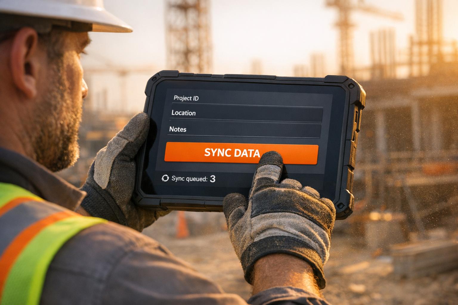
Mobile designs that work in an office often fail on construction sites. For example, 63% of users report difficulty reading screens in direct sunlight due to low contrast ratios [2]. Add in dust, glare, and the need to operate devices while wearing safety gloves, and even basic tasks, like tapping a button, can become frustrating.
Richard Hope, iOS Tech Lead, emphasizes the importance of adapting designs for these conditions:
"When designing a UI for mobile apps for bright light use, focus on high contrast, vibrant but not overly saturated colors, and larger, sans-serif fonts for readability." [2]
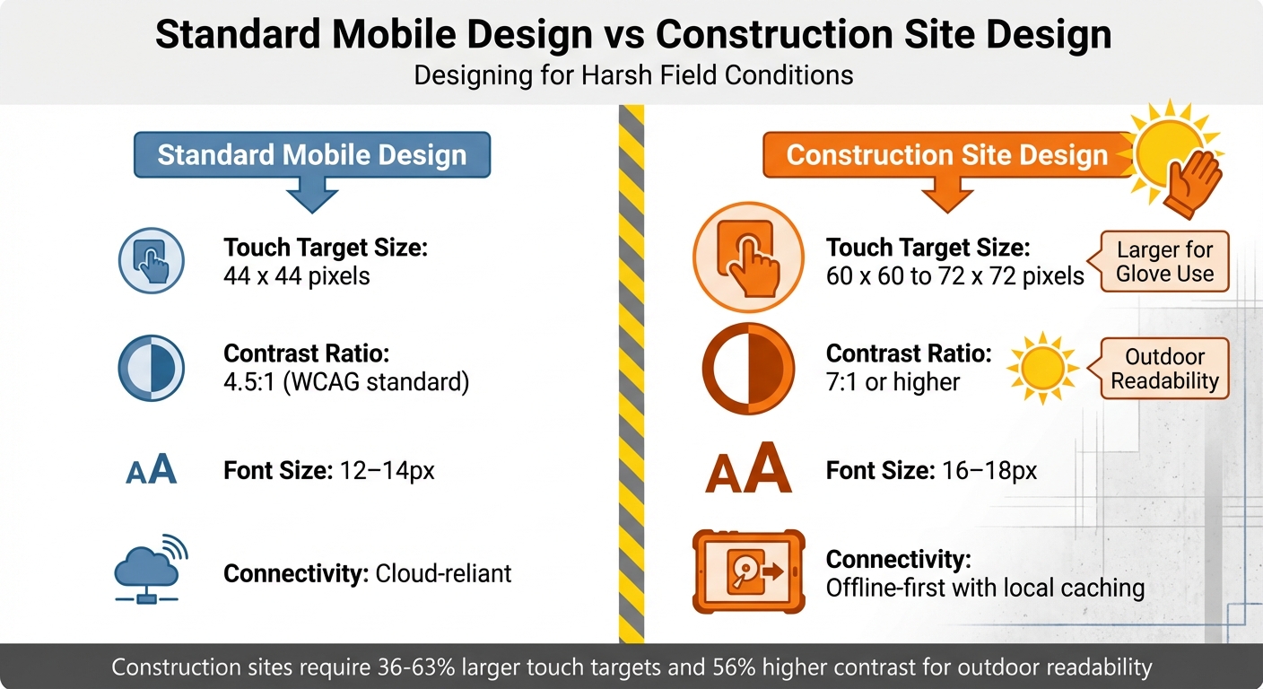
Buttons designed for office use – typically 44 x 44 pixels – should be scaled up to 60–72 x 60–72 pixels, with 16-pixel spacing, to accommodate glove use [6]. Similarly, font sizes should increase from 12–14px to 16–18px for better outdoor readability [4]. Connectivity challenges on remote sites further complicate matters, so apps need to work offline by caching essential data locally and syncing automatically when back online [2].
| Feature | Standard Mobile Design | Construction Site Design |
|---|---|---|
| Touch Target Size | 44 x 44 pixels | 60 x 60 to 72 x 72 pixels |
| Contrast Ratio | 4.5:1 (WCAG) | 7:1 or higher |
| Font Size | 12–14px | 16–18px |
| Connectivity | Cloud-reliant | Offline-first with local caching |
Making Data Entry Fast and Easy
Construction professionals often lose up to 35% of their time on unproductive tasks, including dealing with clunky data entry systems [2]. Workers under pressure – whether wearing gloves or balancing on ladders – can’t afford to wrestle with complex forms. Streamlining data entry with features like pre-filled forms, barcode scanning, and voice input can make a huge difference. For example, in 2024, Tectra Construction introduced a mobile-first platform that simplified data entry, leading to a 42% reduction in communication delays and a 32% improvement in task completion rates [5]. Additionally, delta syncing – which updates only the changes since the last sync – helps save bandwidth on slow networks [2]. Clear error messaging also plays a role in maintaining trust by guiding users through corrections smoothly.
Writing Error Messages That Help Instead of Blame
Error messages in construction tech need to do more than just point out problems – they should guide users toward solutions. For instance, instead of a vague "Invalid entry", a message like "Date must be in MM/DD/YYYY format (example: 02/14/2026)" provides clear instructions. Transparency is also key: visual indicators for network strength, pending uploads, and synchronization progress reassure workers that their data is safely saved [4]. Without these features, users may lose confidence in the system entirely.
Design Principles for Construction Tech Platforms
Tackling the UI/UX challenges in construction tech platforms means focusing on key principles like ease of use, adaptability to tough environments, efficient data handling, and fostering user confidence.
Making Interfaces Accessible to Everyone
Construction platforms need to work for a diverse group – ranging from tech-savvy younger workers to experienced supervisors who might not be as familiar with digital tools. The key idea? Design for the least tech-savvy user. If an interface takes more than 30 seconds to figure out or requires instructions, it’s too complicated [6]. Imagine workers on a busy job site, constantly interrupted – they need interfaces that zero in on one main action at a time, like "Clock In" or "Submit Photo." Overloaded menus with too many options just won’t cut it [6]. This single-focus design helps users complete tasks quickly, even if they’re pulled away mid-process. Think of it as making digital tools as easy to use as a paper form [3].
Accessibility doesn’t stop there. Outdoor conditions also demand thoughtful design adjustments to ensure the tools work seamlessly, no matter the environment.
Designing for Outdoor and Difficult Conditions
What works in an office often fails on a construction site. Workers wearing gloves can’t deal with tiny buttons, and bright sunlight can make standard screens unreadable. To address these challenges, interfaces need features like larger touch targets, better spacing, and higher contrast ratios [6]. Complex gestures like swiping or pinching? Forget them. Simple taps and big, clear buttons are the way to go [6].
Connectivity issues on remote sites add another layer of complexity. Apps must be able to function offline, storing data locally and syncing automatically once a connection is restored [6][7]. Without this capability, workers are left stranded when networks fail.
Speeding Up Data Entry
Typing on-site is often impractical. Instead, lean into tools like voice commands, speech-to-text, and barcode scanning to replace manual input. These features are especially helpful when workers are wearing gloves or managing equipment [4][6]. Automating tasks with pre-filled forms and built-in calculations can also reduce errors and save time [4]. Each screen should focus on completing a single task in under 30 seconds [6].
Interruptions are inevitable on a job site, so apps need to save progress automatically to prevent data loss [6]. For example, in 2025, Zerock Construction adopted an offline-first mobile approach. Workers could input data locally and sync it later, cutting both costs and time by at least 50% [4][7].
Building User Trust with Clear Feedback
Trust is crucial. Workers need reassurance that their data is being saved and the system is working as expected. Visual cues, like indicators for network strength, pending uploads, and synchronization progress, help users feel confident their input won’t vanish [4]. If errors occur, the system should offer clear, actionable solutions.
A great example of this is the $800 million Providence Care Hospital project. Assistant Project Manager Mike Armstrong from EllisDon used mobile-first digital tools with standardized forms and real-time data access. The result? They eliminated the need for 2–3 additional QA/QC personnel while maintaining high-quality standards [2]. As Armstrong put it:
"It has probably saved us 2–3 QA/QC people on our project, in all honesty" [2].
Addressing Organizational Challenges to Better UX
Even the most well-thought-out design can falter without internal support and adequate resources. Construction tech startups often encounter decision-makers focused on short-term ROI, tight budgets, and a disconnect between designers and construction professionals. These internal challenges amplify the UI/UX issues previously discussed, making organizational alignment just as important as adapting designs for on-site use.
Proving UX Value to Decision Makers
Tackling on-site design challenges is only part of the equation; gaining organizational buy-in is equally critical.
Executives prioritize metrics like cost savings and project timelines. With the industry losing $1.84 trillion annually – where 77% of mega projects are delayed, and 98% exceed budgets [2] – it’s crucial to frame UX benefits in these terms. Highlight how better design can reduce rework costs (which can account for 30% to 40% of project expenses), accelerate user adoption, and lower support tickets.
Zack Naylor, UX Researcher and Co-founder at Aurelius, emphasizes the importance of connecting with stakeholders:
"You MUST learn and speak their language. It’s not their job to know the value of UX, so speak in terms they know and care about. Learn about their job, their responsibilities and who/what they’re accountable for." [8]
Engage stakeholders to uncover their specific concerns, whether they’re related to budget constraints or past tech missteps. A small, focused proof-of-concept project can address these hesitations effectively. For example, showing video clips of workers struggling with inefficient interfaces or calculating the financial impact of poor usability can make a compelling case. A well-executed pilot that solves a small but persistent issue can pave the way for larger-scale trust and investment [9][10].
Getting Designers and Construction Experts to Work Together
Internal misalignment can hinder UX improvements just as much as technical issues.
Designers who lack on-site experience risk creating tools that don’t work in real-world conditions. Contextual immersion – where UX teams shadow on-site workers – can uncover practical challenges like noisy environments, interruptions, shared equipment, and other outdoor constraints. This hands-on approach is vital to designing tools that are both functional and intuitive [12].
In 2024, Tectra Construction demonstrated the power of collaboration between UX architects and field professionals. Their efforts boosted user satisfaction by 38%, reduced communication delays by 42%, and shortened project timelines by 25% [5]. John Taylor, Tectra’s CEO, shared:
"Tectra helped us streamline project tracking and improve communication. Teams now complete tasks faster and with higher accuracy." [5]
Simplify communication by avoiding industry jargon and establish regular check-ins, like daily or weekly standups, to keep designers and field teams aligned. If external workers are unavailable for testing, involve internal staff with construction experience to catch early-stage design flaws [11][12].
Improving Design Gradually with Limited Resources
Improving UX doesn’t require a massive budget. Start small with a Minimum Viable Product (MVP) that focuses on essential features, such as centralized task tracking and real-time updates, before scaling up to include advanced tools [5][13]. Use low-fidelity prototypes, like sketches or wireframes, to test ideas early. This approach avoids overcommitting resources to polished designs that might need significant revisions later [12].
In 2025, BuildIn, a construction tech startup, revamped site progress tracking with interactive 3D models and modular widgets. By focusing on real-time syncing and high-contrast design, they achieved a System Usability Scale (SUS) score of 77, classified as "excellent." The redesign increased project visibility by 60% and boosted demo signups by 34% [13]. CEO Ethan Grayson noted:
"The updated app must turn complex site data into clear visuals, improve 3D progress tracking, and help teams react faster on-site." [13]
Focus on immediate, impactful changes that don’t require hardware upgrades. For example, implement delta syncing to update only modified data instead of transferring entire files, or adjust button sizes and contrast for better outdoor visibility. These software optimizations can cut data access times by 25% and improve QA/QC efforts by 30% [2].
Conclusion
Designing effective construction technology means addressing the unique needs of different users. Field workers require interfaces that are simple, glove-friendly, visible in bright sunlight, and functional offline. On the other hand, decision-makers prioritize detailed analytics and clear ROI metrics. The stakes are high – poor data management costs the construction industry $1.84 trillion annually, and professionals spend 35% of their time on unproductive tasks[2][4]. These numbers highlight just how critical thoughtful design is.
The key to success lies in field-first thinking. This approach emphasizes practical features like high-contrast visuals, larger touch targets, and reliable offline functionality[2][4]. As Tommy Kuntze, Director of Research and Design at Rhumbix, puts it:
"The field is the place where everything happens. For our customers, the field is critical to project success because that’s where all of the data is captured"[3].
However, a strong technical foundation isn’t enough. The design must also meet broader business goals. Framing UX improvements in terms of ROI is essential. Start small with a minimum viable product (MVP) that targets key daily operations and workflows for maximum impact[5][14].
To create exceptional platforms, continuous testing and iteration are non-negotiable. Site visits to observe how tools are used in real-world conditions, early involvement of construction experts, and gradual updates to avoid disruption are all critical steps. Companies leading the way in digital adoption have seen a 12% increase in operational efficiency and an 11% boost in employee satisfaction[1]. These gains underscore the importance of aligning all stakeholders.
FAQs
What does ‘field-first’ UX mean?
‘Field-first’ UX is all about designing tools that work seamlessly in the tough, unpredictable conditions of construction sites. This approach puts usability front and center, addressing challenges like unreliable internet, harsh weather, and the need for quick, efficient interactions.
Key features include offline functionality for areas with poor connectivity, glove-friendly screens for workers who can’t remove their gear, and sunlight-readable displays to combat glare. These design choices aren’t just conveniences – they’re essential for keeping construction workflows smooth and error-free.
By tailoring tools to match on-site realities, ‘field-first’ UX helps construction professionals stay productive and focused, no matter how demanding the environment gets.
How do I design for offline use on job sites?
When building apps for job sites, offline functionality is key. Workers often face unreliable or nonexistent internet connections, so creating offline-first applications makes their tasks smoother and more efficient.
Start by focusing on local data storage. This allows workers to access critical information like blueprints, update tasks, and log data directly on their devices, even without an internet connection. Cached data ensures they can keep working without interruptions.
To handle connectivity issues, implement automatic or manual syncing. This ensures that once the device reconnects to the internet, all updates are seamlessly synced with the central system, keeping everything up to date without manual effort.
The interface design also plays a huge role in usability. Opt for simple, intuitive layouts with clear visuals that are easy to navigate. Include features like glove-friendly controls and screens that remain readable in direct sunlight, ensuring the app performs well even in tough, outdoor conditions.
By addressing these challenges, you can create tools that truly support workers in demanding environments.
How can I prove UX ROI to construction leaders?
To convey the return on investment (ROI) of UX to construction leaders, focus on presenting data-backed results that connect design improvements to tangible business outcomes. Highlight metrics like improved project efficiency, reduced costs, and higher stakeholder satisfaction. For instance, demonstrate how streamlined interfaces and real-time data visualization tools can boost productivity and lower operational expenses. This approach makes the benefits of UX clear and measurable, aligning them with organizational goals.
Related Blog Posts
- Why Construction Software Feels Stuck in the 90s: UI/UX Challenges in Industrial Applications
- Why Construction Tech UX Is Different: Designing for Jobsite Realities
- Responsive Design for Construction Sites: Making Web Apps Work in the Field
- Construction Software User Experience: Why Most Apps Fail on Job Sites


Leave a Reply